Compare commits
10 Commits
| Author | SHA1 | Date | |
|---|---|---|---|
 matt matt
|
fe70b56d24 | ||
|
matt
|
ed62f03ba0 | ||
|
matt
|
e034e83198 | ||
|
matt
|
110f4ec332 | ||
|
matt
|
5bf265ed46 | ||
|
matt
|
528fe7c024 | ||
|
matt
|
08be0658cb | ||
|
matt
|
f823841b15 | ||
|
matt
|
9ce3793067 | ||
|
matt
|
89d4605577 |
Generated
+3241
-1036
File diff suppressed because it is too large
Load Diff
+35
-3
@@ -10,58 +10,90 @@
|
||||
"preview": "vite preview"
|
||||
},
|
||||
"dependencies": {
|
||||
"@chakra-ui/button": "^2.1.0",
|
||||
"@chakra-ui/checkbox": "^2.3.2",
|
||||
"@chakra-ui/form-control": "^2.2.0",
|
||||
"@chakra-ui/hooks": "^2.4.3",
|
||||
"@chakra-ui/icons": "^2.2.4",
|
||||
"@chakra-ui/input": "^2.1.2",
|
||||
"@chakra-ui/layout": "^2.3.1",
|
||||
"@chakra-ui/modal": "^2.3.1",
|
||||
"@chakra-ui/popper": "^3.1.0",
|
||||
"@chakra-ui/react": "^2.8.1",
|
||||
"@chakra-ui/select": "^2.1.2",
|
||||
"@chakra-ui/system": "^2.6.2",
|
||||
"@chakra-ui/theme": "^3.4.7",
|
||||
"@chakra-ui/theme-tools": "^2.2.7",
|
||||
"@chakra-ui/utils": "^2.2.3",
|
||||
"@dnd-kit/core": "^6.3.1",
|
||||
"@dnd-kit/sortable": "^10.0.0",
|
||||
"@dnd-kit/utilities": "^3.2.2",
|
||||
"@emotion/react": "^11.14.0",
|
||||
"@emotion/styled": "^11.14.0",
|
||||
"@radix-ui/react-accordion": "^1.2.2",
|
||||
"@radix-ui/react-alert-dialog": "^1.1.4",
|
||||
"@radix-ui/react-avatar": "^1.1.2",
|
||||
"@radix-ui/react-checkbox": "^1.1.4",
|
||||
"@radix-ui/react-collapsible": "^1.1.2",
|
||||
"@radix-ui/react-dialog": "^1.1.4",
|
||||
"@radix-ui/react-dropdown-menu": "^2.1.4",
|
||||
"@radix-ui/react-label": "^2.1.1",
|
||||
"@radix-ui/react-popover": "^1.1.4",
|
||||
"@radix-ui/react-progress": "^1.1.1",
|
||||
"@radix-ui/react-radio-group": "^1.2.3",
|
||||
"@radix-ui/react-scroll-area": "^1.2.2",
|
||||
"@radix-ui/react-select": "^2.1.4",
|
||||
"@radix-ui/react-separator": "^1.1.1",
|
||||
"@radix-ui/react-slot": "^1.1.1",
|
||||
"@radix-ui/react-switch": "^1.1.2",
|
||||
"@radix-ui/react-tabs": "^1.1.2",
|
||||
"@radix-ui/react-toast": "^1.2.6",
|
||||
"@radix-ui/react-toggle": "^1.1.1",
|
||||
"@radix-ui/react-toggle-group": "^1.1.1",
|
||||
"@radix-ui/react-tooltip": "^1.1.6",
|
||||
"@shadcn/ui": "^0.0.4",
|
||||
"@tabler/icons-react": "^3.28.1",
|
||||
"@tanstack/react-query": "^5.63.0",
|
||||
"@tanstack/react-query": "^5.66.7",
|
||||
"@tanstack/react-table": "^8.20.6",
|
||||
"@tanstack/react-virtual": "^3.11.2",
|
||||
"@tanstack/virtual-core": "^3.11.2",
|
||||
"@types/js-levenshtein": "^1.1.3",
|
||||
"@types/uuid": "^10.0.0",
|
||||
"chakra-react-select": "^4.7.5",
|
||||
"chakra-ui-steps": "^2.0.4",
|
||||
"chart.js": "^4.4.7",
|
||||
"chartjs-adapter-date-fns": "^3.0.0",
|
||||
"class-variance-authority": "^0.7.1",
|
||||
"clsx": "^2.1.1",
|
||||
"cmdk": "^1.0.0",
|
||||
"date-fns": "^3.6.0",
|
||||
"framer-motion": "^12.4.4",
|
||||
"js-levenshtein": "^1.1.6",
|
||||
"lodash": "^4.17.21",
|
||||
"lucide-react": "^0.469.0",
|
||||
"motion": "^11.18.0",
|
||||
"next-themes": "^0.4.4",
|
||||
"react": "^18.3.1",
|
||||
"react-chartjs-2": "^5.3.0",
|
||||
"react-data-grid": "^7.0.0-beta.13",
|
||||
"react-day-picker": "^8.10.1",
|
||||
"react-dom": "^18.3.1",
|
||||
"react-dropzone": "^14.3.5",
|
||||
"react-icons": "^5.4.0",
|
||||
"react-router-dom": "^7.1.1",
|
||||
"recharts": "^2.15.0",
|
||||
"sonner": "^1.7.1",
|
||||
"tailwind-merge": "^2.6.0",
|
||||
"tailwindcss-animate": "^1.0.7",
|
||||
"tanstack": "^1.0.0",
|
||||
"vaul": "^1.1.2"
|
||||
"uuid": "^11.0.5",
|
||||
"vaul": "^1.1.2",
|
||||
"xlsx": "^0.18.5"
|
||||
},
|
||||
"devDependencies": {
|
||||
"@eslint/js": "^9.17.0",
|
||||
"@types/fs-extra": "^11.0.4",
|
||||
"@types/lodash": "^4.17.14",
|
||||
"@types/lodash": "^4.17.15",
|
||||
"@types/node": "^22.10.5",
|
||||
"@types/react": "^18.3.18",
|
||||
"@types/react-dom": "^18.3.5",
|
||||
|
||||
+25
-20
@@ -15,6 +15,8 @@ import { RequireAuth } from './components/auth/RequireAuth';
|
||||
import Forecasting from "@/pages/Forecasting";
|
||||
import { Vendors } from '@/pages/Vendors';
|
||||
import { Categories } from '@/pages/Categories';
|
||||
import { Import } from '@/pages/import/Import';
|
||||
import { ChakraProvider } from '@chakra-ui/react';
|
||||
|
||||
const queryClient = new QueryClient();
|
||||
|
||||
@@ -50,26 +52,29 @@ function App() {
|
||||
|
||||
return (
|
||||
<QueryClientProvider client={queryClient}>
|
||||
<Toaster richColors position="top-center" />
|
||||
<Routes>
|
||||
<Route path="/login" element={<Login />} />
|
||||
<Route element={
|
||||
<RequireAuth>
|
||||
<MainLayout />
|
||||
</RequireAuth>
|
||||
}>
|
||||
<Route path="/" element={<Dashboard />} />
|
||||
<Route path="/products" element={<Products />} />
|
||||
<Route path="/categories" element={<Categories />} />
|
||||
<Route path="/vendors" element={<Vendors />} />
|
||||
<Route path="/orders" element={<Orders />} />
|
||||
<Route path="/purchase-orders" element={<PurchaseOrders />} />
|
||||
<Route path="/analytics" element={<Analytics />} />
|
||||
<Route path="/settings" element={<Settings />} />
|
||||
<Route path="/forecasting" element={<Forecasting />} />
|
||||
<Route path="*" element={<Navigate to="/" replace />} />
|
||||
</Route>
|
||||
</Routes>
|
||||
<ChakraProvider>
|
||||
<Toaster richColors position="top-center" />
|
||||
<Routes>
|
||||
<Route path="/login" element={<Login />} />
|
||||
<Route element={
|
||||
<RequireAuth>
|
||||
<MainLayout />
|
||||
</RequireAuth>
|
||||
}>
|
||||
<Route path="/" element={<Dashboard />} />
|
||||
<Route path="/products" element={<Products />} />
|
||||
<Route path="/import" element={<Import />} />
|
||||
<Route path="/categories" element={<Categories />} />
|
||||
<Route path="/vendors" element={<Vendors />} />
|
||||
<Route path="/orders" element={<Orders />} />
|
||||
<Route path="/purchase-orders" element={<PurchaseOrders />} />
|
||||
<Route path="/analytics" element={<Analytics />} />
|
||||
<Route path="/settings" element={<Settings />} />
|
||||
<Route path="/forecasting" element={<Forecasting />} />
|
||||
<Route path="*" element={<Navigate to="/" replace />} />
|
||||
</Route>
|
||||
</Routes>
|
||||
</ChakraProvider>
|
||||
</QueryClientProvider>
|
||||
);
|
||||
}
|
||||
|
||||
@@ -8,6 +8,7 @@ import {
|
||||
LogOut,
|
||||
Users,
|
||||
Tags,
|
||||
FileSpreadsheet,
|
||||
} from "lucide-react";
|
||||
import { IconCrystalBall } from "@tabler/icons-react";
|
||||
import {
|
||||
@@ -35,6 +36,11 @@ const items = [
|
||||
icon: Package,
|
||||
url: "/products",
|
||||
},
|
||||
{
|
||||
title: "Import",
|
||||
icon: FileSpreadsheet,
|
||||
url: "/import",
|
||||
},
|
||||
{
|
||||
title: "Forecasting",
|
||||
icon: IconCrystalBall,
|
||||
|
||||
@@ -27,7 +27,7 @@ import {
|
||||
import { Loader2, X, RefreshCw, AlertTriangle, RefreshCcw, Hourglass } from "lucide-react";
|
||||
import config from "../../config";
|
||||
import { toast } from "sonner";
|
||||
import { Table, TableBody, TableCell, TableRow, TableHeader, TableHead } from "@/components/ui/table";
|
||||
import { Table, TableBody, TableCell, TableRow } from "@/components/ui/table";
|
||||
|
||||
interface ImportProgress {
|
||||
status: "running" | "error" | "complete" | "cancelled";
|
||||
|
||||
@@ -9,7 +9,7 @@ const Card = React.forwardRef<
|
||||
<div
|
||||
ref={ref}
|
||||
className={cn(
|
||||
"rounded-xl border bg-card text-card-foreground shadow",
|
||||
"rounded-lg border bg-card text-card-foreground shadow-sm",
|
||||
className
|
||||
)}
|
||||
{...props}
|
||||
@@ -30,22 +30,25 @@ const CardHeader = React.forwardRef<
|
||||
CardHeader.displayName = "CardHeader"
|
||||
|
||||
const CardTitle = React.forwardRef<
|
||||
HTMLDivElement,
|
||||
React.HTMLAttributes<HTMLDivElement>
|
||||
HTMLParagraphElement,
|
||||
React.HTMLAttributes<HTMLHeadingElement>
|
||||
>(({ className, ...props }, ref) => (
|
||||
<div
|
||||
<h3
|
||||
ref={ref}
|
||||
className={cn("font-semibold leading-none tracking-tight", className)}
|
||||
className={cn(
|
||||
"text-2xl font-semibold leading-none tracking-tight",
|
||||
className
|
||||
)}
|
||||
{...props}
|
||||
/>
|
||||
))
|
||||
CardTitle.displayName = "CardTitle"
|
||||
|
||||
const CardDescription = React.forwardRef<
|
||||
HTMLDivElement,
|
||||
React.HTMLAttributes<HTMLDivElement>
|
||||
HTMLParagraphElement,
|
||||
React.HTMLAttributes<HTMLParagraphElement>
|
||||
>(({ className, ...props }, ref) => (
|
||||
<div
|
||||
<p
|
||||
ref={ref}
|
||||
className={cn("text-sm text-muted-foreground", className)}
|
||||
{...props}
|
||||
@@ -73,4 +76,16 @@ const CardFooter = React.forwardRef<
|
||||
))
|
||||
CardFooter.displayName = "CardFooter"
|
||||
|
||||
export { Card, CardHeader, CardFooter, CardTitle, CardDescription, CardContent }
|
||||
const ScrollArea = React.forwardRef<
|
||||
HTMLDivElement,
|
||||
React.HTMLAttributes<HTMLDivElement>
|
||||
>(({ className, ...props }, ref) => (
|
||||
<div
|
||||
ref={ref}
|
||||
className={cn("overflow-auto", className)}
|
||||
{...props}
|
||||
/>
|
||||
))
|
||||
ScrollArea.displayName = "ScrollArea"
|
||||
|
||||
export { Card, CardHeader, CardFooter, CardTitle, CardDescription, CardContent, ScrollArea }
|
||||
|
||||
@@ -0,0 +1,28 @@
|
||||
import * as React from "react"
|
||||
import * as CheckboxPrimitive from "@radix-ui/react-checkbox"
|
||||
import { Check } from "lucide-react"
|
||||
|
||||
import { cn } from "@/lib/utils"
|
||||
|
||||
const Checkbox = React.forwardRef<
|
||||
React.ElementRef<typeof CheckboxPrimitive.Root>,
|
||||
React.ComponentPropsWithoutRef<typeof CheckboxPrimitive.Root>
|
||||
>(({ className, ...props }, ref) => (
|
||||
<CheckboxPrimitive.Root
|
||||
ref={ref}
|
||||
className={cn(
|
||||
"peer h-4 w-4 shrink-0 rounded-sm border border-primary shadow focus-visible:outline-none focus-visible:ring-1 focus-visible:ring-ring disabled:cursor-not-allowed disabled:opacity-50 data-[state=checked]:bg-primary data-[state=checked]:text-primary-foreground",
|
||||
className
|
||||
)}
|
||||
{...props}
|
||||
>
|
||||
<CheckboxPrimitive.Indicator
|
||||
className={cn("flex items-center justify-center text-current")}
|
||||
>
|
||||
<Check className="h-4 w-4" />
|
||||
</CheckboxPrimitive.Indicator>
|
||||
</CheckboxPrimitive.Root>
|
||||
))
|
||||
Checkbox.displayName = CheckboxPrimitive.Root.displayName
|
||||
|
||||
export { Checkbox }
|
||||
@@ -0,0 +1,23 @@
|
||||
import * as React from "react"
|
||||
|
||||
import { cn } from "@/lib/utils"
|
||||
|
||||
export interface CodeProps extends React.HTMLAttributes<HTMLPreElement> {}
|
||||
|
||||
const Code = React.forwardRef<HTMLPreElement, CodeProps>(
|
||||
({ className, ...props }, ref) => {
|
||||
return (
|
||||
<pre
|
||||
ref={ref}
|
||||
className={cn(
|
||||
"rounded-lg bg-muted px-4 py-4 font-mono text-sm",
|
||||
className
|
||||
)}
|
||||
{...props}
|
||||
/>
|
||||
)
|
||||
}
|
||||
)
|
||||
Code.displayName = "Code"
|
||||
|
||||
export { Code }
|
||||
@@ -0,0 +1,44 @@
|
||||
"use client"
|
||||
|
||||
import * as React from "react"
|
||||
import * as RadioGroupPrimitive from "@radix-ui/react-radio-group"
|
||||
import { Circle } from "lucide-react"
|
||||
|
||||
import { cn } from "@/lib/utils"
|
||||
|
||||
const RadioGroup = React.forwardRef<
|
||||
React.ElementRef<typeof RadioGroupPrimitive.Root>,
|
||||
React.ComponentPropsWithoutRef<typeof RadioGroupPrimitive.Root>
|
||||
>(({ className, ...props }, ref) => {
|
||||
return (
|
||||
<RadioGroupPrimitive.Root
|
||||
className={cn("grid gap-2", className)}
|
||||
{...props}
|
||||
ref={ref}
|
||||
/>
|
||||
)
|
||||
})
|
||||
RadioGroup.displayName = RadioGroupPrimitive.Root.displayName
|
||||
|
||||
const RadioGroupItem = React.forwardRef<
|
||||
React.ElementRef<typeof RadioGroupPrimitive.Item>,
|
||||
React.ComponentPropsWithoutRef<typeof RadioGroupPrimitive.Item>
|
||||
>(({ className, ...props }, ref) => {
|
||||
return (
|
||||
<RadioGroupPrimitive.Item
|
||||
ref={ref}
|
||||
className={cn(
|
||||
"aspect-square h-4 w-4 rounded-full border border-primary text-primary shadow focus:outline-none focus-visible:ring-1 focus-visible:ring-ring disabled:cursor-not-allowed disabled:opacity-50",
|
||||
className
|
||||
)}
|
||||
{...props}
|
||||
>
|
||||
<RadioGroupPrimitive.Indicator className="flex items-center justify-center">
|
||||
<Circle className="h-3.5 w-3.5 fill-primary" />
|
||||
</RadioGroupPrimitive.Indicator>
|
||||
</RadioGroupPrimitive.Item>
|
||||
)
|
||||
})
|
||||
RadioGroupItem.displayName = RadioGroupPrimitive.Item.displayName
|
||||
|
||||
export { RadioGroup, RadioGroupItem }
|
||||
@@ -0,0 +1,127 @@
|
||||
import * as React from "react"
|
||||
import * as ToastPrimitives from "@radix-ui/react-toast"
|
||||
import { cva, type VariantProps } from "class-variance-authority"
|
||||
import { X } from "lucide-react"
|
||||
|
||||
import { cn } from "@/lib/utils"
|
||||
|
||||
const ToastProvider = ToastPrimitives.Provider
|
||||
|
||||
const ToastViewport = React.forwardRef<
|
||||
React.ElementRef<typeof ToastPrimitives.Viewport>,
|
||||
React.ComponentPropsWithoutRef<typeof ToastPrimitives.Viewport>
|
||||
>(({ className, ...props }, ref) => (
|
||||
<ToastPrimitives.Viewport
|
||||
ref={ref}
|
||||
className={cn(
|
||||
"fixed top-0 z-[100] flex max-h-screen w-full flex-col-reverse p-4 sm:bottom-0 sm:right-0 sm:top-auto sm:flex-col md:max-w-[420px]",
|
||||
className
|
||||
)}
|
||||
{...props}
|
||||
/>
|
||||
))
|
||||
ToastViewport.displayName = ToastPrimitives.Viewport.displayName
|
||||
|
||||
const toastVariants = cva(
|
||||
"group pointer-events-auto relative flex w-full items-center justify-between space-x-2 overflow-hidden rounded-md border p-4 pr-6 shadow-lg transition-all data-[swipe=cancel]:translate-x-0 data-[swipe=end]:translate-x-[var(--radix-toast-swipe-end-x)] data-[swipe=move]:translate-x-[var(--radix-toast-swipe-move-x)] data-[swipe=move]:transition-none data-[state=open]:animate-in data-[state=closed]:animate-out data-[swipe=end]:animate-out data-[state=closed]:fade-out-80 data-[state=closed]:slide-out-to-right-full data-[state=open]:slide-in-from-top-full data-[state=open]:sm:slide-in-from-bottom-full",
|
||||
{
|
||||
variants: {
|
||||
variant: {
|
||||
default: "border bg-background text-foreground",
|
||||
destructive:
|
||||
"destructive group border-destructive bg-destructive text-destructive-foreground",
|
||||
},
|
||||
},
|
||||
defaultVariants: {
|
||||
variant: "default",
|
||||
},
|
||||
}
|
||||
)
|
||||
|
||||
const Toast = React.forwardRef<
|
||||
React.ElementRef<typeof ToastPrimitives.Root>,
|
||||
React.ComponentPropsWithoutRef<typeof ToastPrimitives.Root> &
|
||||
VariantProps<typeof toastVariants>
|
||||
>(({ className, variant, ...props }, ref) => {
|
||||
return (
|
||||
<ToastPrimitives.Root
|
||||
ref={ref}
|
||||
className={cn(toastVariants({ variant }), className)}
|
||||
{...props}
|
||||
/>
|
||||
)
|
||||
})
|
||||
Toast.displayName = ToastPrimitives.Root.displayName
|
||||
|
||||
const ToastAction = React.forwardRef<
|
||||
React.ElementRef<typeof ToastPrimitives.Action>,
|
||||
React.ComponentPropsWithoutRef<typeof ToastPrimitives.Action>
|
||||
>(({ className, ...props }, ref) => (
|
||||
<ToastPrimitives.Action
|
||||
ref={ref}
|
||||
className={cn(
|
||||
"inline-flex h-8 shrink-0 items-center justify-center rounded-md border bg-transparent px-3 text-sm font-medium transition-colors hover:bg-secondary focus:outline-none focus:ring-1 focus:ring-ring disabled:pointer-events-none disabled:opacity-50 group-[.destructive]:border-muted/40 group-[.destructive]:hover:border-destructive/30 group-[.destructive]:hover:bg-destructive group-[.destructive]:hover:text-destructive-foreground group-[.destructive]:focus:ring-destructive",
|
||||
className
|
||||
)}
|
||||
{...props}
|
||||
/>
|
||||
))
|
||||
ToastAction.displayName = ToastPrimitives.Action.displayName
|
||||
|
||||
const ToastClose = React.forwardRef<
|
||||
React.ElementRef<typeof ToastPrimitives.Close>,
|
||||
React.ComponentPropsWithoutRef<typeof ToastPrimitives.Close>
|
||||
>(({ className, ...props }, ref) => (
|
||||
<ToastPrimitives.Close
|
||||
ref={ref}
|
||||
className={cn(
|
||||
"absolute right-1 top-1 rounded-md p-1 text-foreground/50 opacity-0 transition-opacity hover:text-foreground focus:opacity-100 focus:outline-none focus:ring-1 group-hover:opacity-100 group-[.destructive]:text-red-300 group-[.destructive]:hover:text-red-50 group-[.destructive]:focus:ring-red-400 group-[.destructive]:focus:ring-offset-red-600",
|
||||
className
|
||||
)}
|
||||
toast-close=""
|
||||
{...props}
|
||||
>
|
||||
<X className="h-4 w-4" />
|
||||
</ToastPrimitives.Close>
|
||||
))
|
||||
ToastClose.displayName = ToastPrimitives.Close.displayName
|
||||
|
||||
const ToastTitle = React.forwardRef<
|
||||
React.ElementRef<typeof ToastPrimitives.Title>,
|
||||
React.ComponentPropsWithoutRef<typeof ToastPrimitives.Title>
|
||||
>(({ className, ...props }, ref) => (
|
||||
<ToastPrimitives.Title
|
||||
ref={ref}
|
||||
className={cn("text-sm font-semibold [&+div]:text-xs", className)}
|
||||
{...props}
|
||||
/>
|
||||
))
|
||||
ToastTitle.displayName = ToastPrimitives.Title.displayName
|
||||
|
||||
const ToastDescription = React.forwardRef<
|
||||
React.ElementRef<typeof ToastPrimitives.Description>,
|
||||
React.ComponentPropsWithoutRef<typeof ToastPrimitives.Description>
|
||||
>(({ className, ...props }, ref) => (
|
||||
<ToastPrimitives.Description
|
||||
ref={ref}
|
||||
className={cn("text-sm opacity-90", className)}
|
||||
{...props}
|
||||
/>
|
||||
))
|
||||
ToastDescription.displayName = ToastPrimitives.Description.displayName
|
||||
|
||||
type ToastProps = React.ComponentPropsWithoutRef<typeof Toast>
|
||||
|
||||
type ToastActionElement = React.ReactElement<typeof ToastAction>
|
||||
|
||||
export {
|
||||
type ToastProps,
|
||||
type ToastActionElement,
|
||||
ToastProvider,
|
||||
ToastViewport,
|
||||
Toast,
|
||||
ToastTitle,
|
||||
ToastDescription,
|
||||
ToastClose,
|
||||
ToastAction,
|
||||
}
|
||||
@@ -0,0 +1,33 @@
|
||||
import { useToast } from "@/hooks/use-toast"
|
||||
import {
|
||||
Toast,
|
||||
ToastClose,
|
||||
ToastDescription,
|
||||
ToastProvider,
|
||||
ToastTitle,
|
||||
ToastViewport,
|
||||
} from "@/components/ui/toast"
|
||||
|
||||
export function Toaster() {
|
||||
const { toasts } = useToast()
|
||||
|
||||
return (
|
||||
<ToastProvider>
|
||||
{toasts.map(function ({ id, title, description, action, ...props }) {
|
||||
return (
|
||||
<Toast key={id} {...props}>
|
||||
<div className="grid gap-1">
|
||||
{title && <ToastTitle>{title}</ToastTitle>}
|
||||
{description && (
|
||||
<ToastDescription>{description}</ToastDescription>
|
||||
)}
|
||||
</div>
|
||||
{action}
|
||||
<ToastClose />
|
||||
</Toast>
|
||||
)
|
||||
})}
|
||||
<ToastViewport />
|
||||
</ToastProvider>
|
||||
)
|
||||
}
|
||||
@@ -0,0 +1,194 @@
|
||||
"use client"
|
||||
|
||||
// Inspired by react-hot-toast library
|
||||
import * as React from "react"
|
||||
|
||||
import type {
|
||||
ToastActionElement,
|
||||
ToastProps,
|
||||
} from "@/components/ui/toast"
|
||||
|
||||
const TOAST_LIMIT = 1
|
||||
const TOAST_REMOVE_DELAY = 1000000
|
||||
|
||||
type ToasterToast = ToastProps & {
|
||||
id: string
|
||||
title?: React.ReactNode
|
||||
description?: React.ReactNode
|
||||
action?: ToastActionElement
|
||||
}
|
||||
|
||||
const actionTypes = {
|
||||
ADD_TOAST: "ADD_TOAST",
|
||||
UPDATE_TOAST: "UPDATE_TOAST",
|
||||
DISMISS_TOAST: "DISMISS_TOAST",
|
||||
REMOVE_TOAST: "REMOVE_TOAST",
|
||||
} as const
|
||||
|
||||
let count = 0
|
||||
|
||||
function genId() {
|
||||
count = (count + 1) % Number.MAX_SAFE_INTEGER
|
||||
return count.toString()
|
||||
}
|
||||
|
||||
type ActionType = typeof actionTypes
|
||||
|
||||
type Action =
|
||||
| {
|
||||
type: ActionType["ADD_TOAST"]
|
||||
toast: ToasterToast
|
||||
}
|
||||
| {
|
||||
type: ActionType["UPDATE_TOAST"]
|
||||
toast: Partial<ToasterToast>
|
||||
}
|
||||
| {
|
||||
type: ActionType["DISMISS_TOAST"]
|
||||
toastId?: ToasterToast["id"]
|
||||
}
|
||||
| {
|
||||
type: ActionType["REMOVE_TOAST"]
|
||||
toastId?: ToasterToast["id"]
|
||||
}
|
||||
|
||||
interface State {
|
||||
toasts: ToasterToast[]
|
||||
}
|
||||
|
||||
const toastTimeouts = new Map<string, ReturnType<typeof setTimeout>>()
|
||||
|
||||
const addToRemoveQueue = (toastId: string) => {
|
||||
if (toastTimeouts.has(toastId)) {
|
||||
return
|
||||
}
|
||||
|
||||
const timeout = setTimeout(() => {
|
||||
toastTimeouts.delete(toastId)
|
||||
dispatch({
|
||||
type: "REMOVE_TOAST",
|
||||
toastId: toastId,
|
||||
})
|
||||
}, TOAST_REMOVE_DELAY)
|
||||
|
||||
toastTimeouts.set(toastId, timeout)
|
||||
}
|
||||
|
||||
export const reducer = (state: State, action: Action): State => {
|
||||
switch (action.type) {
|
||||
case "ADD_TOAST":
|
||||
return {
|
||||
...state,
|
||||
toasts: [action.toast, ...state.toasts].slice(0, TOAST_LIMIT),
|
||||
}
|
||||
|
||||
case "UPDATE_TOAST":
|
||||
return {
|
||||
...state,
|
||||
toasts: state.toasts.map((t) =>
|
||||
t.id === action.toast.id ? { ...t, ...action.toast } : t
|
||||
),
|
||||
}
|
||||
|
||||
case "DISMISS_TOAST": {
|
||||
const { toastId } = action
|
||||
|
||||
// ! Side effects ! - This could be extracted into a dismissToast() action,
|
||||
// but I'll keep it here for simplicity
|
||||
if (toastId) {
|
||||
addToRemoveQueue(toastId)
|
||||
} else {
|
||||
state.toasts.forEach((toast) => {
|
||||
addToRemoveQueue(toast.id)
|
||||
})
|
||||
}
|
||||
|
||||
return {
|
||||
...state,
|
||||
toasts: state.toasts.map((t) =>
|
||||
t.id === toastId || toastId === undefined
|
||||
? {
|
||||
...t,
|
||||
open: false,
|
||||
}
|
||||
: t
|
||||
),
|
||||
}
|
||||
}
|
||||
case "REMOVE_TOAST":
|
||||
if (action.toastId === undefined) {
|
||||
return {
|
||||
...state,
|
||||
toasts: [],
|
||||
}
|
||||
}
|
||||
return {
|
||||
...state,
|
||||
toasts: state.toasts.filter((t) => t.id !== action.toastId),
|
||||
}
|
||||
}
|
||||
}
|
||||
|
||||
const listeners: Array<(state: State) => void> = []
|
||||
|
||||
let memoryState: State = { toasts: [] }
|
||||
|
||||
function dispatch(action: Action) {
|
||||
memoryState = reducer(memoryState, action)
|
||||
listeners.forEach((listener) => {
|
||||
listener(memoryState)
|
||||
})
|
||||
}
|
||||
|
||||
type Toast = Omit<ToasterToast, "id">
|
||||
|
||||
function toast({ ...props }: Toast) {
|
||||
const id = genId()
|
||||
|
||||
const update = (props: ToasterToast) =>
|
||||
dispatch({
|
||||
type: "UPDATE_TOAST",
|
||||
toast: { ...props, id },
|
||||
})
|
||||
const dismiss = () => dispatch({ type: "DISMISS_TOAST", toastId: id })
|
||||
|
||||
dispatch({
|
||||
type: "ADD_TOAST",
|
||||
toast: {
|
||||
...props,
|
||||
id,
|
||||
open: true,
|
||||
onOpenChange: (open) => {
|
||||
if (!open) dismiss()
|
||||
},
|
||||
},
|
||||
})
|
||||
|
||||
return {
|
||||
id: id,
|
||||
dismiss,
|
||||
update,
|
||||
}
|
||||
}
|
||||
|
||||
function useToast() {
|
||||
const [state, setState] = React.useState<State>(memoryState)
|
||||
|
||||
React.useEffect(() => {
|
||||
listeners.push(setState)
|
||||
return () => {
|
||||
const index = listeners.indexOf(setState)
|
||||
if (index > -1) {
|
||||
listeners.splice(index, 1)
|
||||
}
|
||||
}
|
||||
}, [state])
|
||||
|
||||
return {
|
||||
...state,
|
||||
toast,
|
||||
dismiss: (toastId?: string) => dispatch({ type: "DISMISS_TOAST", toastId }),
|
||||
}
|
||||
}
|
||||
|
||||
export { useToast, toast }
|
||||
@@ -0,0 +1,21 @@
|
||||
MIT License
|
||||
|
||||
Copyright (c) 2022 UGNIS,
|
||||
|
||||
Permission is hereby granted, free of charge, to any person obtaining a copy
|
||||
of this software and associated documentation files (the "Software"), to deal
|
||||
in the Software without restriction, including without limitation the rights
|
||||
to use, copy, modify, merge, publish, distribute, sublicense, and/or sell
|
||||
copies of the Software, and to permit persons to whom the Software is
|
||||
furnished to do so, subject to the following conditions:
|
||||
|
||||
The above copyright notice and this permission notice shall be included in all
|
||||
copies or substantial portions of the Software.
|
||||
|
||||
THE SOFTWARE IS PROVIDED "AS IS", WITHOUT WARRANTY OF ANY KIND, EXPRESS OR
|
||||
IMPLIED, INCLUDING BUT NOT LIMITED TO THE WARRANTIES OF MERCHANTABILITY,
|
||||
FITNESS FOR A PARTICULAR PURPOSE AND NONINFRINGEMENT. IN NO EVENT SHALL THE
|
||||
AUTHORS OR COPYRIGHT HOLDERS BE LIABLE FOR ANY CLAIM, DAMAGES OR OTHER
|
||||
LIABILITY, WHETHER IN AN ACTION OF CONTRACT, TORT OR OTHERWISE, ARISING FROM,
|
||||
OUT OF OR IN CONNECTION WITH THE SOFTWARE OR THE USE OR OTHER DEALINGS IN THE
|
||||
SOFTWARE.
|
||||
@@ -0,0 +1,341 @@
|
||||
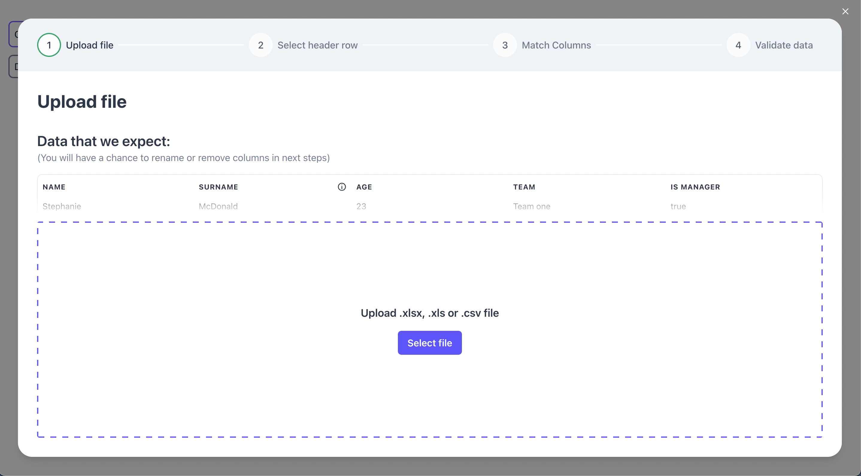
<h1 align="center">RSI react-spreadsheet-import ⚡️</h1>
|
||||
|
||||
<div align="center">
|
||||
|
||||

|
||||
 [](https://www.npmjs.com/package/react-spreadsheet-import)
|
||||
|
||||
</div>
|
||||
<br />
|
||||
|
||||
A component used for importing XLS / XLSX / CSV documents built with [**Chakra UI**](https://chakra-ui.com). Import flow combines:
|
||||
|
||||
- 📥 Uploader
|
||||
- ⚙️ Parser
|
||||
- 📊 File preview
|
||||
- 🧪 UI for column mapping
|
||||
- ✏ UI for validating and editing data
|
||||
|
||||
✨ [**Demo**](https://ugnissoftware.github.io/react-spreadsheet-import/iframe.html?id=react-spreadsheet-import--basic&args=&viewMode=story) ✨
|
||||
<br />
|
||||
|
||||
## Features
|
||||
|
||||
- Custom styles - edit Chakra UI theme to match your project's styles 🎨
|
||||
- Custom validation rules - make sure valid data is being imported, easily spot and correct errors
|
||||
- Hooks - alter raw data after upload or make adjustments on data changes
|
||||
- Auto-mapping columns - automatically map most likely value to your template values, e.g. `name` -> `firstName`
|
||||
<br />
|
||||
|
||||
|
||||
|
||||
## Figma
|
||||
|
||||
We provide full figma designs. You can copy the designs
|
||||
[here](https://www.figma.com/community/file/1080776795891439629)
|
||||
|
||||
## Getting started
|
||||
|
||||
```sh
|
||||
npm i react-spreadsheet-import
|
||||
```
|
||||
|
||||
Using the component: (it's up to you when the flow is open and what you do on submit with the imported data)
|
||||
|
||||
```tsx
|
||||
import { ReactSpreadsheetImport } from "react-spreadsheet-import";
|
||||
|
||||
<ReactSpreadsheetImport isOpen={isOpen} onClose={onClose} onSubmit={onSubmit} fields={fields} />
|
||||
```
|
||||
|
||||
## Required Props
|
||||
|
||||
```tsx
|
||||
// Determines if modal is visible.
|
||||
isOpen: Boolean
|
||||
// Called when flow is closed without reaching submit.
|
||||
onClose: () => void
|
||||
// Called after user completes the flow. Provides data array, where data keys matches your field keys.
|
||||
onSubmit: (data, file) => void | Promise<any>
|
||||
```
|
||||
|
||||
### Fields
|
||||
|
||||
Fields describe what data you are trying to collect.
|
||||
|
||||
```tsx
|
||||
const fields = [
|
||||
{
|
||||
// Visible in table header and when matching columns.
|
||||
label: "Name",
|
||||
// This is the key used for this field when we call onSubmit.
|
||||
key: "name",
|
||||
// Allows for better automatic column matching. Optional.
|
||||
alternateMatches: ["first name", "first"],
|
||||
// Used when editing and validating information.
|
||||
fieldType: {
|
||||
// There are 3 types - "input" / "checkbox" / "select".
|
||||
type: "input",
|
||||
},
|
||||
// Used in the first step to provide an example of what data is expected in this field. Optional.
|
||||
example: "Stephanie",
|
||||
// Can have multiple validations that are visible in Validation Step table.
|
||||
validations: [
|
||||
{
|
||||
// Can be "required" / "unique" / "regex"
|
||||
rule: "required",
|
||||
errorMessage: "Name is required",
|
||||
// There can be "info" / "warning" / "error" levels. Optional. Default "error".
|
||||
level: "error",
|
||||
},
|
||||
],
|
||||
},
|
||||
] as const
|
||||
```
|
||||
|
||||
## Optional Props
|
||||
|
||||
### Hooks
|
||||
|
||||
You can transform and validate data with custom hooks. There are hooks after each step:
|
||||
|
||||
- **uploadStepHook** - runs only once after uploading the file.
|
||||
- **selectHeaderStepHook** - runs only once after selecting the header row in spreadsheet.
|
||||
- **matchColumnsStepHook** - runs only once after column matching. Operations on data that are expensive should be done here.
|
||||
|
||||
The last step - validation step has 2 unique hooks that run only in that step with different performance tradeoffs:
|
||||
|
||||
- **tableHook** - runs at the start and on any change. Runs on all rows. Very expensive, but can change rows that depend on other rows.
|
||||
- **rowHook** - runs at the start and on any row change. Runs only on the rows changed. Fastest, most validations and transformations should be done here.
|
||||
|
||||
Example:
|
||||
|
||||
```tsx
|
||||
<ReactSpreadsheetImport
|
||||
rowHook={(data, addError) => {
|
||||
// Validation
|
||||
if (data.name === "John") {
|
||||
addError("name", { message: "No Johns allowed", level: "info" })
|
||||
}
|
||||
// Transformation
|
||||
return { ...data, name: "Not John" }
|
||||
// Sorry John
|
||||
}}
|
||||
/>
|
||||
```
|
||||
|
||||
### Initial state
|
||||
|
||||
In rare case when you need to skip the beginning of the flow, you can start the flow from any of the steps.
|
||||
|
||||
- **initialStepState** - initial state of component that will be rendered on load.
|
||||
|
||||
```tsx
|
||||
initialStepState?: StepState
|
||||
|
||||
type StepState =
|
||||
| {
|
||||
type: StepType.upload
|
||||
}
|
||||
| {
|
||||
type: StepType.selectSheet
|
||||
workbook: XLSX.WorkBook
|
||||
}
|
||||
| {
|
||||
type: StepType.selectHeader
|
||||
data: RawData[]
|
||||
}
|
||||
| {
|
||||
type: StepType.matchColumns
|
||||
data: RawData[]
|
||||
headerValues: RawData
|
||||
}
|
||||
| {
|
||||
type: StepType.validateData
|
||||
data: any[]
|
||||
}
|
||||
|
||||
type RawData = Array<string | undefined>
|
||||
|
||||
// XLSX.workbook type is native to SheetJS and can be viewed here: https://github.com/SheetJS/sheetjs/blob/83ddb4c1203f6bac052d8c1608b32fead02ea32f/types/index.d.ts#L269
|
||||
```
|
||||
|
||||
Example:
|
||||
|
||||
```tsx
|
||||
import { ReactSpreadsheetImport, StepType } from "react-spreadsheet-import";
|
||||
|
||||
<ReactSpreadsheetImport
|
||||
initialStepState={{
|
||||
type: StepType.matchColumns,
|
||||
data: [
|
||||
["Josh", "2"],
|
||||
["Charlie", "3"],
|
||||
["Lena", "50"],
|
||||
],
|
||||
headerValues: ["name", "age"],
|
||||
}}
|
||||
/>
|
||||
```
|
||||
|
||||
### Dates and time
|
||||
|
||||
Excel stores dates and times as numbers - offsets from an epoch. When reading xlsx files SheetJS provides date formatting helpers.
|
||||
**Default date import format** is `yyyy-mm-dd`. Date parsing with SheetJS sometimes yields unexpected results, therefore thorough date validations are recommended.
|
||||
|
||||
- **dateFormat** - sets SheetJS `dateNF` option. Can be used to format dates when importing sheet data.
|
||||
- **parseRaw** - sets SheetJS `raw` option. If `true`, date formatting will be applied to XLSX date fields only. Default is `true`
|
||||
|
||||
Common date-time formats can be viewed [here](https://docs.sheetjs.com/docs/csf/features/dates/#date-and-time-number-formats).
|
||||
|
||||
### Other optional props
|
||||
|
||||
```tsx
|
||||
// Allows submitting with errors. Default: true
|
||||
allowInvalidSubmit?: boolean
|
||||
// Translations for each text. See customisation bellow
|
||||
translations?: object
|
||||
// Theme configuration passed to underlying Chakra-UI. See customisation bellow
|
||||
customTheme?: object
|
||||
// Specifies maximum number of rows for a single import
|
||||
maxRecords?: number
|
||||
// Maximum upload filesize (in bytes)
|
||||
maxFileSize?: number
|
||||
// Automatically map imported headers to specified fields if possible. Default: true
|
||||
autoMapHeaders?: boolean
|
||||
// When field type is "select", automatically match values if possible. Default: false
|
||||
autoMapSelectValues?: boolean
|
||||
// Headers matching accuracy: 1 for strict and up for more flexible matching. Default: 2
|
||||
autoMapDistance?: number
|
||||
// Enable navigation in stepper component and show back button. Default: false
|
||||
isNavigationEnabled?: boolean
|
||||
```
|
||||
|
||||
## Customisation
|
||||
|
||||
### Customising styles (colors, fonts)
|
||||
|
||||
You can see default theme we use [here](https://github.com/UgnisSoftware/react-spreadsheet-import/blob/master/src/theme.ts). Your override should match this object's structure.
|
||||
|
||||
There are 3 ways you can style the component:
|
||||
|
||||
1.) Change theme colors globally
|
||||
|
||||
```jsx
|
||||
<ReactSpreadsheetImport
|
||||
{...mockRsiValues}
|
||||
isOpen={isOpen}
|
||||
onClose={onClose}
|
||||
onSubmit={setData}
|
||||
customTheme={{
|
||||
colors: {
|
||||
background: 'white',
|
||||
...
|
||||
rsi: {
|
||||
// your brand colors should go here
|
||||
50: '...'
|
||||
...
|
||||
500: 'teal',
|
||||
...
|
||||
900: "...",
|
||||
},
|
||||
},
|
||||
}}
|
||||
/>
|
||||
```
|
||||
|
||||
<img width="1189" alt="Screenshot 2022-04-13 at 10 24 34" src="https://user-images.githubusercontent.com/5903616/163123718-15c05ad8-243b-4a81-8141-c47216047468.png">
|
||||
|
||||
2.) Change all components of the same type, like all Buttons, at the same time
|
||||
|
||||
```jsx
|
||||
<ReactSpreadsheetImport
|
||||
{...mockRsiValues}
|
||||
isOpen={isOpen}
|
||||
onClose={onClose}
|
||||
onSubmit={setData}
|
||||
customTheme={{
|
||||
components: {
|
||||
Button: {
|
||||
baseStyle: {
|
||||
borderRadius: "none",
|
||||
},
|
||||
defaultProps: {
|
||||
colorScheme: "yellow",
|
||||
},
|
||||
},
|
||||
},
|
||||
}}
|
||||
/>
|
||||
```
|
||||
|
||||
<img width="1191" alt="Screenshot 2022-04-13 at 11 04 30" src="https://user-images.githubusercontent.com/5903616/163130213-82f955b4-5081-49e0-8f43-8857d480dacd.png">
|
||||
|
||||
3.) Change components specifically in each Step.
|
||||
```jsx
|
||||
<ReactSpreadsheetImport
|
||||
{...mockRsiValues}
|
||||
isOpen={isOpen}
|
||||
onClose={onClose}
|
||||
onSubmit={setData}
|
||||
customTheme={{
|
||||
components: {
|
||||
UploadStep: {
|
||||
baseStyle: {
|
||||
dropzoneButton: {
|
||||
bg: "red",
|
||||
},
|
||||
},
|
||||
},
|
||||
},
|
||||
}}
|
||||
/>
|
||||
```
|
||||
<img width="1182" alt="Screenshot 2022-04-13 at 10 21 58" src="https://user-images.githubusercontent.com/5903616/163123694-5b79179e-037e-4f9d-b1a9-6078f758bb7e.png">
|
||||
|
||||
Underneath we use Chakra-UI, you can send in a custom theme for us to apply. Read more about themes [here](https://chakra-ui.com/docs/styled-system/theming/theme)
|
||||
|
||||
### Changing text (translations)
|
||||
|
||||
You can change any text in the flow:
|
||||
|
||||
```tsx
|
||||
<ReactSpreadsheetImport
|
||||
translations={{
|
||||
uploadStep: {
|
||||
title: "Upload Employees",
|
||||
},
|
||||
}}
|
||||
/>
|
||||
```
|
||||
|
||||
You can see all the translation keys [here](https://github.com/UgnisSoftware/react-spreadsheet-import/blob/master/src/translationsRSIProps.ts)
|
||||
|
||||
## VS other libraries
|
||||
|
||||
Flatfile vs react-spreadsheet-import and Dromo vs react-spreadsheet-import:
|
||||
|
||||
| | RSI | Flatfile | Dromo |
|
||||
| ------------------------------ | -------------- | ----------- | ----------- |
|
||||
| Licence | MIT | Proprietary | Proprietary |
|
||||
| Price | Free | Paid | Paid |
|
||||
| Support | Github Issues | Enterprise | Enterprise |
|
||||
| Self-host | Yes | Paid | Paid |
|
||||
| Hosted solution | In development | Yes | Yes |
|
||||
| On-prem deployment | N/A | Yes | Yes |
|
||||
| Hooks | Yes | Yes | Yes |
|
||||
| Automatic header matching | Yes | Yes | Yes |
|
||||
| Data validation | Yes | Yes | Yes |
|
||||
| Custom styling | Yes | Yes | Yes |
|
||||
| Translations | Yes | Yes | Yes |
|
||||
| Trademarked words `Data Hooks` | No | Yes | No |
|
||||
|
||||
React-spreadsheet-import can be used as a free and open-source alternative to Flatfile and Dromo.
|
||||
|
||||
## Contributing
|
||||
|
||||
Feel free to open issues if you have any questions or notice bugs. If you want different component behaviour, consider forking the project.
|
||||
|
||||
## Credits
|
||||
|
||||
Created by Ugnis. [Julita Kriauciunaite](https://github.com/JulitorK) and [Karolis Masiulis](https://github.com/masiulis). You can contact us at `info@ugnis.com`
|
||||
+23367
File diff suppressed because it is too large
Load Diff
@@ -0,0 +1,174 @@
|
||||
{
|
||||
"name": "react-spreadsheet-import",
|
||||
"version": "4.7.1",
|
||||
"description": "React spreadsheet import for xlsx and csv files with column matching and validation",
|
||||
"main": "./dist-commonjs/index.js",
|
||||
"module": "./dist/index.js",
|
||||
"types": "./types/index.d.ts",
|
||||
"files": [
|
||||
"dist-commonjs",
|
||||
"dist",
|
||||
"types"
|
||||
],
|
||||
"scripts": {
|
||||
"start": "storybook dev -p 6006",
|
||||
"test:unit": "jest",
|
||||
"test:e2e": "npx playwright test",
|
||||
"test:chromatic": "npx chromatic ",
|
||||
"ts": "tsc",
|
||||
"lint": "eslint \"src/**/*.{ts,tsx}\"",
|
||||
"lint:fix": "eslint \"src/**/*.{ts,tsx}\" --fix",
|
||||
"prebuild": "npm run clean",
|
||||
"build": "rollup -c rollup.config.ts",
|
||||
"build-storybook": "storybook build -o docs-build",
|
||||
"release:patch": "git checkout master && git pull && npm run test:unit && npm run ts && npm run build && npm version patch && git add -A && git push && git push --tags && npm publish",
|
||||
"release:minor": "git checkout master && git pull && npm run test:unit && npm run ts && npm run build && npm version minor && git add -A && git push && git push --tags && npm publish",
|
||||
"release:major": "git checkout master && git pull && npm run test:unit && npm run ts && npm run build && npm version major && git add -A && git push && git push --tags && npm publish",
|
||||
"clean": "rimraf dist dist-commonjs types"
|
||||
},
|
||||
"repository": {
|
||||
"type": "git",
|
||||
"url": "git+https://github.com/UgnisSoftware/react-spreadsheet-import.git"
|
||||
},
|
||||
"keywords": [
|
||||
"React",
|
||||
"spreadsheet",
|
||||
"import",
|
||||
"upload",
|
||||
"csv",
|
||||
"xlsx",
|
||||
"validate",
|
||||
"automatic",
|
||||
"match"
|
||||
],
|
||||
"author": {
|
||||
"name": "Ugnis"
|
||||
},
|
||||
"license": "MIT",
|
||||
"bugs": {
|
||||
"url": "https://github.com/UgnisSoftware/react-spreadsheet-import/issues"
|
||||
},
|
||||
"homepage": "https://github.com/UgnisSoftware/react-spreadsheet-import#readme",
|
||||
"peerDependencies": {
|
||||
"react": ">=18",
|
||||
"react-dom": ">=18"
|
||||
},
|
||||
"dependencies": {
|
||||
"@chakra-ui/react": "^2.8.1",
|
||||
"@emotion/react": "^11.11.1",
|
||||
"@emotion/styled": "^11.11.0",
|
||||
"chakra-react-select": "^4.7.5",
|
||||
"chakra-ui-steps": "2.0.4",
|
||||
"framer-motion": "^10.16.4",
|
||||
"js-levenshtein": "1.1.6",
|
||||
"lodash": "4.17.21",
|
||||
"react-data-grid": "7.0.0-beta.13",
|
||||
"react-dropzone": "14.2.3",
|
||||
"react-icons": "4.11.0",
|
||||
"uuid": "^9.0.1",
|
||||
"xlsx-ugnis": "0.20.3"
|
||||
},
|
||||
"devDependencies": {
|
||||
"@babel/core": "7.23.2",
|
||||
"@babel/preset-env": "7.23.2",
|
||||
"@babel/preset-react": "7.22.15",
|
||||
"@babel/preset-typescript": "7.23.2",
|
||||
"@emotion/jest": "11.11.0",
|
||||
"@jest/types": "27.5.1",
|
||||
"@playwright/test": "^1.39.0",
|
||||
"@storybook/addon-essentials": "7.5.1",
|
||||
"@storybook/addon-interactions": "7.5.1",
|
||||
"@storybook/addon-links": "7.5.1",
|
||||
"@storybook/blocks": "7.5.1",
|
||||
"@storybook/cli": "7.5.1",
|
||||
"@storybook/react": "7.5.1",
|
||||
"@storybook/react-webpack5": "7.5.1",
|
||||
"@storybook/testing-library": "^0.0.14-next.2",
|
||||
"@testing-library/dom": "9.3.0",
|
||||
"@testing-library/jest-dom": "5.16.5",
|
||||
"@testing-library/react": "14.0.0",
|
||||
"@testing-library/user-event": "14.4.3",
|
||||
"@types/jest": "27.4.1",
|
||||
"@types/js-levenshtein": "1.1.1",
|
||||
"@types/node": "^20.8.7",
|
||||
"@types/react": "18.2.6",
|
||||
"@types/react-dom": "18.2.4",
|
||||
"@types/styled-system": "5.1.16",
|
||||
"@types/uuid": "9.0.1",
|
||||
"@typescript-eslint/eslint-plugin": "5.59.7",
|
||||
"@typescript-eslint/parser": "5.59.7",
|
||||
"babel-loader": "9.1.3",
|
||||
"chromatic": "^7.4.0",
|
||||
"eslint": "8.41.0",
|
||||
"eslint-config-prettier": "8.8.0",
|
||||
"eslint-plugin-prettier": "4.2.1",
|
||||
"eslint-plugin-react": "7.32.2",
|
||||
"eslint-plugin-react-hooks": "4.6.0",
|
||||
"jest": "27.5.1",
|
||||
"jest-watch-typeahead": "1.0.0",
|
||||
"lint-staged": "13.2.2",
|
||||
"prettier": "2.8.8",
|
||||
"prop-types": "15.8.1",
|
||||
"react": "18.2.0",
|
||||
"react-dom": "18.2.0",
|
||||
"react-select-event": "5.5.1",
|
||||
"rollup": "2.70.1",
|
||||
"rollup-plugin-typescript2": "0.31.2",
|
||||
"storybook": "7.5.1",
|
||||
"ts-essentials": "9.3.2",
|
||||
"ts-jest": "27.1.4",
|
||||
"ttypescript": "1.5.15",
|
||||
"typescript": "4.9.5",
|
||||
"typescript-transform-paths": "3.4.6"
|
||||
},
|
||||
"overrides": {
|
||||
"semver": "^7.5.3"
|
||||
},
|
||||
"lint-staged": {
|
||||
"*.{ts,tsx}": "eslint",
|
||||
"*.{js,ts,tsx,md,html,css,json}": "prettier --write"
|
||||
},
|
||||
"prettier": {
|
||||
"tabWidth": 2,
|
||||
"trailingComma": "all",
|
||||
"semi": false,
|
||||
"printWidth": 120
|
||||
},
|
||||
"jest": {
|
||||
"preset": "ts-jest",
|
||||
"testEnvironment": "jsdom",
|
||||
"moduleFileExtensions": [
|
||||
"ts",
|
||||
"tsx",
|
||||
"js",
|
||||
"jsx",
|
||||
"mjs"
|
||||
],
|
||||
"transform": {
|
||||
"^.+\\.(ts|tsx)?$": "ts-jest/dist",
|
||||
"^.+\\.mjs$": "ts-jest/dist"
|
||||
},
|
||||
"moduleNameMapper": {
|
||||
"~/(.*)": "<rootDir>/src/$1"
|
||||
},
|
||||
"modulePathIgnorePatterns": [
|
||||
"<rootDir>/e2e/"
|
||||
],
|
||||
"transformIgnorePatterns": [
|
||||
"[/\\\\]node_modules[/\\\\].+\\.(js|jsx|mjs)$"
|
||||
],
|
||||
"setupFiles": [
|
||||
"./src/tests/setup.ts"
|
||||
],
|
||||
"globals": {
|
||||
"ts-jest": {
|
||||
"tsconfig": "tsconfig.json"
|
||||
}
|
||||
},
|
||||
"watchPlugins": [
|
||||
"jest-watch-typeahead/filename",
|
||||
"jest-watch-typeahead/testname"
|
||||
]
|
||||
},
|
||||
"readme": "ERROR: No README data found!"
|
||||
}
|
||||
@@ -0,0 +1,41 @@
|
||||
import merge from "lodash/merge"
|
||||
|
||||
import { Steps } from "./steps/Steps"
|
||||
import { rtlThemeSupport, themeOverrides } from "./theme"
|
||||
import { Providers } from "./components/Providers"
|
||||
import type { RsiProps } from "./types"
|
||||
import { ModalWrapper } from "./components/ModalWrapper"
|
||||
import { translations } from "./translationsRSIProps"
|
||||
|
||||
export const defaultTheme = themeOverrides
|
||||
|
||||
export const defaultRSIProps: Partial<RsiProps<any>> = {
|
||||
autoMapHeaders: true,
|
||||
autoMapSelectValues: false,
|
||||
allowInvalidSubmit: true,
|
||||
autoMapDistance: 2,
|
||||
isNavigationEnabled: false,
|
||||
translations: translations,
|
||||
uploadStepHook: async (value) => value,
|
||||
selectHeaderStepHook: async (headerValues, data) => ({ headerValues, data }),
|
||||
matchColumnsStepHook: async (table) => table,
|
||||
dateFormat: "yyyy-mm-dd", // ISO 8601,
|
||||
parseRaw: true,
|
||||
} as const
|
||||
|
||||
export const ReactSpreadsheetImport = <T extends string>(propsWithoutDefaults: RsiProps<T>) => {
|
||||
const props = merge({}, defaultRSIProps, propsWithoutDefaults)
|
||||
const mergedTranslations =
|
||||
props.translations !== translations ? merge(translations, props.translations) : translations
|
||||
const mergedThemes = props.rtl
|
||||
? merge(defaultTheme, rtlThemeSupport, props.customTheme)
|
||||
: merge(defaultTheme, props.customTheme)
|
||||
|
||||
return (
|
||||
<Providers theme={mergedThemes} rsiValues={{ ...props, translations: mergedTranslations }}>
|
||||
<ModalWrapper isOpen={props.isOpen} onClose={props.onClose}>
|
||||
<Steps />
|
||||
</ModalWrapper>
|
||||
</Providers>
|
||||
)
|
||||
}
|
||||
@@ -0,0 +1,88 @@
|
||||
import type React from "react"
|
||||
import {
|
||||
Dialog,
|
||||
DialogContent,
|
||||
DialogOverlay,
|
||||
DialogPortal,
|
||||
DialogClose,
|
||||
} from "@/components/ui/dialog"
|
||||
import {
|
||||
AlertDialog,
|
||||
AlertDialogAction,
|
||||
AlertDialogCancel,
|
||||
AlertDialogContent,
|
||||
AlertDialogDescription,
|
||||
AlertDialogFooter,
|
||||
AlertDialogHeader,
|
||||
AlertDialogTitle,
|
||||
AlertDialogTrigger,
|
||||
AlertDialogPortal,
|
||||
AlertDialogOverlay,
|
||||
} from "@/components/ui/alert-dialog"
|
||||
import { useRsi } from "../hooks/useRsi"
|
||||
import { useState } from "react"
|
||||
|
||||
type Props = {
|
||||
children: React.ReactNode
|
||||
isOpen: boolean
|
||||
onClose: () => void
|
||||
}
|
||||
|
||||
export const ModalWrapper = ({ children, isOpen, onClose }: Props) => {
|
||||
const { rtl, translations } = useRsi()
|
||||
const [showCloseAlert, setShowCloseAlert] = useState(false)
|
||||
|
||||
return (
|
||||
<>
|
||||
<Dialog open={isOpen} onOpenChange={() => setShowCloseAlert(true)} modal>
|
||||
<DialogPortal>
|
||||
<DialogOverlay className="bg-background/80 backdrop-blur-sm" />
|
||||
<DialogContent
|
||||
onEscapeKeyDown={(e) => {
|
||||
e.preventDefault()
|
||||
setShowCloseAlert(true)
|
||||
}}
|
||||
onPointerDownOutside={(e) => e.preventDefault()}
|
||||
className="fixed left-[50%] top-[50%] translate-x-[-50%] translate-y-[-50%] w-[calc(100%-2rem)] h-[calc(100%-2rem)] max-w-[100vw] max-h-[100vh] flex flex-col overflow-hidden rounded-lg border bg-background p-0 shadow-lg sm:w-[calc(100%-3rem)] sm:h-[calc(100%-3rem)] md:w-[calc(100%-4rem)] md:h-[calc(100%-4rem)]"
|
||||
>
|
||||
<AlertDialog>
|
||||
<AlertDialogTrigger asChild>
|
||||
<DialogClose className="absolute right-4 top-4" onClick={(e) => {
|
||||
e.preventDefault()
|
||||
setShowCloseAlert(true)
|
||||
}} />
|
||||
</AlertDialogTrigger>
|
||||
</AlertDialog>
|
||||
<div dir={rtl ? "rtl" : "ltr"} className="flex-1 overflow-auto">
|
||||
{children}
|
||||
</div>
|
||||
</DialogContent>
|
||||
</DialogPortal>
|
||||
</Dialog>
|
||||
|
||||
<AlertDialog open={showCloseAlert} onOpenChange={setShowCloseAlert}>
|
||||
<AlertDialogPortal>
|
||||
<AlertDialogOverlay className="z-[1400]" />
|
||||
<AlertDialogContent className="z-[1500]">
|
||||
<AlertDialogHeader>
|
||||
<AlertDialogTitle>
|
||||
{translations.alerts.confirmClose.headerTitle}
|
||||
</AlertDialogTitle>
|
||||
<AlertDialogDescription>
|
||||
{translations.alerts.confirmClose.bodyText}
|
||||
</AlertDialogDescription>
|
||||
</AlertDialogHeader>
|
||||
<AlertDialogFooter>
|
||||
<AlertDialogCancel onClick={() => setShowCloseAlert(false)}>
|
||||
{translations.alerts.confirmClose.cancelButtonTitle}
|
||||
</AlertDialogCancel>
|
||||
<AlertDialogAction onClick={onClose}>
|
||||
{translations.alerts.confirmClose.exitButtonTitle}
|
||||
</AlertDialogAction>
|
||||
</AlertDialogFooter>
|
||||
</AlertDialogContent>
|
||||
</AlertDialogPortal>
|
||||
</AlertDialog>
|
||||
</>
|
||||
)
|
||||
}
|
||||
@@ -0,0 +1,33 @@
|
||||
import { ChakraProvider, extendTheme } from "@chakra-ui/react"
|
||||
import { createContext } from "react"
|
||||
import type { RsiProps } from "../types"
|
||||
import type { CustomTheme } from "../theme"
|
||||
|
||||
export const RsiContext = createContext({} as any)
|
||||
|
||||
type ProvidersProps<T extends string> = {
|
||||
children: React.ReactNode
|
||||
theme: CustomTheme
|
||||
rsiValues: RsiProps<T>
|
||||
}
|
||||
|
||||
export const rootId = "chakra-modal-rsi"
|
||||
|
||||
export const Providers = <T extends string>({ children, theme, rsiValues }: ProvidersProps<T>) => {
|
||||
const mergedTheme = extendTheme(theme)
|
||||
|
||||
if (!rsiValues.fields) {
|
||||
throw new Error("Fields must be provided to react-spreadsheet-import")
|
||||
}
|
||||
|
||||
return (
|
||||
<RsiContext.Provider value={rsiValues}>
|
||||
<ChakraProvider>
|
||||
{/* cssVarsRoot used to override RSI defaultTheme but not the rest of chakra defaultTheme */}
|
||||
<ChakraProvider cssVarsRoot={`#${rootId}`} theme={mergedTheme}>
|
||||
{children}
|
||||
</ChakraProvider>
|
||||
</ChakraProvider>
|
||||
</RsiContext.Provider>
|
||||
)
|
||||
}
|
||||
@@ -0,0 +1,23 @@
|
||||
import type { DataGridProps, Column } from "react-data-grid"
|
||||
import DataGrid from "react-data-grid"
|
||||
import { useRsi } from "../hooks/useRsi"
|
||||
|
||||
export type { Column }
|
||||
|
||||
export type Props<TRow> = DataGridProps<TRow> & {
|
||||
rowHeight?: number
|
||||
hiddenHeader?: boolean
|
||||
className?: string
|
||||
style?: React.CSSProperties
|
||||
}
|
||||
|
||||
export const Table = <TRow,>({ className, ...props }: Props<TRow>) => {
|
||||
const { rtl } = useRsi()
|
||||
return (
|
||||
<DataGrid
|
||||
className={"rdg-light " + (className || "")}
|
||||
direction={rtl ? "rtl" : "ltr"}
|
||||
{...props}
|
||||
/>
|
||||
)
|
||||
}
|
||||
@@ -0,0 +1,9 @@
|
||||
import { useContext } from "react"
|
||||
import { RsiContext } from "../components/Providers"
|
||||
import type { RsiProps } from "../types"
|
||||
import type { MarkRequired } from "ts-essentials"
|
||||
import type { defaultRSIProps } from "../ReactSpreadsheetImport"
|
||||
import type { Translations } from "../translationsRSIProps"
|
||||
|
||||
export const useRsi = <T extends string>() =>
|
||||
useContext<MarkRequired<RsiProps<T>, keyof typeof defaultRSIProps> & { translations: Translations }>(RsiContext)
|
||||
@@ -0,0 +1,2 @@
|
||||
export { StepType } from "./steps/UploadFlow"
|
||||
export { ReactSpreadsheetImport } from "./ReactSpreadsheetImport"
|
||||
+232
@@ -0,0 +1,232 @@
|
||||
import { useCallback, useEffect, useMemo, useState } from "react"
|
||||
import { UserTableColumn } from "./components/UserTableColumn"
|
||||
import { useRsi } from "../../hooks/useRsi"
|
||||
import { TemplateColumn } from "./components/TemplateColumn"
|
||||
import { ColumnGrid } from "./components/ColumnGrid"
|
||||
import { setColumn } from "./utils/setColumn"
|
||||
import { setIgnoreColumn } from "./utils/setIgnoreColumn"
|
||||
import { setSubColumn } from "./utils/setSubColumn"
|
||||
import { normalizeTableData } from "./utils/normalizeTableData"
|
||||
import type { Field, RawData } from "../../types"
|
||||
import { getMatchedColumns } from "./utils/getMatchedColumns"
|
||||
import { findUnmatchedRequiredFields } from "./utils/findUnmatchedRequiredFields"
|
||||
import { toast } from "sonner"
|
||||
import {
|
||||
AlertDialog,
|
||||
AlertDialogAction,
|
||||
AlertDialogCancel,
|
||||
AlertDialogContent,
|
||||
AlertDialogDescription,
|
||||
AlertDialogFooter,
|
||||
AlertDialogHeader,
|
||||
AlertDialogTitle,
|
||||
AlertDialogPortal,
|
||||
AlertDialogOverlay,
|
||||
} from "@/components/ui/alert-dialog"
|
||||
|
||||
export type MatchColumnsProps<T extends string> = {
|
||||
data: RawData[]
|
||||
headerValues: RawData
|
||||
onContinue: (data: any[], rawData: RawData[], columns: Columns<T>) => void
|
||||
onBack?: () => void
|
||||
}
|
||||
|
||||
export enum ColumnType {
|
||||
empty,
|
||||
ignored,
|
||||
matched,
|
||||
matchedCheckbox,
|
||||
matchedSelect,
|
||||
matchedSelectOptions,
|
||||
}
|
||||
|
||||
export type MatchedOptions<T> = {
|
||||
entry: string
|
||||
value: T
|
||||
}
|
||||
|
||||
type EmptyColumn = { type: ColumnType.empty; index: number; header: string }
|
||||
type IgnoredColumn = { type: ColumnType.ignored; index: number; header: string }
|
||||
type MatchedColumn<T> = { type: ColumnType.matched; index: number; header: string; value: T }
|
||||
type MatchedSwitchColumn<T> = { type: ColumnType.matchedCheckbox; index: number; header: string; value: T }
|
||||
export type MatchedSelectColumn<T> = {
|
||||
type: ColumnType.matchedSelect
|
||||
index: number
|
||||
header: string
|
||||
value: T
|
||||
matchedOptions: Partial<MatchedOptions<T>>[]
|
||||
}
|
||||
export type MatchedSelectOptionsColumn<T> = {
|
||||
type: ColumnType.matchedSelectOptions
|
||||
index: number
|
||||
header: string
|
||||
value: T
|
||||
matchedOptions: MatchedOptions<T>[]
|
||||
}
|
||||
|
||||
export type Column<T extends string> =
|
||||
| EmptyColumn
|
||||
| IgnoredColumn
|
||||
| MatchedColumn<T>
|
||||
| MatchedSwitchColumn<T>
|
||||
| MatchedSelectColumn<T>
|
||||
| MatchedSelectOptionsColumn<T>
|
||||
|
||||
export type Columns<T extends string> = Column<T>[]
|
||||
|
||||
export const MatchColumnsStep = <T extends string>({
|
||||
data,
|
||||
headerValues,
|
||||
onContinue,
|
||||
onBack,
|
||||
}: MatchColumnsProps<T>) => {
|
||||
const dataExample = data.slice(0, 2)
|
||||
const { fields, autoMapHeaders, autoMapSelectValues, autoMapDistance, translations, allowInvalidSubmit } = useRsi<T>()
|
||||
const [isLoading, setIsLoading] = useState(false)
|
||||
const [columns, setColumns] = useState<Columns<T>>(
|
||||
// Do not remove spread, it indexes empty array elements, otherwise map() skips over them
|
||||
([...headerValues] as string[]).map((value, index) => ({ type: ColumnType.empty, index, header: value ?? "" })),
|
||||
)
|
||||
const [showUnmatchedFieldsAlert, setShowUnmatchedFieldsAlert] = useState(false)
|
||||
|
||||
const onChange = useCallback(
|
||||
(value: T, columnIndex: number) => {
|
||||
const field = fields.find((field: Field<T>) => field.key === value)
|
||||
if (!field) return
|
||||
|
||||
const existingFieldIndex = columns.findIndex((column) => "value" in column && column.value === field.key)
|
||||
|
||||
setColumns(
|
||||
columns.map<Column<T>>((column, index) => {
|
||||
if (columnIndex === index) {
|
||||
// Set the new column value
|
||||
return setColumn(column, field, data, autoMapSelectValues)
|
||||
} else if (index === existingFieldIndex) {
|
||||
// Clear the old column that had this field
|
||||
toast.warning(translations.matchColumnsStep.duplicateColumnWarningTitle, {
|
||||
description: translations.matchColumnsStep.duplicateColumnWarningDescription,
|
||||
})
|
||||
return setColumn(column)
|
||||
} else {
|
||||
// Leave other columns unchanged
|
||||
return column
|
||||
}
|
||||
}),
|
||||
)
|
||||
},
|
||||
[
|
||||
autoMapSelectValues,
|
||||
columns,
|
||||
data,
|
||||
fields,
|
||||
translations.matchColumnsStep.duplicateColumnWarningDescription,
|
||||
translations.matchColumnsStep.duplicateColumnWarningTitle,
|
||||
],
|
||||
)
|
||||
|
||||
const onIgnore = useCallback(
|
||||
(columnIndex: number) => {
|
||||
setColumns(columns.map((column, index) => (columnIndex === index ? setIgnoreColumn<T>(column) : column)))
|
||||
},
|
||||
[columns, setColumns],
|
||||
)
|
||||
|
||||
const onRevertIgnore = useCallback(
|
||||
(columnIndex: number) => {
|
||||
setColumns(columns.map((column, index) => (columnIndex === index ? setColumn(column) : column)))
|
||||
},
|
||||
[columns, setColumns],
|
||||
)
|
||||
|
||||
const onSubChange = useCallback(
|
||||
(value: string, columnIndex: number, entry: string) => {
|
||||
setColumns(
|
||||
columns.map((column, index) =>
|
||||
columnIndex === index && "matchedOptions" in column ? setSubColumn(column, entry, value) : column,
|
||||
),
|
||||
)
|
||||
},
|
||||
[columns, setColumns],
|
||||
)
|
||||
const unmatchedRequiredFields = useMemo(() => findUnmatchedRequiredFields(fields, columns), [fields, columns])
|
||||
|
||||
const handleOnContinue = useCallback(async () => {
|
||||
if (unmatchedRequiredFields.length > 0) {
|
||||
setShowUnmatchedFieldsAlert(true)
|
||||
} else {
|
||||
setIsLoading(true)
|
||||
await onContinue(normalizeTableData(columns, data, fields), data, columns)
|
||||
setIsLoading(false)
|
||||
}
|
||||
}, [unmatchedRequiredFields.length, onContinue, columns, data, fields])
|
||||
|
||||
const handleAlertOnContinue = useCallback(async () => {
|
||||
setShowUnmatchedFieldsAlert(false)
|
||||
setIsLoading(true)
|
||||
await onContinue(normalizeTableData(columns, data, fields), data, columns)
|
||||
setIsLoading(false)
|
||||
}, [onContinue, columns, data, fields])
|
||||
|
||||
useEffect(
|
||||
() => {
|
||||
if (autoMapHeaders) {
|
||||
setColumns(getMatchedColumns(columns, fields, data, autoMapDistance, autoMapSelectValues))
|
||||
}
|
||||
},
|
||||
// eslint-disable-next-line react-hooks/exhaustive-deps
|
||||
[],
|
||||
)
|
||||
|
||||
return (
|
||||
<>
|
||||
<AlertDialog open={showUnmatchedFieldsAlert} onOpenChange={setShowUnmatchedFieldsAlert}>
|
||||
<AlertDialogPortal>
|
||||
<AlertDialogOverlay className="z-[1400]" />
|
||||
<AlertDialogContent className="z-[1500]">
|
||||
<AlertDialogHeader>
|
||||
<AlertDialogTitle>
|
||||
{translations.alerts.unmatchedRequiredFields.headerTitle}
|
||||
</AlertDialogTitle>
|
||||
<div className="space-y-3">
|
||||
<AlertDialogDescription>
|
||||
{translations.alerts.unmatchedRequiredFields.bodyText}
|
||||
</AlertDialogDescription>
|
||||
<p className="text-sm text-muted-foreground">
|
||||
{translations.alerts.unmatchedRequiredFields.listTitle}{" "}
|
||||
<span className="font-bold">
|
||||
{unmatchedRequiredFields.join(", ")}
|
||||
</span>
|
||||
</p>
|
||||
</div>
|
||||
</AlertDialogHeader>
|
||||
<AlertDialogFooter>
|
||||
<AlertDialogCancel>
|
||||
{translations.alerts.unmatchedRequiredFields.cancelButtonTitle}
|
||||
</AlertDialogCancel>
|
||||
{allowInvalidSubmit && (
|
||||
<AlertDialogAction onClick={handleAlertOnContinue}>
|
||||
{translations.alerts.unmatchedRequiredFields.continueButtonTitle}
|
||||
</AlertDialogAction>
|
||||
)}
|
||||
</AlertDialogFooter>
|
||||
</AlertDialogContent>
|
||||
</AlertDialogPortal>
|
||||
</AlertDialog>
|
||||
<ColumnGrid
|
||||
columns={columns}
|
||||
onContinue={handleOnContinue}
|
||||
onBack={onBack}
|
||||
isLoading={isLoading}
|
||||
userColumn={(column) => (
|
||||
<UserTableColumn
|
||||
column={column}
|
||||
onIgnore={onIgnore}
|
||||
onRevertIgnore={onRevertIgnore}
|
||||
entries={dataExample.map((row) => row[column.index])}
|
||||
/>
|
||||
)}
|
||||
templateColumn={(column) => <TemplateColumn column={column} onChange={onChange} onSubChange={onSubChange} />}
|
||||
/>
|
||||
</>
|
||||
)
|
||||
}
|
||||
+112
@@ -0,0 +1,112 @@
|
||||
import type React from "react"
|
||||
import type { Column, Columns } from "../MatchColumnsStep"
|
||||
import { ColumnType } from "../MatchColumnsStep"
|
||||
import { useRsi } from "../../../hooks/useRsi"
|
||||
import { Button } from "@/components/ui/button"
|
||||
import { ScrollArea, ScrollBar } from "@/components/ui/scroll-area"
|
||||
|
||||
type ColumnGridProps<T extends string> = {
|
||||
columns: Columns<T>
|
||||
userColumn: (column: Column<T>) => React.ReactNode
|
||||
templateColumn: (column: Column<T>) => React.ReactNode
|
||||
onContinue: (val: Record<string, string>[]) => void
|
||||
onBack?: () => void
|
||||
isLoading: boolean
|
||||
}
|
||||
|
||||
export const ColumnGrid = <T extends string>({
|
||||
columns,
|
||||
userColumn,
|
||||
templateColumn,
|
||||
onContinue,
|
||||
onBack,
|
||||
isLoading,
|
||||
}: ColumnGridProps<T>) => {
|
||||
const { translations } = useRsi()
|
||||
const normalColumnWidth = 250
|
||||
const ignoredColumnWidth = 48 // 12 units = 3rem = 48px
|
||||
const gap = 16
|
||||
const totalWidth = columns.reduce((acc, col) =>
|
||||
acc + (col.type === ColumnType.ignored ? ignoredColumnWidth : normalColumnWidth) + gap,
|
||||
-gap // Subtract one gap since we need gaps between columns only
|
||||
)
|
||||
|
||||
return (
|
||||
<div className="flex h-[calc(100vh-10rem)] flex-col">
|
||||
<div className="flex-1 overflow-hidden">
|
||||
<div className="px-8 py-6">
|
||||
<div className="mb-8">
|
||||
<h2 className="text-3xl font-semibold text-foreground">
|
||||
{translations.matchColumnsStep.title}
|
||||
</h2>
|
||||
</div>
|
||||
<ScrollArea className="relative">
|
||||
<div className="space-y-8" style={{ width: totalWidth }}>
|
||||
{/* Your table section */}
|
||||
<div>
|
||||
<h3 className="mb-4 text-lg font-medium text-foreground">
|
||||
{translations.matchColumnsStep.userTableTitle}
|
||||
</h3>
|
||||
<div className="relative">
|
||||
<div
|
||||
className="grid auto-cols-fr gap-4"
|
||||
style={{
|
||||
gridTemplateColumns: columns.map(col =>
|
||||
`${col.type === ColumnType.ignored ? ignoredColumnWidth : normalColumnWidth}px`
|
||||
).join(" "),
|
||||
}}
|
||||
>
|
||||
{columns.map((column, index) => (
|
||||
<div key={column.header + index}>
|
||||
{userColumn(column)}
|
||||
</div>
|
||||
))}
|
||||
</div>
|
||||
<div className="pointer-events-none absolute bottom-0 left-0 right-0 h-16 bg-gradient-to-b from-transparent via-background/50 to-background" />
|
||||
</div>
|
||||
</div>
|
||||
|
||||
{/* Will become section */}
|
||||
<div>
|
||||
<h3 className="mb-4 text-lg font-medium text-foreground">
|
||||
{translations.matchColumnsStep.templateTitle}
|
||||
</h3>
|
||||
<div
|
||||
className="grid auto-cols-fr gap-4"
|
||||
style={{
|
||||
gridTemplateColumns: columns.map(col =>
|
||||
`${col.type === ColumnType.ignored ? ignoredColumnWidth : normalColumnWidth}px`
|
||||
).join(" "),
|
||||
}}
|
||||
>
|
||||
{columns.map((column, index) => (
|
||||
<div key={column.header + index}>
|
||||
{templateColumn(column)}
|
||||
</div>
|
||||
))}
|
||||
</div>
|
||||
</div>
|
||||
</div>
|
||||
<ScrollBar orientation="horizontal" />
|
||||
</ScrollArea>
|
||||
</div>
|
||||
</div>
|
||||
<div className="border-t bg-muted px-8 py-4 -mb-1">
|
||||
<div className="flex items-center justify-between">
|
||||
{onBack && (
|
||||
<Button variant="outline" onClick={onBack}>
|
||||
{translations.matchColumnsStep.backButtonTitle}
|
||||
</Button>
|
||||
)}
|
||||
<Button
|
||||
className="ml-auto"
|
||||
disabled={isLoading}
|
||||
onClick={() => onContinue([])}
|
||||
>
|
||||
{translations.matchColumnsStep.nextButtonTitle}
|
||||
</Button>
|
||||
</div>
|
||||
</div>
|
||||
</div>
|
||||
)
|
||||
}
|
||||
+42
@@ -0,0 +1,42 @@
|
||||
import { chakra, useStyleConfig, Flex } from "@chakra-ui/react"
|
||||
import { dataAttr } from "@chakra-ui/utils"
|
||||
import { motion } from "framer-motion"
|
||||
import { CgCheck } from "react-icons/cg"
|
||||
|
||||
const MotionFlex = motion(Flex)
|
||||
|
||||
const animationConfig = {
|
||||
transition: {
|
||||
duration: 0.1,
|
||||
},
|
||||
exit: { scale: 0.5, opacity: 0 },
|
||||
initial: { scale: 0.5, opacity: 0 },
|
||||
animate: { scale: 1, opacity: 1 },
|
||||
}
|
||||
type MatchIconProps = {
|
||||
isChecked: boolean
|
||||
}
|
||||
|
||||
export const MatchIcon = (props: MatchIconProps) => {
|
||||
const style = useStyleConfig("MatchIcon", props)
|
||||
|
||||
return (
|
||||
<chakra.div
|
||||
__css={style}
|
||||
minW={6}
|
||||
minH={6}
|
||||
w={6}
|
||||
h={6}
|
||||
ml="0.875rem"
|
||||
mr={3}
|
||||
data-highlighted={dataAttr(props.isChecked)}
|
||||
data-testid="column-checkmark"
|
||||
>
|
||||
{props.isChecked && (
|
||||
<MotionFlex {...animationConfig}>
|
||||
<CgCheck size="24px" />
|
||||
</MotionFlex>
|
||||
)}
|
||||
</chakra.div>
|
||||
)
|
||||
}
|
||||
+129
@@ -0,0 +1,129 @@
|
||||
import { useRsi } from "../../../hooks/useRsi"
|
||||
import type { Column } from "../MatchColumnsStep"
|
||||
import { ColumnType } from "../MatchColumnsStep"
|
||||
import type { Fields, Field } from "../../../types"
|
||||
import {
|
||||
Card,
|
||||
CardContent,
|
||||
CardHeader,
|
||||
} from "@/components/ui/card"
|
||||
import {
|
||||
Select,
|
||||
SelectContent,
|
||||
SelectItem,
|
||||
SelectTrigger,
|
||||
SelectValue,
|
||||
} from "@/components/ui/select"
|
||||
import {
|
||||
Accordion,
|
||||
AccordionContent,
|
||||
AccordionItem,
|
||||
AccordionTrigger,
|
||||
} from "@/components/ui/accordion"
|
||||
import { Check } from "lucide-react"
|
||||
|
||||
type TemplateColumnProps<T extends string> = {
|
||||
column: Column<T>
|
||||
onChange: (value: T, columnIndex: number) => void
|
||||
onSubChange: (value: string, columnIndex: number, entry: string) => void
|
||||
}
|
||||
const getAccordionTitle = <T extends string>(fields: Fields<T>, column: Column<T>, translations: any) => {
|
||||
const fieldLabel = fields.find((field: Field<T>) => "value" in column && field.key === column.value)!.label
|
||||
return `${translations.matchColumnsStep.matchDropdownTitle} ${fieldLabel} (${
|
||||
"matchedOptions" in column && column.matchedOptions.filter((option) => !option.value).length
|
||||
} ${translations.matchColumnsStep.unmatched})`
|
||||
}
|
||||
|
||||
export const TemplateColumn = <T extends string>({ column, onChange, onSubChange }: TemplateColumnProps<T>) => {
|
||||
const { translations, fields } = useRsi<T>()
|
||||
const isIgnored = column.type === ColumnType.ignored
|
||||
const isChecked =
|
||||
column.type === ColumnType.matched ||
|
||||
column.type === ColumnType.matchedCheckbox ||
|
||||
column.type === ColumnType.matchedSelectOptions
|
||||
const isSelect = "matchedOptions" in column
|
||||
const selectOptions = fields.map(({ label, key }: { label: string; key: string }) => ({ value: key, label }))
|
||||
const selectValue = column.type === ColumnType.empty ? undefined :
|
||||
selectOptions.find(({ value }: { value: string }) => "value" in column && column.value === value)?.value
|
||||
|
||||
if (isIgnored) {
|
||||
return null
|
||||
}
|
||||
|
||||
return (
|
||||
<Card className="h-full">
|
||||
<CardHeader className="flex flex-row items-center justify-between space-x-2 p-4">
|
||||
<div className="flex-1">
|
||||
<Select
|
||||
key={`select-${column.index}-${("value" in column ? column.value : "empty")}`}
|
||||
value={selectValue}
|
||||
onValueChange={(value) => onChange(value as T, column.index)}
|
||||
>
|
||||
<SelectTrigger className="w-full">
|
||||
<SelectValue placeholder={translations.matchColumnsStep.selectPlaceholder} />
|
||||
</SelectTrigger>
|
||||
<SelectContent
|
||||
side="bottom"
|
||||
align="start"
|
||||
className="z-[1500]"
|
||||
>
|
||||
{selectOptions.map((option: { value: string; label: string }) => (
|
||||
<SelectItem key={option.value} value={option.value}>
|
||||
{option.label}
|
||||
</SelectItem>
|
||||
))}
|
||||
</SelectContent>
|
||||
</Select>
|
||||
</div>
|
||||
{isChecked && (
|
||||
<div className="flex h-8 w-8 items-center justify-center rounded-full border border-green-700 bg-green-300 dark:bg-green-900/20">
|
||||
<Check className="h-4 w-4 text-green-700 dark:text-green-500" />
|
||||
</div>
|
||||
)}
|
||||
</CardHeader>
|
||||
{isSelect && (
|
||||
<CardContent className="p-4">
|
||||
<Accordion type="multiple" className="w-full">
|
||||
<AccordionItem value="options" className="border-none">
|
||||
<AccordionTrigger className="py-2 text-sm hover:no-underline">
|
||||
{getAccordionTitle<T>(fields, column, translations)}
|
||||
</AccordionTrigger>
|
||||
<AccordionContent>
|
||||
<div className="space-y-2">
|
||||
{column.matchedOptions.map((option) => (
|
||||
<div key={option.entry} className="space-y-1">
|
||||
<p className="text-sm text-muted-foreground">
|
||||
{option.entry}
|
||||
</p>
|
||||
<Select
|
||||
value={option.value}
|
||||
onValueChange={(value) => onSubChange(value, column.index, option.entry!)}
|
||||
>
|
||||
<SelectTrigger className="w-full">
|
||||
<SelectValue placeholder={translations.matchColumnsStep.subSelectPlaceholder} />
|
||||
</SelectTrigger>
|
||||
<SelectContent
|
||||
side="bottom"
|
||||
align="start"
|
||||
className="z-[1000]"
|
||||
>
|
||||
{fields
|
||||
.find((field: Field<T>) => "value" in column && field.key === column.value)
|
||||
?.fieldType.options.map((option: { value: string; label: string }) => (
|
||||
<SelectItem key={option.value} value={option.value}>
|
||||
{option.label}
|
||||
</SelectItem>
|
||||
))}
|
||||
</SelectContent>
|
||||
</Select>
|
||||
</div>
|
||||
))}
|
||||
</div>
|
||||
</AccordionContent>
|
||||
</AccordionItem>
|
||||
</Accordion>
|
||||
</CardContent>
|
||||
)}
|
||||
</Card>
|
||||
)
|
||||
}
|
||||
+74
@@ -0,0 +1,74 @@
|
||||
import { Button } from "@/components/ui/button"
|
||||
import { Card, CardContent, CardHeader } from "@/components/ui/card"
|
||||
import { X, RotateCcw } from "lucide-react"
|
||||
import type { Column } from "../MatchColumnsStep"
|
||||
import { ColumnType } from "../MatchColumnsStep"
|
||||
import type { RawData } from "../../../types"
|
||||
|
||||
type UserTableColumnProps<T extends string> = {
|
||||
column: Column<T>
|
||||
entries: RawData
|
||||
onIgnore: (index: number) => void
|
||||
onRevertIgnore: (index: number) => void
|
||||
}
|
||||
|
||||
export const UserTableColumn = <T extends string>(props: UserTableColumnProps<T>) => {
|
||||
const {
|
||||
column: { header, index, type },
|
||||
entries,
|
||||
onIgnore,
|
||||
onRevertIgnore,
|
||||
} = props
|
||||
const isIgnored = type === ColumnType.ignored
|
||||
|
||||
if (isIgnored) {
|
||||
return (
|
||||
<Card className="h-full w-12 bg-muted/50">
|
||||
<CardHeader className="flex flex-col items-center space-y-4 p-2">
|
||||
<Button
|
||||
variant="ghost"
|
||||
size="icon"
|
||||
onClick={() => onRevertIgnore(index)}
|
||||
className="h-8 w-8"
|
||||
>
|
||||
<RotateCcw className="h-4 w-4" />
|
||||
</Button>
|
||||
<div
|
||||
className="vertical-text font-medium text-muted-foreground"
|
||||
style={{ writingMode: 'vertical-rl', textOrientation: 'mixed', transform: 'rotate(180deg)' }}
|
||||
>
|
||||
{header}
|
||||
</div>
|
||||
</CardHeader>
|
||||
</Card>
|
||||
)
|
||||
}
|
||||
|
||||
return (
|
||||
<Card className="h-full">
|
||||
<CardHeader className="flex flex-row items-center justify-between space-x-2 p-4">
|
||||
<p className="font-medium">
|
||||
{header}
|
||||
</p>
|
||||
<Button
|
||||
variant="ghost"
|
||||
size="icon"
|
||||
onClick={() => onIgnore(index)}
|
||||
className="h-8 w-8"
|
||||
>
|
||||
<X className="h-4 w-4" />
|
||||
</Button>
|
||||
</CardHeader>
|
||||
<CardContent className="space-y-2 p-4">
|
||||
{entries.map((entry, i) => (
|
||||
<p
|
||||
key={`${entry || ""}-${i}`}
|
||||
className="truncate text-sm text-muted-foreground"
|
||||
>
|
||||
{entry}
|
||||
</p>
|
||||
))}
|
||||
</CardContent>
|
||||
</Card>
|
||||
)
|
||||
}
|
||||
+26
@@ -0,0 +1,26 @@
|
||||
import lavenstein from "js-levenshtein"
|
||||
import type { Fields } from "../../../types"
|
||||
|
||||
type AutoMatchAccumulator<T> = {
|
||||
distance: number
|
||||
value: T
|
||||
}
|
||||
|
||||
export const findMatch = <T extends string>(
|
||||
header: string,
|
||||
fields: Fields<T>,
|
||||
autoMapDistance: number,
|
||||
): T | undefined => {
|
||||
const smallestValue = fields.reduce<AutoMatchAccumulator<T>>((acc, field) => {
|
||||
const distance = Math.min(
|
||||
...[
|
||||
lavenstein(field.key, header),
|
||||
...(field.alternateMatches?.map((alternate) => lavenstein(alternate, header)) || []),
|
||||
],
|
||||
)
|
||||
return distance < acc.distance || acc.distance === undefined
|
||||
? ({ value: field.key, distance } as AutoMatchAccumulator<T>)
|
||||
: acc
|
||||
}, {} as AutoMatchAccumulator<T>)
|
||||
return smallestValue.distance <= autoMapDistance ? smallestValue.value : undefined
|
||||
}
|
||||
+8
@@ -0,0 +1,8 @@
|
||||
import type { Fields } from "../../../types"
|
||||
import type { Columns } from "../MatchColumnsStep"
|
||||
|
||||
export const findUnmatchedRequiredFields = <T extends string>(fields: Fields<T>, columns: Columns<T>) =>
|
||||
fields
|
||||
.filter((field) => field.validations?.some((validation) => validation.rule === "required"))
|
||||
.filter((field) => columns.findIndex((column) => "value" in column && column.value === field.key) === -1)
|
||||
.map((field) => field.label) || []
|
||||
+6
@@ -0,0 +1,6 @@
|
||||
import type { Fields } from "../../../types"
|
||||
|
||||
export const getFieldOptions = <T extends string>(fields: Fields<T>, fieldKey: string) => {
|
||||
const field = fields.find(({ key }) => fieldKey === key)!
|
||||
return field.fieldType.type === "select" ? field.fieldType.options : []
|
||||
}
|
||||
+41
@@ -0,0 +1,41 @@
|
||||
import lavenstein from "js-levenshtein"
|
||||
import { findMatch } from "./findMatch"
|
||||
import type { Field, Fields } from "../../../types"
|
||||
import { setColumn } from "./setColumn"
|
||||
import type { Column, Columns } from "../MatchColumnsStep"
|
||||
import type { MatchColumnsProps } from "../MatchColumnsStep"
|
||||
|
||||
export const getMatchedColumns = <T extends string>(
|
||||
columns: Columns<T>,
|
||||
fields: Fields<T>,
|
||||
data: MatchColumnsProps<T>["data"],
|
||||
autoMapDistance: number,
|
||||
autoMapSelectValues?: boolean,
|
||||
) =>
|
||||
columns.reduce<Column<T>[]>((arr, column) => {
|
||||
const autoMatch = findMatch(column.header, fields, autoMapDistance)
|
||||
if (autoMatch) {
|
||||
const field = fields.find((field) => field.key === autoMatch) as Field<T>
|
||||
const duplicateIndex = arr.findIndex((column) => "value" in column && column.value === field.key)
|
||||
const duplicate = arr[duplicateIndex]
|
||||
if (duplicate && "value" in duplicate) {
|
||||
return lavenstein(duplicate.value, duplicate.header) < lavenstein(autoMatch, column.header)
|
||||
? [
|
||||
...arr.slice(0, duplicateIndex),
|
||||
setColumn(arr[duplicateIndex], field, data, autoMapSelectValues),
|
||||
...arr.slice(duplicateIndex + 1),
|
||||
setColumn(column),
|
||||
]
|
||||
: [
|
||||
...arr.slice(0, duplicateIndex),
|
||||
setColumn(arr[duplicateIndex]),
|
||||
...arr.slice(duplicateIndex + 1),
|
||||
setColumn(column, field, data, autoMapSelectValues),
|
||||
]
|
||||
} else {
|
||||
return [...arr, setColumn(column, field, data, autoMapSelectValues)]
|
||||
}
|
||||
} else {
|
||||
return [...arr, column]
|
||||
}
|
||||
}, [])
|
||||
+13
@@ -0,0 +1,13 @@
|
||||
const booleanWhitelist: Record<string, boolean> = {
|
||||
yes: true,
|
||||
no: false,
|
||||
true: true,
|
||||
false: false,
|
||||
}
|
||||
|
||||
export const normalizeCheckboxValue = (value: string | undefined): boolean => {
|
||||
if (value && value.toLowerCase() in booleanWhitelist) {
|
||||
return booleanWhitelist[value.toLowerCase()]
|
||||
}
|
||||
return false
|
||||
}
|
||||
+42
@@ -0,0 +1,42 @@
|
||||
import type { Columns } from "../MatchColumnsStep"
|
||||
import { ColumnType } from "../MatchColumnsStep"
|
||||
import type { Data, Fields, RawData } from "../../../types"
|
||||
import { normalizeCheckboxValue } from "./normalizeCheckboxValue"
|
||||
|
||||
export const normalizeTableData = <T extends string>(columns: Columns<T>, data: RawData[], fields: Fields<T>) =>
|
||||
data.map((row) =>
|
||||
columns.reduce((acc, column, index) => {
|
||||
const curr = row[index]
|
||||
switch (column.type) {
|
||||
case ColumnType.matchedCheckbox: {
|
||||
const field = fields.find((field) => field.key === column.value)!
|
||||
if ("booleanMatches" in field.fieldType && Object.keys(field.fieldType).length) {
|
||||
const booleanMatchKey = Object.keys(field.fieldType.booleanMatches || []).find(
|
||||
(key) => key.toLowerCase() === curr?.toLowerCase(),
|
||||
)!
|
||||
const booleanMatch = field.fieldType.booleanMatches?.[booleanMatchKey]
|
||||
acc[column.value] = booleanMatchKey ? booleanMatch : normalizeCheckboxValue(curr)
|
||||
} else {
|
||||
acc[column.value] = normalizeCheckboxValue(curr)
|
||||
}
|
||||
return acc
|
||||
}
|
||||
case ColumnType.matched: {
|
||||
acc[column.value] = curr === "" ? undefined : curr
|
||||
return acc
|
||||
}
|
||||
case ColumnType.matchedSelect:
|
||||
case ColumnType.matchedSelectOptions: {
|
||||
const matchedOption = column.matchedOptions.find(({ entry, value }) => entry === curr)
|
||||
acc[column.value] = matchedOption?.value || undefined
|
||||
return acc
|
||||
}
|
||||
case ColumnType.empty:
|
||||
case ColumnType.ignored: {
|
||||
return acc
|
||||
}
|
||||
default:
|
||||
return acc
|
||||
}
|
||||
}, {} as Data<T>),
|
||||
)
|
||||
+38
@@ -0,0 +1,38 @@
|
||||
import type { Field } from "../../../types"
|
||||
import { Column, ColumnType, MatchColumnsProps, MatchedOptions } from "../MatchColumnsStep"
|
||||
import { uniqueEntries } from "./uniqueEntries"
|
||||
|
||||
export const setColumn = <T extends string>(
|
||||
oldColumn: Column<T>,
|
||||
field?: Field<T>,
|
||||
data?: MatchColumnsProps<T>["data"],
|
||||
autoMapSelectValues?: boolean,
|
||||
): Column<T> => {
|
||||
switch (field?.fieldType.type) {
|
||||
case "select":
|
||||
const fieldOptions = field.fieldType.options
|
||||
const uniqueData = uniqueEntries(data || [], oldColumn.index) as MatchedOptions<T>[]
|
||||
const matchedOptions = autoMapSelectValues
|
||||
? uniqueData.map((record) => {
|
||||
const value = fieldOptions.find(
|
||||
(fieldOption) => fieldOption.value === record.entry || fieldOption.label === record.entry,
|
||||
)?.value
|
||||
return value ? ({ ...record, value } as MatchedOptions<T>) : (record as MatchedOptions<T>)
|
||||
})
|
||||
: uniqueData
|
||||
const allMatched = matchedOptions.filter((o) => o.value).length == uniqueData?.length
|
||||
|
||||
return {
|
||||
...oldColumn,
|
||||
type: allMatched ? ColumnType.matchedSelectOptions : ColumnType.matchedSelect,
|
||||
value: field.key,
|
||||
matchedOptions,
|
||||
}
|
||||
case "checkbox":
|
||||
return { index: oldColumn.index, type: ColumnType.matchedCheckbox, value: field.key, header: oldColumn.header }
|
||||
case "input":
|
||||
return { index: oldColumn.index, type: ColumnType.matched, value: field.key, header: oldColumn.header }
|
||||
default:
|
||||
return { index: oldColumn.index, header: oldColumn.header, type: ColumnType.empty }
|
||||
}
|
||||
}
|
||||
+7
@@ -0,0 +1,7 @@
|
||||
import { Column, ColumnType } from "../MatchColumnsStep"
|
||||
|
||||
export const setIgnoreColumn = <T extends string>({ header, index }: Column<T>): Column<T> => ({
|
||||
header,
|
||||
index,
|
||||
type: ColumnType.ignored,
|
||||
})
|
||||
+14
@@ -0,0 +1,14 @@
|
||||
import { ColumnType, MatchedOptions, MatchedSelectColumn, MatchedSelectOptionsColumn } from "../MatchColumnsStep"
|
||||
export const setSubColumn = <T>(
|
||||
oldColumn: MatchedSelectColumn<T> | MatchedSelectOptionsColumn<T>,
|
||||
entry: string,
|
||||
value: string,
|
||||
): MatchedSelectColumn<T> | MatchedSelectOptionsColumn<T> => {
|
||||
const options = oldColumn.matchedOptions.map((option) => (option.entry === entry ? { ...option, value } : option))
|
||||
const allMathced = options.every(({ value }) => !!value)
|
||||
if (allMathced) {
|
||||
return { ...oldColumn, matchedOptions: options as MatchedOptions<T>[], type: ColumnType.matchedSelectOptions }
|
||||
} else {
|
||||
return { ...oldColumn, matchedOptions: options as MatchedOptions<T>[], type: ColumnType.matchedSelect }
|
||||
}
|
||||
}
|
||||
+11
@@ -0,0 +1,11 @@
|
||||
import uniqBy from "lodash/uniqBy"
|
||||
import type { MatchColumnsProps, MatchedOptions } from "../MatchColumnsStep"
|
||||
|
||||
export const uniqueEntries = <T extends string>(
|
||||
data: MatchColumnsProps<T>["data"],
|
||||
index: number,
|
||||
): Partial<MatchedOptions<T>>[] =>
|
||||
uniqBy(
|
||||
data.map((row) => ({ entry: row[index] })),
|
||||
"entry",
|
||||
).filter(({ entry }) => !!entry)
|
||||
+57
@@ -0,0 +1,57 @@
|
||||
import { useCallback, useState } from "react"
|
||||
import { SelectHeaderTable } from "./components/SelectHeaderTable"
|
||||
import { useRsi } from "../../hooks/useRsi"
|
||||
import type { RawData } from "../../types"
|
||||
import { Button } from "@/components/ui/button"
|
||||
|
||||
type SelectHeaderProps = {
|
||||
data: RawData[]
|
||||
onContinue: (headerValues: RawData, data: RawData[]) => Promise<void>
|
||||
onBack?: () => void
|
||||
}
|
||||
|
||||
export const SelectHeaderStep = ({ data, onContinue, onBack }: SelectHeaderProps) => {
|
||||
const { translations } = useRsi()
|
||||
const [selectedRows, setSelectedRows] = useState<ReadonlySet<number>>(new Set([0]))
|
||||
const [isLoading, setIsLoading] = useState(false)
|
||||
|
||||
const handleContinue = useCallback(async () => {
|
||||
const [selectedRowIndex] = selectedRows
|
||||
// We consider data above header to be redundant
|
||||
const trimmedData = data.slice(selectedRowIndex + 1)
|
||||
setIsLoading(true)
|
||||
await onContinue(data[selectedRowIndex], trimmedData)
|
||||
setIsLoading(false)
|
||||
}, [onContinue, data, selectedRows])
|
||||
|
||||
return (
|
||||
<div className="flex flex-col">
|
||||
<div className="px-8 py-6">
|
||||
<h2 className="text-2xl font-semibold text-foreground">
|
||||
{translations.selectHeaderStep.title}
|
||||
</h2>
|
||||
</div>
|
||||
<div className="flex-1 px-8 mb-12 overflow-auto">
|
||||
<SelectHeaderTable
|
||||
data={data}
|
||||
selectedRows={selectedRows}
|
||||
setSelectedRows={setSelectedRows}
|
||||
/>
|
||||
</div>
|
||||
<div className="flex items-center justify-between border-t bg-muted px-8 py-4 mt-2">
|
||||
{onBack && (
|
||||
<Button variant="outline" onClick={onBack}>
|
||||
{translations.selectHeaderStep.backButtonTitle}
|
||||
</Button>
|
||||
)}
|
||||
<Button
|
||||
className="ml-auto"
|
||||
disabled={isLoading}
|
||||
onClick={handleContinue}
|
||||
>
|
||||
{translations.selectHeaderStep.nextButtonTitle}
|
||||
</Button>
|
||||
</div>
|
||||
</div>
|
||||
)
|
||||
}
|
||||
+106
@@ -0,0 +1,106 @@
|
||||
import { useMemo } from "react"
|
||||
import type { RawData } from "../../../types"
|
||||
import {
|
||||
Table,
|
||||
TableBody,
|
||||
TableCell,
|
||||
TableHead,
|
||||
TableHeader,
|
||||
TableRow,
|
||||
} from "@/components/ui/table"
|
||||
import { RadioGroup, RadioGroupItem } from "@/components/ui/radio-group"
|
||||
import { Label } from "@/components/ui/label"
|
||||
import { cn } from "@/lib/utils"
|
||||
|
||||
interface Props {
|
||||
data: RawData[]
|
||||
selectedRows: ReadonlySet<number>
|
||||
setSelectedRows: (rows: ReadonlySet<number>) => void
|
||||
}
|
||||
|
||||
export const SelectHeaderTable = ({ data, selectedRows, setSelectedRows }: Props) => {
|
||||
const columns = useMemo(() => {
|
||||
const longestRowLength = data.reduce((acc, curr) => (acc > curr.length ? acc : curr.length), 0)
|
||||
return Array.from(Array(longestRowLength), (_, index) => ({
|
||||
key: index.toString(),
|
||||
name: `Column ${index + 1}`,
|
||||
}))
|
||||
}, [data])
|
||||
|
||||
if (!data || data.length === 0) {
|
||||
return (
|
||||
<div className="p-4">
|
||||
<p className="text-sm text-muted-foreground">No data available to select headers from.</p>
|
||||
</div>
|
||||
)
|
||||
}
|
||||
|
||||
const selectedRowIndex = Array.from(selectedRows)[0]
|
||||
const gridTemplateColumns = `60px repeat(${columns.length}, minmax(150px, 300px))`
|
||||
|
||||
return (
|
||||
<div className="rounded-md border p-3">
|
||||
<p className="mb-2 p-2 text-sm text-muted-foreground">
|
||||
Select the row that contains your column headers
|
||||
</p>
|
||||
<div className="h-[calc(100vh-27rem)] overflow-auto">
|
||||
<Table className="relative w-full" style={{ tableLayout: 'fixed' }}>
|
||||
<TableHeader>
|
||||
<TableRow className="grid" style={{ gridTemplateColumns }}>
|
||||
<TableHead className="sticky top-0 z-20 bg-background overflow-hidden">
|
||||
<div className="truncate">Select</div>
|
||||
</TableHead>
|
||||
{columns.map((column) => (
|
||||
<TableHead
|
||||
key={column.key}
|
||||
className="sticky top-0 z-20 bg-background overflow-hidden"
|
||||
>
|
||||
<div className="truncate">
|
||||
{column.name}
|
||||
</div>
|
||||
</TableHead>
|
||||
))}
|
||||
</TableRow>
|
||||
</TableHeader>
|
||||
<TableBody>
|
||||
<RadioGroup
|
||||
value={selectedRowIndex?.toString()}
|
||||
onValueChange={(value) => setSelectedRows(new Set([parseInt(value)]))}
|
||||
>
|
||||
{data.map((row, rowIndex) => (
|
||||
<TableRow
|
||||
key={rowIndex}
|
||||
className={cn(
|
||||
"grid",
|
||||
selectedRowIndex === rowIndex && "bg-muted",
|
||||
"group hover:bg-muted/50"
|
||||
)}
|
||||
style={{ gridTemplateColumns }}
|
||||
>
|
||||
<TableCell className="overflow-hidden">
|
||||
<div className="flex items-center">
|
||||
<RadioGroupItem value={rowIndex.toString()} id={`row-${rowIndex}`} />
|
||||
<Label htmlFor={`row-${rowIndex}`} className="sr-only">
|
||||
Select as header row
|
||||
</Label>
|
||||
</div>
|
||||
</TableCell>
|
||||
{columns.map((column, colIndex) => (
|
||||
<TableCell
|
||||
key={`${rowIndex}-${column.key}`}
|
||||
className="overflow-hidden"
|
||||
>
|
||||
<div className="truncate">
|
||||
{row[colIndex] || ""}
|
||||
</div>
|
||||
</TableCell>
|
||||
))}
|
||||
</TableRow>
|
||||
))}
|
||||
</RadioGroup>
|
||||
</TableBody>
|
||||
</Table>
|
||||
</div>
|
||||
</div>
|
||||
)
|
||||
}
|
||||
+68
@@ -0,0 +1,68 @@
|
||||
import DataGrid, { Column, FormatterProps, useRowSelection } from "react-data-grid"
|
||||
import { RadioGroup, RadioGroupItem } from "@/components/ui/radio-group"
|
||||
import { Label } from "@/components/ui/label"
|
||||
import type { RawData } from "../../../types"
|
||||
import { cn } from "@/lib/utils"
|
||||
|
||||
const SELECT_COLUMN_KEY = "select-row"
|
||||
|
||||
function SelectFormatter(props: FormatterProps<unknown>) {
|
||||
const [isRowSelected, onRowSelectionChange] = useRowSelection()
|
||||
|
||||
return (
|
||||
<div className="flex h-full items-center pl-2">
|
||||
<RadioGroup defaultValue={isRowSelected ? "selected" : undefined}>
|
||||
<div className="flex items-center space-x-2">
|
||||
<RadioGroupItem
|
||||
value="selected"
|
||||
id={`row-${props.rowIdx}`}
|
||||
checked={isRowSelected}
|
||||
onClick={(event) => {
|
||||
onRowSelectionChange({
|
||||
row: props.row,
|
||||
checked: !isRowSelected,
|
||||
isShiftClick: (event.nativeEvent as MouseEvent).shiftKey,
|
||||
})
|
||||
}}
|
||||
/>
|
||||
<Label
|
||||
htmlFor={`row-${props.rowIdx}`}
|
||||
className="sr-only"
|
||||
>
|
||||
Select as header row
|
||||
</Label>
|
||||
</div>
|
||||
</RadioGroup>
|
||||
</div>
|
||||
)
|
||||
}
|
||||
|
||||
export const SelectColumn: Column<any, any> = {
|
||||
key: SELECT_COLUMN_KEY,
|
||||
name: "Select Header",
|
||||
width: 100,
|
||||
minWidth: 100,
|
||||
maxWidth: 100,
|
||||
resizable: false,
|
||||
sortable: false,
|
||||
frozen: true,
|
||||
cellClass: "rdg-radio",
|
||||
formatter: SelectFormatter,
|
||||
}
|
||||
|
||||
export const generateSelectionColumns = (data: RawData[]) => {
|
||||
const longestRowLength = data.reduce((acc, curr) => (acc > curr.length ? acc : curr.length), 0)
|
||||
return [
|
||||
SelectColumn,
|
||||
...Array.from(Array(longestRowLength), (_, index) => ({
|
||||
key: index.toString(),
|
||||
name: `Column ${index + 1}`,
|
||||
width: 150,
|
||||
formatter: ({ row }) => (
|
||||
<div className="p-2 overflow-hidden text-ellipsis whitespace-nowrap">
|
||||
{row[index]}
|
||||
</div>
|
||||
),
|
||||
})),
|
||||
]
|
||||
}
|
||||
+77
@@ -0,0 +1,77 @@
|
||||
import { useCallback, useState } from "react"
|
||||
import { useRsi } from "../../hooks/useRsi"
|
||||
import { RadioGroup, RadioGroupItem } from "@/components/ui/radio-group"
|
||||
import { Label } from "@/components/ui/label"
|
||||
import { Button } from "@/components/ui/button"
|
||||
import { ChevronLeft } from "lucide-react"
|
||||
|
||||
type SelectSheetProps = {
|
||||
sheetNames: string[]
|
||||
onContinue: (sheetName: string) => Promise<void>
|
||||
onBack?: () => void
|
||||
}
|
||||
|
||||
export const SelectSheetStep = ({ sheetNames, onContinue, onBack }: SelectSheetProps) => {
|
||||
const [isLoading, setIsLoading] = useState(false)
|
||||
const { translations } = useRsi()
|
||||
const [value, setValue] = useState(sheetNames[0])
|
||||
|
||||
const handleOnContinue = useCallback(
|
||||
async (data: typeof value) => {
|
||||
setIsLoading(true)
|
||||
await onContinue(data)
|
||||
setIsLoading(false)
|
||||
},
|
||||
[onContinue],
|
||||
)
|
||||
|
||||
return (
|
||||
<div className="flex h-[calc(100vh-10rem)] flex-col">
|
||||
<div className="flex-1 overflow-hidden">
|
||||
<div className="px-8 py-6">
|
||||
<div className="mb-8">
|
||||
<h2 className="text-3xl font-semibold text-foreground">
|
||||
{translations.uploadStep.selectSheet.title}
|
||||
</h2>
|
||||
</div>
|
||||
<RadioGroup
|
||||
value={value}
|
||||
onValueChange={setValue}
|
||||
className="space-y-4"
|
||||
>
|
||||
{sheetNames.map((sheetName) => (
|
||||
<div key={sheetName} className="flex items-center space-x-2">
|
||||
<RadioGroupItem value={sheetName} id={sheetName} />
|
||||
<Label
|
||||
htmlFor={sheetName}
|
||||
className="text-base"
|
||||
>
|
||||
{sheetName}
|
||||
</Label>
|
||||
</div>
|
||||
))}
|
||||
</RadioGroup>
|
||||
</div>
|
||||
</div>
|
||||
<div className="flex items-center justify-between border-t px-8 py-4 bg-muted -mb-1">
|
||||
{onBack && (
|
||||
<Button
|
||||
variant="ghost"
|
||||
onClick={onBack}
|
||||
className="gap-2"
|
||||
>
|
||||
<ChevronLeft className="h-4 w-4" />
|
||||
{translations.uploadStep.selectSheet.backButtonTitle}
|
||||
</Button>
|
||||
)}
|
||||
<div className="flex-1" />
|
||||
<Button
|
||||
onClick={() => handleOnContinue(value)}
|
||||
disabled={isLoading}
|
||||
>
|
||||
{translations.uploadStep.selectSheet.nextButtonTitle}
|
||||
</Button>
|
||||
</div>
|
||||
</div>
|
||||
)
|
||||
}
|
||||
@@ -0,0 +1,81 @@
|
||||
import { StepState, StepType, UploadFlow } from "./UploadFlow"
|
||||
import { useRsi } from "../hooks/useRsi"
|
||||
import { useRef, useState } from "react"
|
||||
import { steps, stepTypeToStepIndex, stepIndexToStepType } from "../utils/steps"
|
||||
import { CgCheck } from "react-icons/cg"
|
||||
|
||||
const CheckIcon = ({ color }: { color: string }) => <CgCheck size="24" className={color} />
|
||||
|
||||
export const Steps = () => {
|
||||
const { initialStepState, translations, isNavigationEnabled } = useRsi()
|
||||
const initialStep = stepTypeToStepIndex(initialStepState?.type)
|
||||
const [activeStep, setActiveStep] = useState(initialStep)
|
||||
const [state, setState] = useState<StepState>(initialStepState || { type: StepType.upload })
|
||||
const history = useRef<StepState[]>([])
|
||||
|
||||
const onClickStep = (stepIndex: number) => {
|
||||
const type = stepIndexToStepType(stepIndex)
|
||||
const historyIdx = history.current.findIndex((v) => v.type === type)
|
||||
if (historyIdx === -1) return
|
||||
const nextHistory = history.current.slice(0, historyIdx + 1)
|
||||
history.current = nextHistory
|
||||
setState(nextHistory[nextHistory.length - 1])
|
||||
setActiveStep(stepIndex)
|
||||
}
|
||||
|
||||
const onBack = () => {
|
||||
onClickStep(Math.max(activeStep - 1, 0))
|
||||
}
|
||||
|
||||
const onNext = (v: StepState) => {
|
||||
history.current.push(state)
|
||||
setState(v)
|
||||
v.type !== StepType.selectSheet && setActiveStep(activeStep + 1)
|
||||
}
|
||||
|
||||
return (
|
||||
<>
|
||||
<div className="hidden border-b bg-muted px-4 py-6 md:block">
|
||||
<nav className="mx-auto flex items-center justify-center gap-4 lg:gap-24" aria-label="Steps">
|
||||
{steps.map((key, index) => {
|
||||
const isActive = index === activeStep
|
||||
const isCompleted = index < activeStep
|
||||
return (
|
||||
<div key={key} className="flex items-center">
|
||||
<button
|
||||
className={`group flex items-center ${isNavigationEnabled ? 'cursor-pointer' : 'cursor-default'}`}
|
||||
onClick={isNavigationEnabled ? () => onClickStep(index) : undefined}
|
||||
disabled={!isNavigationEnabled}
|
||||
>
|
||||
<div className={`flex shrink-0 h-10 w-10 items-center justify-center rounded-full border-2 ${
|
||||
isActive
|
||||
? 'border-primary bg-primary text-primary-foreground'
|
||||
: isCompleted
|
||||
? 'border-primary bg-primary text-primary-foreground'
|
||||
: 'border-muted-foreground/20 bg-background'
|
||||
}`}>
|
||||
{isCompleted ? (
|
||||
<CheckIcon color="text-primary-foreground" />
|
||||
) : (
|
||||
<span className={`text-sm font-medium ${
|
||||
isActive ? 'text-primary-foreground' : 'text-muted-foreground'
|
||||
}`}>
|
||||
{index + 1}
|
||||
</span>
|
||||
)}
|
||||
</div>
|
||||
<span className={`ml-2 text-sm font-medium ${
|
||||
isActive ? 'text-foreground' : 'text-muted-foreground'
|
||||
}`}>
|
||||
{translations[key].title}
|
||||
</span>
|
||||
</button>
|
||||
</div>
|
||||
)
|
||||
})}
|
||||
</nav>
|
||||
</div>
|
||||
<UploadFlow state={state} onNext={onNext} onBack={isNavigationEnabled ? onBack : undefined} />
|
||||
</>
|
||||
)
|
||||
}
|
||||
@@ -0,0 +1,168 @@
|
||||
import { useCallback, useState } from "react"
|
||||
import type XLSX from "xlsx"
|
||||
import { UploadStep } from "./UploadStep/UploadStep"
|
||||
import { SelectHeaderStep } from "./SelectHeaderStep/SelectHeaderStep"
|
||||
import { SelectSheetStep } from "./SelectSheetStep/SelectSheetStep"
|
||||
import { mapWorkbook } from "../utils/mapWorkbook"
|
||||
import { ValidationStep } from "./ValidationStep/ValidationStep"
|
||||
import { addErrorsAndRunHooks } from "./ValidationStep/utils/dataMutations"
|
||||
import { MatchColumnsStep } from "./MatchColumnsStep/MatchColumnsStep"
|
||||
import { exceedsMaxRecords } from "../utils/exceedsMaxRecords"
|
||||
import { useRsi } from "../hooks/useRsi"
|
||||
import type { RawData } from "../types"
|
||||
import { Progress } from "@/components/ui/progress"
|
||||
import { useToast } from "@/hooks/use-toast"
|
||||
|
||||
export enum StepType {
|
||||
upload = "upload",
|
||||
selectSheet = "selectSheet",
|
||||
selectHeader = "selectHeader",
|
||||
matchColumns = "matchColumns",
|
||||
validateData = "validateData",
|
||||
}
|
||||
export type StepState =
|
||||
| {
|
||||
type: StepType.upload
|
||||
}
|
||||
| {
|
||||
type: StepType.selectSheet
|
||||
workbook: XLSX.WorkBook
|
||||
}
|
||||
| {
|
||||
type: StepType.selectHeader
|
||||
data: RawData[]
|
||||
}
|
||||
| {
|
||||
type: StepType.matchColumns
|
||||
data: RawData[]
|
||||
headerValues: RawData
|
||||
}
|
||||
| {
|
||||
type: StepType.validateData
|
||||
data: any[]
|
||||
}
|
||||
|
||||
interface Props {
|
||||
state: StepState
|
||||
onNext: (v: StepState) => void
|
||||
onBack?: () => void
|
||||
}
|
||||
|
||||
export const UploadFlow = ({ state, onNext, onBack }: Props) => {
|
||||
const {
|
||||
maxRecords,
|
||||
translations,
|
||||
uploadStepHook,
|
||||
selectHeaderStepHook,
|
||||
matchColumnsStepHook,
|
||||
fields,
|
||||
rowHook,
|
||||
tableHook,
|
||||
} = useRsi()
|
||||
const [uploadedFile, setUploadedFile] = useState<File | null>(null)
|
||||
const { toast } = useToast()
|
||||
const errorToast = useCallback(
|
||||
(description: string) => {
|
||||
toast({
|
||||
variant: "destructive",
|
||||
title: translations.alerts.toast.error,
|
||||
description,
|
||||
})
|
||||
},
|
||||
[toast, translations],
|
||||
)
|
||||
|
||||
switch (state.type) {
|
||||
case StepType.upload:
|
||||
return (
|
||||
<UploadStep
|
||||
onContinue={async (workbook, file) => {
|
||||
setUploadedFile(file)
|
||||
const isSingleSheet = workbook.SheetNames.length === 1
|
||||
if (isSingleSheet) {
|
||||
if (maxRecords && exceedsMaxRecords(workbook.Sheets[workbook.SheetNames[0]], maxRecords)) {
|
||||
errorToast(translations.uploadStep.maxRecordsExceeded(maxRecords.toString()))
|
||||
return
|
||||
}
|
||||
try {
|
||||
const mappedWorkbook = await uploadStepHook(mapWorkbook(workbook))
|
||||
onNext({
|
||||
type: StepType.selectHeader,
|
||||
data: mappedWorkbook,
|
||||
})
|
||||
} catch (e) {
|
||||
errorToast((e as Error).message)
|
||||
}
|
||||
} else {
|
||||
onNext({ type: StepType.selectSheet, workbook })
|
||||
}
|
||||
}}
|
||||
/>
|
||||
)
|
||||
case StepType.selectSheet:
|
||||
return (
|
||||
<SelectSheetStep
|
||||
sheetNames={state.workbook.SheetNames}
|
||||
onContinue={async (sheetName) => {
|
||||
if (maxRecords && exceedsMaxRecords(state.workbook.Sheets[sheetName], maxRecords)) {
|
||||
errorToast(translations.uploadStep.maxRecordsExceeded(maxRecords.toString()))
|
||||
return
|
||||
}
|
||||
try {
|
||||
const mappedWorkbook = await uploadStepHook(mapWorkbook(state.workbook, sheetName))
|
||||
onNext({
|
||||
type: StepType.selectHeader,
|
||||
data: mappedWorkbook,
|
||||
})
|
||||
} catch (e) {
|
||||
errorToast((e as Error).message)
|
||||
}
|
||||
}}
|
||||
onBack={onBack}
|
||||
/>
|
||||
)
|
||||
case StepType.selectHeader:
|
||||
return (
|
||||
<SelectHeaderStep
|
||||
data={state.data}
|
||||
onContinue={async (...args) => {
|
||||
try {
|
||||
const { data, headerValues } = await selectHeaderStepHook(...args)
|
||||
onNext({
|
||||
type: StepType.matchColumns,
|
||||
data,
|
||||
headerValues,
|
||||
})
|
||||
} catch (e) {
|
||||
errorToast((e as Error).message)
|
||||
}
|
||||
}}
|
||||
onBack={onBack}
|
||||
/>
|
||||
)
|
||||
case StepType.matchColumns:
|
||||
return (
|
||||
<MatchColumnsStep
|
||||
data={state.data}
|
||||
headerValues={state.headerValues}
|
||||
onContinue={async (values, rawData, columns) => {
|
||||
try {
|
||||
const data = await matchColumnsStepHook(values, rawData, columns)
|
||||
const dataWithMeta = await addErrorsAndRunHooks(data, fields, rowHook, tableHook)
|
||||
onNext({
|
||||
type: StepType.validateData,
|
||||
data: dataWithMeta,
|
||||
})
|
||||
} catch (e) {
|
||||
errorToast((e as Error).message)
|
||||
}
|
||||
}}
|
||||
onBack={onBack}
|
||||
/>
|
||||
)
|
||||
case StepType.validateData:
|
||||
return <ValidationStep initialData={state.data} file={uploadedFile!} onBack={onBack} />
|
||||
default:
|
||||
return <Progress value={33} className="w-full" />
|
||||
}
|
||||
}
|
||||
@@ -0,0 +1,39 @@
|
||||
import type XLSX from "xlsx"
|
||||
import { useCallback, useState } from "react"
|
||||
import { useRsi } from "../../hooks/useRsi"
|
||||
import { DropZone } from "./components/DropZone"
|
||||
import { ExampleTable } from "./components/ExampleTable"
|
||||
import { FadingOverlay } from "./components/FadingOverlay"
|
||||
|
||||
type UploadProps = {
|
||||
onContinue: (data: XLSX.WorkBook, file: File) => Promise<void>
|
||||
}
|
||||
|
||||
export const UploadStep = ({ onContinue }: UploadProps) => {
|
||||
const [isLoading, setIsLoading] = useState(false)
|
||||
const { translations, fields } = useRsi()
|
||||
|
||||
const handleOnContinue = useCallback(
|
||||
async (data: XLSX.WorkBook, file: File) => {
|
||||
setIsLoading(true)
|
||||
await onContinue(data, file)
|
||||
setIsLoading(false)
|
||||
},
|
||||
[onContinue],
|
||||
)
|
||||
|
||||
return (
|
||||
<div className="p-6">
|
||||
<h2 className="text-2xl font-semibold mb-4">{translations.uploadStep.title}</h2>
|
||||
<p className="text-lg mb-2">{translations.uploadStep.manifestTitle}</p>
|
||||
<p className="text-muted-foreground mb-6">{translations.uploadStep.manifestDescription}</p>
|
||||
<div className="relative mb-0 border-t rounded-lg h-[80px]">
|
||||
<div className="absolute inset-0">
|
||||
<ExampleTable fields={fields} />
|
||||
</div>
|
||||
<FadingOverlay />
|
||||
</div>
|
||||
<DropZone onContinue={handleOnContinue} isLoading={isLoading} />
|
||||
</div>
|
||||
)
|
||||
}
|
||||
+85
@@ -0,0 +1,85 @@
|
||||
import { useDropzone } from "react-dropzone"
|
||||
import * as XLSX from "xlsx"
|
||||
import { useState } from "react"
|
||||
import { useRsi } from "../../../hooks/useRsi"
|
||||
import { readFileAsync } from "../utils/readFilesAsync"
|
||||
import { Button } from "@/components/ui/button"
|
||||
import { useToast } from "@/hooks/use-toast"
|
||||
import { cn } from "@/lib/utils"
|
||||
|
||||
type DropZoneProps = {
|
||||
onContinue: (data: XLSX.WorkBook, file: File) => void
|
||||
isLoading: boolean
|
||||
}
|
||||
|
||||
export const DropZone = ({ onContinue, isLoading }: DropZoneProps) => {
|
||||
const { translations, maxFileSize, dateFormat, parseRaw } = useRsi()
|
||||
const { toast } = useToast()
|
||||
const [loading, setLoading] = useState(false)
|
||||
const { getRootProps, getInputProps, isDragActive, open } = useDropzone({
|
||||
noClick: true,
|
||||
noKeyboard: true,
|
||||
maxFiles: 1,
|
||||
maxSize: maxFileSize,
|
||||
accept: {
|
||||
"application/vnd.ms-excel": [".xls"],
|
||||
"application/vnd.openxmlformats-officedocument.spreadsheetml.sheet": [".xlsx"],
|
||||
"text/csv": [".csv"],
|
||||
},
|
||||
onDropRejected: (fileRejections) => {
|
||||
setLoading(false)
|
||||
fileRejections.forEach((fileRejection) => {
|
||||
toast({
|
||||
variant: "destructive",
|
||||
title: `${fileRejection.file.name} ${translations.uploadStep.dropzone.errorToastDescription}`,
|
||||
description: fileRejection.errors[0].message,
|
||||
})
|
||||
})
|
||||
},
|
||||
onDropAccepted: async ([file]) => {
|
||||
setLoading(true)
|
||||
const arrayBuffer = await readFileAsync(file)
|
||||
const workbook = XLSX.read(arrayBuffer, {
|
||||
cellDates: true,
|
||||
dateNF: dateFormat,
|
||||
raw: parseRaw,
|
||||
dense: true,
|
||||
type: 'array',
|
||||
codepage: 65001, // UTF-8
|
||||
WTF: false // Don't throw on errors
|
||||
})
|
||||
setLoading(false)
|
||||
onContinue(workbook, file)
|
||||
},
|
||||
})
|
||||
|
||||
return (
|
||||
<div
|
||||
{...getRootProps()}
|
||||
className={cn(
|
||||
"flex h-full w-full flex-1 flex-col items-center justify-center rounded-lg border-2 border-dashed border-secondary-foreground/30 bg-muted/90 p-12",
|
||||
isDragActive && "border-primary bg-muted"
|
||||
)}
|
||||
>
|
||||
<input {...getInputProps()} data-testid="rsi-dropzone" />
|
||||
{isDragActive ? (
|
||||
<p className="text-lg text-muted-foreground mb-1 py-6">
|
||||
{translations.uploadStep.dropzone.activeDropzoneTitle}
|
||||
</p>
|
||||
) : loading || isLoading ? (
|
||||
<p className="text-lg text-muted-foreground">
|
||||
{translations.uploadStep.dropzone.loadingTitle}
|
||||
</p>
|
||||
) : (
|
||||
<>
|
||||
<p className="mb-4 text-lg text-muted-foreground">
|
||||
{translations.uploadStep.dropzone.title}
|
||||
</p>
|
||||
<Button onClick={open} variant="default">
|
||||
{translations.uploadStep.dropzone.buttonTitle}
|
||||
</Button>
|
||||
</>
|
||||
)}
|
||||
</div>
|
||||
)
|
||||
}
|
||||
+25
@@ -0,0 +1,25 @@
|
||||
import type { Fields } from "../../../types"
|
||||
import { useMemo } from "react"
|
||||
import { Table } from "../../../components/Table"
|
||||
import { generateColumns } from "./columns"
|
||||
import { generateExampleRow } from "../utils/generateExampleRow"
|
||||
|
||||
interface Props<T extends string> {
|
||||
fields: Fields<T>
|
||||
}
|
||||
|
||||
export const ExampleTable = <T extends string>({ fields }: Props<T>) => {
|
||||
const data = useMemo(() => generateExampleRow(fields), [fields])
|
||||
const columns = useMemo(() => generateColumns(fields), [fields])
|
||||
|
||||
return (
|
||||
<div className="h-full w-full">
|
||||
<Table
|
||||
rows={data}
|
||||
columns={columns}
|
||||
className="rdg-example h-full"
|
||||
style={{ height: '100%' }}
|
||||
/>
|
||||
</div>
|
||||
)
|
||||
}
|
||||
+5
@@ -0,0 +1,5 @@
|
||||
export const FadingOverlay = () => (
|
||||
<div
|
||||
className="absolute inset-x-0 bottom-0 h-12 pointer-events-none bg-gradient-to-t from-background to-transparent"
|
||||
/>
|
||||
)
|
||||
+44
@@ -0,0 +1,44 @@
|
||||
import type { Column } from "react-data-grid"
|
||||
import type { Fields } from "../../../types"
|
||||
import { CgInfo } from "react-icons/cg"
|
||||
import {
|
||||
Tooltip,
|
||||
TooltipContent,
|
||||
TooltipProvider,
|
||||
TooltipTrigger,
|
||||
} from "@/components/ui/tooltip"
|
||||
|
||||
export const generateColumns = <T extends string>(fields: Fields<T>) =>
|
||||
fields.map(
|
||||
(column): Column<any> => ({
|
||||
key: column.key,
|
||||
name: column.label,
|
||||
minWidth: 150,
|
||||
headerRenderer: () => (
|
||||
<div className="flex items-center gap-1 relative">
|
||||
<div className="flex-1 overflow-hidden text-ellipsis">
|
||||
{column.label}
|
||||
</div>
|
||||
{column.description && (
|
||||
<TooltipProvider>
|
||||
<Tooltip>
|
||||
<TooltipTrigger asChild>
|
||||
<div className="flex-none">
|
||||
<CgInfo className="h-4 w-4" />
|
||||
</div>
|
||||
</TooltipTrigger>
|
||||
<TooltipContent>
|
||||
{column.description}
|
||||
</TooltipContent>
|
||||
</Tooltip>
|
||||
</TooltipProvider>
|
||||
)}
|
||||
</div>
|
||||
),
|
||||
formatter: ({ row }) => (
|
||||
<div className="min-w-full min-h-full overflow-hidden text-ellipsis">
|
||||
{row[column.key]}
|
||||
</div>
|
||||
),
|
||||
}),
|
||||
)
|
||||
+14
@@ -0,0 +1,14 @@
|
||||
import type { Field, Fields } from "../../../types"
|
||||
|
||||
const titleMap: Record<Field<string>["fieldType"]["type"], string> = {
|
||||
checkbox: "Boolean",
|
||||
select: "Options",
|
||||
input: "Text",
|
||||
}
|
||||
|
||||
export const generateExampleRow = <T extends string>(fields: Fields<T>) => [
|
||||
fields.reduce((acc, field) => {
|
||||
acc[field.key as T] = field.example || titleMap[field.fieldType.type]
|
||||
return acc
|
||||
}, {} as Record<T, string>),
|
||||
]
|
||||
+9
@@ -0,0 +1,9 @@
|
||||
export const getDropZoneBorder = (color: string) => {
|
||||
return {
|
||||
bgGradient: `repeating-linear(0deg, ${color}, ${color} 10px, transparent 10px, transparent 20px, ${color} 20px), repeating-linear-gradient(90deg, ${color}, ${color} 10px, transparent 10px, transparent 20px, ${color} 20px), repeating-linear-gradient(180deg, ${color}, ${color} 10px, transparent 10px, transparent 20px, ${color} 20px), repeating-linear-gradient(270deg, ${color}, ${color} 10px, transparent 10px, transparent 20px, ${color} 20px)`,
|
||||
backgroundSize: "2px 100%, 100% 2px, 2px 100% , 100% 2px",
|
||||
backgroundPosition: "0 0, 0 0, 100% 0, 0 100%",
|
||||
backgroundRepeat: "no-repeat",
|
||||
borderRadius: "4px",
|
||||
}
|
||||
}
|
||||
+13
@@ -0,0 +1,13 @@
|
||||
export const readFileAsync = (file: File) => {
|
||||
return new Promise((resolve, reject) => {
|
||||
const reader = new FileReader()
|
||||
|
||||
reader.onload = () => {
|
||||
resolve(reader.result)
|
||||
}
|
||||
|
||||
reader.onerror = reject
|
||||
|
||||
reader.readAsArrayBuffer(file)
|
||||
})
|
||||
}
|
||||
+518
@@ -0,0 +1,518 @@
|
||||
import { useCallback, useMemo, useState } from "react"
|
||||
import { useRsi } from "../../hooks/useRsi"
|
||||
import type { Meta } from "./types"
|
||||
import { addErrorsAndRunHooks } from "./utils/dataMutations"
|
||||
import type { Data, Field, SelectOption } from "../../types"
|
||||
import {
|
||||
Table,
|
||||
TableBody,
|
||||
TableCell,
|
||||
TableHead,
|
||||
TableHeader,
|
||||
TableRow,
|
||||
} from "@/components/ui/table"
|
||||
import {
|
||||
useReactTable,
|
||||
getCoreRowModel,
|
||||
type ColumnDef,
|
||||
flexRender,
|
||||
type RowSelectionState,
|
||||
} from "@tanstack/react-table"
|
||||
import { Checkbox } from "@/components/ui/checkbox"
|
||||
import { Input } from "@/components/ui/input"
|
||||
import {
|
||||
AlertDialog,
|
||||
AlertDialogAction,
|
||||
AlertDialogCancel,
|
||||
AlertDialogContent,
|
||||
AlertDialogDescription,
|
||||
AlertDialogFooter,
|
||||
AlertDialogHeader,
|
||||
AlertDialogTitle,
|
||||
AlertDialogPortal,
|
||||
AlertDialogOverlay,
|
||||
} from "@/components/ui/alert-dialog"
|
||||
import { Button } from "@/components/ui/button"
|
||||
import { Switch } from "@/components/ui/switch"
|
||||
import { useToast } from "@/hooks/use-toast"
|
||||
import {
|
||||
Select,
|
||||
SelectContent,
|
||||
SelectItem,
|
||||
SelectTrigger,
|
||||
SelectValue,
|
||||
} from "@/components/ui/select"
|
||||
|
||||
type Props<T extends string> = {
|
||||
initialData: (Data<T> & Meta)[]
|
||||
file: File
|
||||
onBack?: () => void
|
||||
}
|
||||
|
||||
type CellProps = {
|
||||
value: any,
|
||||
onChange: (value: any) => void,
|
||||
error?: { level: string, message: string },
|
||||
field: Field<string>
|
||||
}
|
||||
|
||||
const EditableCell = ({ value, onChange, error, field }: CellProps) => {
|
||||
const [isEditing, setIsEditing] = useState(false)
|
||||
const [inputValue, setInputValue] = useState(value ?? "")
|
||||
|
||||
const getDisplayValue = (value: any, fieldType: Field<string>["fieldType"]) => {
|
||||
if (fieldType.type === "select") {
|
||||
return fieldType.options.find((opt: SelectOption) => opt.value === value)?.label || value
|
||||
}
|
||||
if (fieldType.type === "checkbox") {
|
||||
if (typeof value === "boolean") return value ? "Yes" : "No"
|
||||
return value
|
||||
}
|
||||
return value
|
||||
}
|
||||
|
||||
const isRequiredAndEmpty = field.validations?.some(v => v.rule === "required") && !value
|
||||
|
||||
// Show editing UI for:
|
||||
// 1. Error cells
|
||||
// 2. When actively editing
|
||||
// 3. Required select fields that are empty
|
||||
// 4. Checkbox fields (always show the checkbox)
|
||||
const shouldShowEditUI = error?.level === "error" ||
|
||||
isEditing ||
|
||||
(field.fieldType.type === "select" && isRequiredAndEmpty) ||
|
||||
field.fieldType.type === "checkbox"
|
||||
|
||||
if (shouldShowEditUI) {
|
||||
switch (field.fieldType.type) {
|
||||
case "select":
|
||||
return (
|
||||
<Select
|
||||
defaultOpen={isEditing}
|
||||
value={value as string || ""}
|
||||
onValueChange={(newValue) => {
|
||||
onChange(newValue)
|
||||
setIsEditing(false)
|
||||
}}
|
||||
>
|
||||
<SelectTrigger
|
||||
className={`w-full ${
|
||||
(error?.level === "error" || isRequiredAndEmpty)
|
||||
? "border-destructive text-destructive"
|
||||
: ""
|
||||
}`}
|
||||
>
|
||||
<SelectValue placeholder="Select..." />
|
||||
</SelectTrigger>
|
||||
<SelectContent>
|
||||
{field.fieldType.options.map((option: SelectOption) => (
|
||||
<SelectItem key={option.value} value={option.value}>
|
||||
{option.label}
|
||||
</SelectItem>
|
||||
))}
|
||||
</SelectContent>
|
||||
</Select>
|
||||
)
|
||||
case "checkbox":
|
||||
return (
|
||||
<div className="flex items-center gap-2">
|
||||
<Checkbox
|
||||
checked={Boolean(value)}
|
||||
onCheckedChange={(checked) => {
|
||||
onChange(checked)
|
||||
}}
|
||||
/>
|
||||
</div>
|
||||
)
|
||||
default:
|
||||
return (
|
||||
<Input
|
||||
value={inputValue}
|
||||
onChange={(e) => setInputValue(e.target.value)}
|
||||
onKeyDown={(e) => {
|
||||
if (e.key === "Enter") {
|
||||
onChange(inputValue)
|
||||
if (!error?.level) {
|
||||
setIsEditing(false)
|
||||
}
|
||||
}
|
||||
}}
|
||||
onBlur={() => {
|
||||
onChange(inputValue)
|
||||
if (!error?.level) {
|
||||
setIsEditing(false)
|
||||
}
|
||||
}}
|
||||
className={`w-full bg-transparent ${
|
||||
error?.level === "error"
|
||||
? "border-destructive text-destructive"
|
||||
: ""
|
||||
}`}
|
||||
autoFocus={!error?.level}
|
||||
/>
|
||||
)
|
||||
}
|
||||
}
|
||||
|
||||
// Display mode
|
||||
return (
|
||||
<div
|
||||
onClick={() => {
|
||||
if (field.fieldType.type !== "checkbox") {
|
||||
setIsEditing(true)
|
||||
setInputValue(value ?? "")
|
||||
}
|
||||
}}
|
||||
className={`cursor-text py-2 ${
|
||||
error?.level === "error" ? "text-destructive" : ""
|
||||
}`}
|
||||
>
|
||||
{getDisplayValue(value, field.fieldType)}
|
||||
</div>
|
||||
)
|
||||
}
|
||||
|
||||
export const ValidationStep = <T extends string>({ initialData, file, onBack }: Props<T>) => {
|
||||
const { translations, fields, onClose, onSubmit, rowHook, tableHook, allowInvalidSubmit } = useRsi<T>()
|
||||
const { toast } = useToast()
|
||||
|
||||
const [data, setData] = useState<(Data<T> & Meta)[]>(initialData)
|
||||
const [rowSelection, setRowSelection] = useState<RowSelectionState>({})
|
||||
const [filterByErrors, setFilterByErrors] = useState(false)
|
||||
const [showSubmitAlert, setShowSubmitAlert] = useState(false)
|
||||
const [isSubmitting, setSubmitting] = useState(false)
|
||||
|
||||
// Memoize filtered data to prevent recalculation on every render
|
||||
const filteredData = useMemo(() => {
|
||||
if (!filterByErrors) return data
|
||||
return data.filter(row =>
|
||||
row.__errors && Object.values(row.__errors).some(err => err.level === "error")
|
||||
)
|
||||
}, [data, filterByErrors])
|
||||
|
||||
const updateData = useCallback(
|
||||
async (rows: typeof data, indexes?: number[]) => {
|
||||
// Check if hooks are async - if they are we want to apply changes optimistically for better UX
|
||||
if (rowHook?.constructor.name === "AsyncFunction" || tableHook?.constructor.name === "AsyncFunction") {
|
||||
setData(rows)
|
||||
}
|
||||
addErrorsAndRunHooks<T>(rows, fields, rowHook, tableHook, indexes).then((data) => setData(data))
|
||||
},
|
||||
[rowHook, tableHook, fields],
|
||||
)
|
||||
|
||||
const updateRows = useCallback(
|
||||
(rowIndex: number, columnId: string, value: string) => {
|
||||
const newData = [...data]
|
||||
// Get the actual row from the filtered or unfiltered data
|
||||
const row = filteredData[rowIndex]
|
||||
if (row) {
|
||||
// Find the original index in the full dataset
|
||||
const originalIndex = data.findIndex(r => r.__index === row.__index)
|
||||
const updatedRow = {
|
||||
...row,
|
||||
[columnId]: value,
|
||||
}
|
||||
newData[originalIndex] = updatedRow
|
||||
updateData(newData, [originalIndex])
|
||||
}
|
||||
},
|
||||
[data, filteredData, updateData],
|
||||
)
|
||||
|
||||
const columns = useMemo<ColumnDef<Data<T> & Meta>[]>(() => {
|
||||
const baseColumns: ColumnDef<Data<T> & Meta>[] = [
|
||||
{
|
||||
id: "select",
|
||||
header: ({ table }) => (
|
||||
<Checkbox
|
||||
checked={table.getIsAllPageRowsSelected()}
|
||||
onCheckedChange={(value) => table.toggleAllPageRowsSelected(!!value)}
|
||||
aria-label="Select all"
|
||||
/>
|
||||
),
|
||||
cell: ({ row }) => (
|
||||
<Checkbox
|
||||
checked={row.getIsSelected()}
|
||||
onCheckedChange={(value) => row.toggleSelected(!!value)}
|
||||
aria-label="Select row"
|
||||
/>
|
||||
),
|
||||
enableSorting: false,
|
||||
enableHiding: false,
|
||||
size: 50,
|
||||
},
|
||||
...fields.map((field: Field<T>): ColumnDef<Data<T> & Meta> => ({
|
||||
accessorKey: field.key,
|
||||
header: field.label,
|
||||
cell: ({ row, column }) => {
|
||||
const value = row.getValue(column.id)
|
||||
const error = row.original.__errors?.[column.id]
|
||||
const rowIndex = row.index
|
||||
|
||||
return (
|
||||
<EditableCell
|
||||
value={value}
|
||||
onChange={(newValue) => updateRows(rowIndex, column.id, newValue)}
|
||||
error={error}
|
||||
field={field}
|
||||
/>
|
||||
)
|
||||
},
|
||||
// Use configured width or fallback to sensible defaults
|
||||
size: (field as any).width || (
|
||||
field.fieldType.type === "checkbox" ? 80 :
|
||||
field.fieldType.type === "select" ? 150 :
|
||||
200
|
||||
),
|
||||
})),
|
||||
]
|
||||
return baseColumns
|
||||
}, [fields, updateRows])
|
||||
|
||||
const table = useReactTable({
|
||||
data: filteredData,
|
||||
columns,
|
||||
state: {
|
||||
rowSelection,
|
||||
},
|
||||
enableRowSelection: true,
|
||||
onRowSelectionChange: setRowSelection,
|
||||
getCoreRowModel: getCoreRowModel(),
|
||||
})
|
||||
|
||||
const deleteSelectedRows = () => {
|
||||
if (Object.keys(rowSelection).length) {
|
||||
const selectedRows = Object.keys(rowSelection).map(Number)
|
||||
const newData = data.filter((_, index) => !selectedRows.includes(index))
|
||||
updateData(newData)
|
||||
setRowSelection({})
|
||||
}
|
||||
}
|
||||
|
||||
const normalizeValue = useCallback((value: any, field: Field<T>) => {
|
||||
if (field.fieldType.type === "checkbox") {
|
||||
if (typeof value === "boolean") return value
|
||||
if (typeof value === "string") {
|
||||
const normalizedValue = value.toLowerCase().trim()
|
||||
if (field.fieldType.booleanMatches) {
|
||||
return !!field.fieldType.booleanMatches[normalizedValue]
|
||||
}
|
||||
return ["yes", "true", "1"].includes(normalizedValue)
|
||||
}
|
||||
return false
|
||||
}
|
||||
if (field.fieldType.type === "select") {
|
||||
// Ensure the value matches one of the options
|
||||
if (field.fieldType.options.some(opt => opt.value === value)) {
|
||||
return value
|
||||
}
|
||||
// Try to match by label
|
||||
const matchByLabel = field.fieldType.options.find(
|
||||
opt => opt.label.toLowerCase() === String(value).toLowerCase()
|
||||
)
|
||||
return matchByLabel ? matchByLabel.value : value
|
||||
}
|
||||
return value
|
||||
}, [])
|
||||
|
||||
const submitData = async () => {
|
||||
const calculatedData = data.reduce(
|
||||
(acc, value) => {
|
||||
const { __index, __errors, ...values } = value
|
||||
|
||||
// Normalize values based on field types
|
||||
const normalizedValues = Object.entries(values).reduce((obj, [key, val]) => {
|
||||
const field = fields.find((f: Field<T>) => f.key === key)
|
||||
if (field) {
|
||||
obj[key as keyof Data<T>] = normalizeValue(val, field)
|
||||
} else {
|
||||
obj[key as keyof Data<T>] = val as string | boolean | undefined
|
||||
}
|
||||
return obj
|
||||
}, {} as Data<T>)
|
||||
|
||||
if (__errors) {
|
||||
for (const key in __errors) {
|
||||
if (__errors[key].level === "error") {
|
||||
acc.invalidData.push(normalizedValues)
|
||||
return acc
|
||||
}
|
||||
}
|
||||
}
|
||||
acc.validData.push(normalizedValues)
|
||||
return acc
|
||||
},
|
||||
{ validData: [] as Data<T>[], invalidData: [] as Data<T>[], all: data },
|
||||
)
|
||||
setShowSubmitAlert(false)
|
||||
setSubmitting(true)
|
||||
const response = onSubmit(calculatedData, file)
|
||||
if (response?.then) {
|
||||
response
|
||||
.then(() => {
|
||||
onClose()
|
||||
})
|
||||
.catch((err: Error) => {
|
||||
toast({
|
||||
variant: "destructive",
|
||||
title: translations.alerts.submitError.title,
|
||||
description: err?.message || translations.alerts.submitError.defaultMessage,
|
||||
})
|
||||
})
|
||||
.finally(() => {
|
||||
setSubmitting(false)
|
||||
})
|
||||
} else {
|
||||
onClose()
|
||||
}
|
||||
}
|
||||
const onContinue = () => {
|
||||
const invalidData = data.find((value) => {
|
||||
if (value?.__errors) {
|
||||
return !!Object.values(value.__errors)?.filter((err) => err.level === "error").length
|
||||
}
|
||||
return false
|
||||
})
|
||||
if (!invalidData) {
|
||||
submitData()
|
||||
} else {
|
||||
setShowSubmitAlert(true)
|
||||
}
|
||||
}
|
||||
|
||||
return (
|
||||
<div className="flex h-[calc(100vh-9.5rem)] flex-col">
|
||||
<AlertDialog open={showSubmitAlert} onOpenChange={setShowSubmitAlert}>
|
||||
<AlertDialogPortal>
|
||||
<AlertDialogOverlay className="z-[1400]" />
|
||||
<AlertDialogContent className="z-[1500]">
|
||||
<AlertDialogHeader>
|
||||
<AlertDialogTitle>
|
||||
{translations.alerts.submitIncomplete.headerTitle}
|
||||
</AlertDialogTitle>
|
||||
<AlertDialogDescription>
|
||||
{allowInvalidSubmit
|
||||
? translations.alerts.submitIncomplete.bodyText
|
||||
: translations.alerts.submitIncomplete.bodyTextSubmitForbidden}
|
||||
</AlertDialogDescription>
|
||||
</AlertDialogHeader>
|
||||
<AlertDialogFooter>
|
||||
<AlertDialogCancel>
|
||||
{translations.alerts.submitIncomplete.cancelButtonTitle}
|
||||
</AlertDialogCancel>
|
||||
{allowInvalidSubmit && (
|
||||
<AlertDialogAction onClick={submitData}>
|
||||
{translations.alerts.submitIncomplete.finishButtonTitle}
|
||||
</AlertDialogAction>
|
||||
)}
|
||||
</AlertDialogFooter>
|
||||
</AlertDialogContent>
|
||||
</AlertDialogPortal>
|
||||
</AlertDialog>
|
||||
<div className="flex-1 overflow-hidden">
|
||||
<div className="px-8 py-6">
|
||||
<div className="mb-8 flex flex-wrap items-center justify-between gap-2">
|
||||
<h2 className="text-3xl font-semibold text-foreground">
|
||||
{translations.validationStep.title}
|
||||
</h2>
|
||||
<div className="flex flex-wrap items-center gap-4">
|
||||
<Button
|
||||
variant="outline"
|
||||
size="sm"
|
||||
onClick={deleteSelectedRows}
|
||||
>
|
||||
{translations.validationStep.discardButtonTitle}
|
||||
</Button>
|
||||
<div className="flex items-center gap-2">
|
||||
<Switch
|
||||
checked={filterByErrors}
|
||||
onCheckedChange={setFilterByErrors}
|
||||
id="filter-errors"
|
||||
/>
|
||||
<label htmlFor="filter-errors" className="text-sm text-muted-foreground">
|
||||
{translations.validationStep.filterSwitchTitle}
|
||||
</label>
|
||||
</div>
|
||||
</div>
|
||||
</div>
|
||||
<div className="rounded-md border overflow-hidden">
|
||||
<div className="overflow-x-auto">
|
||||
<Table>
|
||||
<TableHeader>
|
||||
{table.getHeaderGroups().map((headerGroup) => (
|
||||
<TableRow key={headerGroup.id}>
|
||||
{headerGroup.headers.map((header) => (
|
||||
<TableHead
|
||||
key={header.id}
|
||||
style={{
|
||||
width: header.getSize(),
|
||||
minWidth: header.getSize(),
|
||||
}}
|
||||
>
|
||||
{header.isPlaceholder
|
||||
? null
|
||||
: flexRender(
|
||||
header.column.columnDef.header,
|
||||
header.getContext()
|
||||
)}
|
||||
</TableHead>
|
||||
))}
|
||||
</TableRow>
|
||||
))}
|
||||
</TableHeader>
|
||||
<TableBody>
|
||||
{table.getRowModel().rows?.length ? (
|
||||
table.getRowModel().rows.map((row) => (
|
||||
<TableRow
|
||||
key={row.id}
|
||||
data-state={row.getIsSelected() && "selected"}
|
||||
>
|
||||
{row.getVisibleCells().map((cell) => (
|
||||
<TableCell
|
||||
key={cell.id}
|
||||
className="p-2"
|
||||
style={{
|
||||
width: cell.column.getSize(),
|
||||
minWidth: cell.column.getSize(),
|
||||
}}
|
||||
>
|
||||
{flexRender(cell.column.columnDef.cell, cell.getContext())}
|
||||
</TableCell>
|
||||
))}
|
||||
</TableRow>
|
||||
))
|
||||
) : (
|
||||
<TableRow>
|
||||
<TableCell colSpan={columns.length} className="h-24 text-center">
|
||||
{filterByErrors
|
||||
? translations.validationStep.noRowsMessageWhenFiltered
|
||||
: translations.validationStep.noRowsMessage}
|
||||
</TableCell>
|
||||
</TableRow>
|
||||
)}
|
||||
</TableBody>
|
||||
</Table>
|
||||
</div>
|
||||
</div>
|
||||
</div>
|
||||
</div>
|
||||
<div className="border-t bg-muted px-8 py-4 mt-5">
|
||||
<div className="flex items-center justify-between">
|
||||
{onBack && (
|
||||
<Button variant="outline" onClick={onBack}>
|
||||
{translations.validationStep.backButtonTitle}
|
||||
</Button>
|
||||
)}
|
||||
<Button
|
||||
className="ml-auto"
|
||||
disabled={isSubmitting}
|
||||
onClick={onContinue}
|
||||
>
|
||||
{translations.validationStep.nextButtonTitle}
|
||||
</Button>
|
||||
</div>
|
||||
</div>
|
||||
</div>
|
||||
)
|
||||
}
|
||||
+191
@@ -0,0 +1,191 @@
|
||||
import type { Column as RDGColumn, RenderEditCellProps, FormatterProps } from "react-data-grid"
|
||||
import { useRowSelection } from "react-data-grid"
|
||||
import { Checkbox, Input, Switch } from "@chakra-ui/react"
|
||||
import type { Data, Fields, Field, SelectOption } from "../../../types"
|
||||
import type { ChangeEvent } from "react"
|
||||
import type { Meta } from "../types"
|
||||
import { CgInfo } from "react-icons/cg"
|
||||
import {
|
||||
Select,
|
||||
SelectContent,
|
||||
SelectItem,
|
||||
SelectTrigger,
|
||||
SelectValue,
|
||||
} from "@/components/ui/select"
|
||||
|
||||
const SELECT_COLUMN_KEY = "select-row"
|
||||
|
||||
function autoFocusAndSelect(input: HTMLInputElement | null) {
|
||||
input?.focus()
|
||||
input?.select()
|
||||
}
|
||||
|
||||
type RowType<T extends string> = Data<T> & Meta
|
||||
|
||||
export const generateColumns = <T extends string>(fields: Fields<T>): RDGColumn<RowType<T>>[] => [
|
||||
{
|
||||
key: SELECT_COLUMN_KEY,
|
||||
name: "",
|
||||
width: 35,
|
||||
minWidth: 35,
|
||||
maxWidth: 35,
|
||||
resizable: false,
|
||||
sortable: false,
|
||||
frozen: true,
|
||||
cellClass: "rdg-checkbox",
|
||||
formatter: (props: FormatterProps<RowType<T>>) => {
|
||||
// eslint-disable-next-line react-hooks/rules-of-hooks
|
||||
const [isRowSelected, onRowSelectionChange] = useRowSelection()
|
||||
return (
|
||||
<Checkbox
|
||||
bg="white"
|
||||
aria-label="Select"
|
||||
isChecked={isRowSelected}
|
||||
onChange={(event) => {
|
||||
onRowSelectionChange({
|
||||
row: props.row,
|
||||
checked: Boolean(event.target.checked),
|
||||
isShiftClick: (event.nativeEvent as MouseEvent).shiftKey,
|
||||
})
|
||||
}}
|
||||
/>
|
||||
)
|
||||
},
|
||||
},
|
||||
...fields.map(
|
||||
(column: Field<T>): RDGColumn<RowType<T>> => ({
|
||||
key: column.key,
|
||||
name: column.label,
|
||||
minWidth: 150,
|
||||
resizable: true,
|
||||
headerRenderer: () => (
|
||||
<div className="flex gap-1 items-center relative">
|
||||
<div className="flex-1 overflow-hidden text-ellipsis">
|
||||
{column.label}
|
||||
</div>
|
||||
{column.description && (
|
||||
<div className="flex-none">
|
||||
<CgInfo className="h-4 w-4" />
|
||||
</div>
|
||||
)}
|
||||
</div>
|
||||
),
|
||||
editable: column.fieldType.type !== "checkbox",
|
||||
editor: ({ row, onRowChange, onClose }: RenderEditCellProps<RowType<T>>) => {
|
||||
let component
|
||||
|
||||
switch (column.fieldType.type) {
|
||||
case "select":
|
||||
component = (
|
||||
<Select
|
||||
defaultOpen
|
||||
value={row[column.key] as string}
|
||||
onValueChange={(value) => {
|
||||
onRowChange({ ...row, [column.key]: value }, true)
|
||||
}}
|
||||
>
|
||||
<SelectTrigger className="w-full border-0 focus:ring-0">
|
||||
<SelectValue />
|
||||
</SelectTrigger>
|
||||
<SelectContent
|
||||
position="popper"
|
||||
className="z-[1000]"
|
||||
align="start"
|
||||
side="bottom"
|
||||
>
|
||||
{column.fieldType.options.map((option: SelectOption) => (
|
||||
<SelectItem key={option.value} value={option.value}>
|
||||
{option.label}
|
||||
</SelectItem>
|
||||
))}
|
||||
</SelectContent>
|
||||
</Select>
|
||||
)
|
||||
break
|
||||
default:
|
||||
component = (
|
||||
<div className="pl-2">
|
||||
<Input
|
||||
ref={autoFocusAndSelect}
|
||||
variant="unstyled"
|
||||
autoFocus
|
||||
size="small"
|
||||
value={row[column.key] as string}
|
||||
onChange={(event: ChangeEvent<HTMLInputElement>) => {
|
||||
onRowChange({ ...row, [column.key]: event.target.value })
|
||||
}}
|
||||
onBlur={() => onClose(true)}
|
||||
/>
|
||||
</div>
|
||||
)
|
||||
}
|
||||
|
||||
return component
|
||||
},
|
||||
editorOptions: {
|
||||
editOnClick: true,
|
||||
},
|
||||
formatter: ({ row, onRowChange }: FormatterProps<RowType<T>>) => {
|
||||
let component
|
||||
|
||||
switch (column.fieldType.type) {
|
||||
case "checkbox":
|
||||
component = (
|
||||
<div
|
||||
className="flex items-center h-full"
|
||||
onClick={(event) => {
|
||||
event.stopPropagation()
|
||||
}}
|
||||
>
|
||||
<Switch
|
||||
isChecked={row[column.key] as boolean}
|
||||
onChange={() => {
|
||||
onRowChange({ ...row, [column.key]: !row[column.key as T] })
|
||||
}}
|
||||
/>
|
||||
</div>
|
||||
)
|
||||
break
|
||||
case "select":
|
||||
component = (
|
||||
<div className="min-w-full min-h-full overflow-hidden text-ellipsis">
|
||||
{column.fieldType.options.find((option: SelectOption) => option.value === row[column.key as T])?.label || null}
|
||||
</div>
|
||||
)
|
||||
break
|
||||
default:
|
||||
component = (
|
||||
<div className="min-w-full min-h-full overflow-hidden text-ellipsis">
|
||||
{row[column.key as T]}
|
||||
</div>
|
||||
)
|
||||
}
|
||||
|
||||
if (row.__errors?.[column.key]) {
|
||||
return (
|
||||
<div className="relative group">
|
||||
{component}
|
||||
<div className="absolute left-0 -top-8 z-50 hidden group-hover:block bg-popover text-popover-foreground text-sm p-2 rounded shadow">
|
||||
{row.__errors?.[column.key]?.message}
|
||||
</div>
|
||||
</div>
|
||||
)
|
||||
}
|
||||
|
||||
return component
|
||||
},
|
||||
cellClass: (row: Meta) => {
|
||||
switch (row.__errors?.[column.key]?.level) {
|
||||
case "error":
|
||||
return "rdg-cell-error"
|
||||
case "warning":
|
||||
return "rdg-cell-warning"
|
||||
case "info":
|
||||
return "rdg-cell-info"
|
||||
default:
|
||||
return ""
|
||||
}
|
||||
},
|
||||
}),
|
||||
),
|
||||
]
|
||||
@@ -0,0 +1,5 @@
|
||||
import { InfoWithSource } from "../../types"
|
||||
|
||||
export type Meta = { __index: string; __errors?: Error | null }
|
||||
export type Error = { [key: string]: InfoWithSource }
|
||||
export type Errors = { [id: string]: Error }
|
||||
+151
@@ -0,0 +1,151 @@
|
||||
import type { Data, Fields, Info, RowHook, TableHook } from "../../../types"
|
||||
import type { Meta, Error, Errors } from "../types"
|
||||
import { v4 } from "uuid"
|
||||
import { ErrorSources } from "../../../types"
|
||||
|
||||
export const addErrorsAndRunHooks = async <T extends string>(
|
||||
data: (Data<T> & Partial<Meta>)[],
|
||||
fields: Fields<T>,
|
||||
rowHook?: RowHook<T>,
|
||||
tableHook?: TableHook<T>,
|
||||
changedRowIndexes?: number[],
|
||||
): Promise<(Data<T> & Meta)[]> => {
|
||||
const errors: Errors = {}
|
||||
|
||||
const addError = (source: ErrorSources, rowIndex: number, fieldKey: T, error: Info) => {
|
||||
errors[rowIndex] = {
|
||||
...errors[rowIndex],
|
||||
[fieldKey]: { ...error, source },
|
||||
}
|
||||
}
|
||||
|
||||
if (tableHook) {
|
||||
data = await tableHook(data, (...props) => addError(ErrorSources.Table, ...props))
|
||||
}
|
||||
|
||||
if (rowHook) {
|
||||
if (changedRowIndexes) {
|
||||
for (const index of changedRowIndexes) {
|
||||
data[index] = await rowHook(data[index], (...props) => addError(ErrorSources.Row, index, ...props), data)
|
||||
}
|
||||
} else {
|
||||
data = await Promise.all(
|
||||
data.map(async (value, index) =>
|
||||
rowHook(value, (...props) => addError(ErrorSources.Row, index, ...props), data),
|
||||
),
|
||||
)
|
||||
}
|
||||
}
|
||||
|
||||
fields.forEach((field) => {
|
||||
field.validations?.forEach((validation) => {
|
||||
switch (validation.rule) {
|
||||
case "unique": {
|
||||
const values = data.map((entry) => entry[field.key as T])
|
||||
|
||||
const taken = new Set() // Set of items used at least once
|
||||
const duplicates = new Set() // Set of items used multiple times
|
||||
|
||||
values.forEach((value) => {
|
||||
if (validation.allowEmpty && !value) {
|
||||
// If allowEmpty is set, we will not validate falsy fields such as undefined or empty string.
|
||||
return
|
||||
}
|
||||
|
||||
if (taken.has(value)) {
|
||||
duplicates.add(value)
|
||||
} else {
|
||||
taken.add(value)
|
||||
}
|
||||
})
|
||||
|
||||
values.forEach((value, index) => {
|
||||
if (duplicates.has(value)) {
|
||||
addError(ErrorSources.Table, index, field.key as T, {
|
||||
level: validation.level || "error",
|
||||
message: validation.errorMessage || "Field must be unique",
|
||||
})
|
||||
}
|
||||
})
|
||||
break
|
||||
}
|
||||
case "required": {
|
||||
const dataToValidate = changedRowIndexes ? changedRowIndexes.map((index) => data[index]) : data
|
||||
dataToValidate.forEach((entry, index) => {
|
||||
const realIndex = changedRowIndexes ? changedRowIndexes[index] : index
|
||||
if (entry[field.key as T] === null || entry[field.key as T] === undefined || entry[field.key as T] === "") {
|
||||
addError(ErrorSources.Row, realIndex, field.key as T, {
|
||||
level: validation.level || "error",
|
||||
message: validation.errorMessage || "Field is required",
|
||||
})
|
||||
}
|
||||
})
|
||||
|
||||
break
|
||||
}
|
||||
case "regex": {
|
||||
const dataToValidate = changedRowIndexes ? changedRowIndexes.map((index) => data[index]) : data
|
||||
const regex = new RegExp(validation.value, validation.flags)
|
||||
dataToValidate.forEach((entry, index) => {
|
||||
const realIndex = changedRowIndexes ? changedRowIndexes[index] : index
|
||||
const value = entry[field.key]?.toString() ?? ""
|
||||
if (!value.match(regex)) {
|
||||
addError(ErrorSources.Row, realIndex, field.key as T, {
|
||||
level: validation.level || "error",
|
||||
message:
|
||||
validation.errorMessage || `Field did not match the regex /${validation.value}/${validation.flags} `,
|
||||
})
|
||||
}
|
||||
})
|
||||
|
||||
break
|
||||
}
|
||||
}
|
||||
})
|
||||
})
|
||||
|
||||
return data.map((value, index) => {
|
||||
// This is required only for table. Mutates to prevent needless rerenders
|
||||
if (!("__index" in value)) {
|
||||
value.__index = v4()
|
||||
}
|
||||
const newValue = value as Data<T> & Meta
|
||||
|
||||
// If we are validating all indexes, or we did full validation on this row - apply all errors
|
||||
if (!changedRowIndexes || changedRowIndexes.includes(index)) {
|
||||
if (errors[index]) {
|
||||
return { ...newValue, __errors: errors[index] }
|
||||
}
|
||||
|
||||
if (!errors[index] && value?.__errors) {
|
||||
return { ...newValue, __errors: null }
|
||||
}
|
||||
}
|
||||
// if we have not validated this row, keep it's row errors but apply global error changes
|
||||
else {
|
||||
// at this point errors[index] contains only table source errors, previous row and table errors are in value.__errors
|
||||
const hasRowErrors =
|
||||
value.__errors && Object.values(value.__errors).some((error) => error.source === ErrorSources.Row)
|
||||
|
||||
if (!hasRowErrors) {
|
||||
if (errors[index]) {
|
||||
return { ...newValue, __errors: errors[index] }
|
||||
}
|
||||
return newValue
|
||||
}
|
||||
|
||||
const errorsWithoutTableError = Object.entries(value.__errors!).reduce((acc, [key, value]) => {
|
||||
if (value.source === ErrorSources.Row) {
|
||||
acc[key] = value
|
||||
}
|
||||
return acc
|
||||
}, {} as Error)
|
||||
|
||||
const newErrors = { ...errorsWithoutTableError, ...errors[index] }
|
||||
|
||||
return { ...newValue, __errors: newErrors }
|
||||
}
|
||||
|
||||
return newValue
|
||||
})
|
||||
}
|
||||
@@ -0,0 +1,509 @@
|
||||
import { StepsTheme } from "chakra-ui-steps"
|
||||
import type { CSSObject } from "@chakra-ui/react"
|
||||
import type { DeepPartial } from "ts-essentials"
|
||||
import type { ChakraStylesConfig } from "chakra-react-select"
|
||||
import type { SelectOption } from "./types"
|
||||
|
||||
const StepsComponent: typeof StepsTheme = {
|
||||
...StepsTheme,
|
||||
baseStyle: (props: any) => {
|
||||
const navigationEnabled = !!props.onClickStep
|
||||
return {
|
||||
...StepsTheme.baseStyle(props),
|
||||
stepContainer: {
|
||||
...StepsTheme.baseStyle(props).stepContainer,
|
||||
cursor: navigationEnabled ? "pointer" : "initial",
|
||||
},
|
||||
label: {
|
||||
...StepsTheme.baseStyle(props).label,
|
||||
color: "textColor",
|
||||
},
|
||||
}
|
||||
},
|
||||
variants: {
|
||||
circles: (props: any) => ({
|
||||
...StepsTheme.variants.circles(props),
|
||||
step: {
|
||||
...StepsTheme.variants.circles(props).step,
|
||||
"&:not(:last-child):after": {
|
||||
...StepsTheme.variants.circles(props).step["&:not(:last-child):after"],
|
||||
backgroundColor: "background",
|
||||
},
|
||||
},
|
||||
stepIconContainer: {
|
||||
...StepsTheme.variants.circles(props).stepIconContainer,
|
||||
flex: "0 0 auto",
|
||||
bg: "background",
|
||||
borderColor: "background",
|
||||
},
|
||||
}),
|
||||
},
|
||||
}
|
||||
|
||||
const MatchIconTheme: any = {
|
||||
baseStyle: (props: any) => {
|
||||
return {
|
||||
display: "flex",
|
||||
alignItems: "center",
|
||||
justifyContent: "center",
|
||||
borderRadius: "50%",
|
||||
borderWidth: "2px",
|
||||
bg: "background",
|
||||
borderColor: "yellow.500",
|
||||
color: "background",
|
||||
transitionDuration: "ultra-fast",
|
||||
_highlighted: {
|
||||
bg: "green.500",
|
||||
borderColor: "green.500",
|
||||
},
|
||||
}
|
||||
},
|
||||
defaultProps: {
|
||||
size: "md",
|
||||
colorScheme: "green",
|
||||
},
|
||||
}
|
||||
|
||||
export const themeOverrides = {
|
||||
colors: {
|
||||
textColor: "#2D3748",
|
||||
subtitleColor: "#718096",
|
||||
inactiveColor: "#A0AEC0",
|
||||
border: "#E2E8F0",
|
||||
background: "white",
|
||||
backgroundAlpha: "rgba(255,255,255,0)",
|
||||
secondaryBackground: "#EDF2F7",
|
||||
highlight: "#E2E8F0",
|
||||
rsi: {
|
||||
50: "#E6E6FF",
|
||||
100: "#C4C6FF",
|
||||
200: "#A2A5FC",
|
||||
300: "#8888FC",
|
||||
400: "#7069FA",
|
||||
500: "#5D55FA",
|
||||
600: "#4D3DF7",
|
||||
700: "#3525E6",
|
||||
800: "#1D0EBE",
|
||||
900: "#0C008C",
|
||||
},
|
||||
},
|
||||
shadows: {
|
||||
outline: 0,
|
||||
},
|
||||
components: {
|
||||
UploadStep: {
|
||||
baseStyle: {
|
||||
heading: {
|
||||
fontSize: "3xl",
|
||||
color: "textColor",
|
||||
mb: "2rem",
|
||||
},
|
||||
title: {
|
||||
fontSize: "2xl",
|
||||
lineHeight: 8,
|
||||
fontWeight: "semibold",
|
||||
color: "textColor",
|
||||
},
|
||||
subtitle: {
|
||||
fontSize: "md",
|
||||
lineHeight: 6,
|
||||
color: "subtitleColor",
|
||||
mb: "1rem",
|
||||
},
|
||||
tableWrapper: {
|
||||
mb: "0.5rem",
|
||||
position: "relative",
|
||||
h: "72px",
|
||||
},
|
||||
dropzoneText: {
|
||||
size: "lg",
|
||||
lineHeight: 7,
|
||||
fontWeight: "semibold",
|
||||
color: "textColor",
|
||||
},
|
||||
dropZoneBorder: "rsi.500",
|
||||
dropzoneButton: {
|
||||
mt: "1rem",
|
||||
},
|
||||
},
|
||||
},
|
||||
SelectSheetStep: {
|
||||
baseStyle: {
|
||||
heading: {
|
||||
color: "textColor",
|
||||
mb: 8,
|
||||
fontSize: "3xl",
|
||||
},
|
||||
radio: {},
|
||||
radioLabel: {
|
||||
color: "textColor",
|
||||
},
|
||||
},
|
||||
},
|
||||
SelectHeaderStep: {
|
||||
baseStyle: {
|
||||
heading: {
|
||||
color: "textColor",
|
||||
mb: 8,
|
||||
fontSize: "3xl",
|
||||
},
|
||||
},
|
||||
},
|
||||
MatchColumnsStep: {
|
||||
baseStyle: {
|
||||
heading: {
|
||||
color: "textColor",
|
||||
mb: 8,
|
||||
fontSize: "3xl",
|
||||
},
|
||||
title: {
|
||||
color: "textColor",
|
||||
fontSize: "2xl",
|
||||
lineHeight: 8,
|
||||
fontWeight: "semibold",
|
||||
mb: 4,
|
||||
},
|
||||
userTable: {
|
||||
header: {
|
||||
fontSize: "xs",
|
||||
lineHeight: 4,
|
||||
fontWeight: "bold",
|
||||
letterSpacing: "wider",
|
||||
color: "textColor",
|
||||
overflow: "hidden",
|
||||
whiteSpace: "nowrap",
|
||||
textOverflow: "ellipsis",
|
||||
["&[data-ignored]"]: {
|
||||
color: "inactiveColor",
|
||||
},
|
||||
},
|
||||
cell: {
|
||||
fontSize: "sm",
|
||||
lineHeight: 5,
|
||||
fontWeight: "medium",
|
||||
color: "textColor",
|
||||
px: 6,
|
||||
py: 4,
|
||||
overflow: "hidden",
|
||||
whiteSpace: "nowrap",
|
||||
textOverflow: "ellipsis",
|
||||
["&[data-ignored]"]: {
|
||||
color: "inactiveColor",
|
||||
},
|
||||
},
|
||||
ignoreButton: {
|
||||
size: "xs",
|
||||
colorScheme: "gray",
|
||||
color: "textColor",
|
||||
},
|
||||
},
|
||||
selectColumn: {
|
||||
text: {
|
||||
fontSize: "sm",
|
||||
lineHeight: 5,
|
||||
fontWeight: "normal",
|
||||
color: "inactiveColor",
|
||||
px: 4,
|
||||
},
|
||||
accordionLabel: {
|
||||
color: "blue.600",
|
||||
fontSize: "sm",
|
||||
lineHeight: 5,
|
||||
pl: 1,
|
||||
},
|
||||
selectLabel: {
|
||||
pt: "0.375rem",
|
||||
pb: 2,
|
||||
fontSize: "md",
|
||||
lineHeight: 6,
|
||||
fontWeight: "medium",
|
||||
color: "textColor",
|
||||
},
|
||||
},
|
||||
select: {
|
||||
control: (provided) => ({
|
||||
...provided,
|
||||
borderColor: "border",
|
||||
_hover: {
|
||||
borderColor: "border",
|
||||
},
|
||||
["&[data-focus-visible]"]: {
|
||||
borderColor: "border",
|
||||
boxShadow: "none",
|
||||
},
|
||||
}),
|
||||
menu: (provided) => ({
|
||||
...provided,
|
||||
p: 0,
|
||||
mt: 0,
|
||||
}),
|
||||
menuList: (provided) => ({
|
||||
...provided,
|
||||
bg: "background",
|
||||
borderColor: "border",
|
||||
}),
|
||||
option: (provided, state) => ({
|
||||
...provided,
|
||||
color: "textColor",
|
||||
bg: state.isSelected || state.isFocused ? "highlight" : "background",
|
||||
overflow: "hidden",
|
||||
textOverflow: "ellipsis",
|
||||
display: "block",
|
||||
whiteSpace: "nowrap",
|
||||
_hover: {
|
||||
bg: "highlight",
|
||||
},
|
||||
}),
|
||||
placeholder: (provided) => ({
|
||||
...provided,
|
||||
color: "inactiveColor",
|
||||
}),
|
||||
noOptionsMessage: (provided) => ({
|
||||
...provided,
|
||||
color: "inactiveColor",
|
||||
}),
|
||||
} as ChakraStylesConfig<SelectOption>,
|
||||
},
|
||||
},
|
||||
ValidationStep: {
|
||||
baseStyle: {
|
||||
heading: {
|
||||
color: "textColor",
|
||||
fontSize: "3xl",
|
||||
},
|
||||
select: {
|
||||
valueContainer: (provided) => ({
|
||||
...provided,
|
||||
py: 0,
|
||||
px: 1.5,
|
||||
}),
|
||||
inputContainer: (provided) => ({ ...provided, py: 0 }),
|
||||
control: (provided) => ({ ...provided, border: "none" }),
|
||||
input: (provided) => ({ ...provided, color: "textColor" }),
|
||||
menu: (provided) => ({
|
||||
...provided,
|
||||
p: 0,
|
||||
mt: 0,
|
||||
}),
|
||||
menuList: (provided) => ({
|
||||
...provided,
|
||||
bg: "background",
|
||||
borderColor: "border",
|
||||
}),
|
||||
option: (provided, state) => ({
|
||||
...provided,
|
||||
color: "textColor",
|
||||
bg: state.isSelected || state.isFocused ? "highlight" : "background",
|
||||
overflow: "hidden",
|
||||
textOverflow: "ellipsis",
|
||||
display: "block",
|
||||
whiteSpace: "nowrap",
|
||||
}),
|
||||
noOptionsMessage: (provided) => ({
|
||||
...provided,
|
||||
color: "inactiveColor",
|
||||
}),
|
||||
} as ChakraStylesConfig<SelectOption>,
|
||||
},
|
||||
},
|
||||
MatchIcon: MatchIconTheme,
|
||||
Steps: StepsComponent,
|
||||
Modal: {
|
||||
baseStyle: {
|
||||
dialog: {
|
||||
borderRadius: "md",
|
||||
bg: "background",
|
||||
fontSize: "lg",
|
||||
color: "textColor",
|
||||
},
|
||||
closeModalButton: {},
|
||||
backButton: {
|
||||
gridColumn: "1",
|
||||
gridRow: "1",
|
||||
justifySelf: "start",
|
||||
},
|
||||
continueButton: {
|
||||
gridColumn: "1 / 3",
|
||||
gridRow: "1",
|
||||
justifySelf: "center",
|
||||
},
|
||||
},
|
||||
variants: {
|
||||
rsi: {
|
||||
header: {
|
||||
bg: "secondaryBackground",
|
||||
px: "2rem",
|
||||
py: "1.5rem",
|
||||
},
|
||||
body: {
|
||||
bg: "background",
|
||||
display: "flex",
|
||||
paddingX: "2rem",
|
||||
paddingY: "2rem",
|
||||
flexDirection: "column",
|
||||
flex: 1,
|
||||
overflow: "auto",
|
||||
height: "100%",
|
||||
},
|
||||
footer: {
|
||||
bg: "secondaryBackground",
|
||||
py: "1.5rem",
|
||||
px: "2rem",
|
||||
justifyContent: "center",
|
||||
display: "grid",
|
||||
gridTemplateColumns: "1fr 1fr",
|
||||
gridTemplateRows: "1fr",
|
||||
gap: "1rem",
|
||||
},
|
||||
dialog: {
|
||||
outline: "unset",
|
||||
minH: "calc(var(--chakra-vh) - 4rem)",
|
||||
maxW: "calc(var(--chakra-vw) - 4rem)",
|
||||
my: "2rem",
|
||||
borderRadius: "lg",
|
||||
overflow: "hidden",
|
||||
},
|
||||
},
|
||||
},
|
||||
},
|
||||
Button: {
|
||||
defaultProps: {
|
||||
colorScheme: "rsi",
|
||||
},
|
||||
},
|
||||
},
|
||||
styles: {
|
||||
global: {
|
||||
// supporting older browsers but avoiding fill-available CSS as it doesn't work https://github.com/chakra-ui/chakra-ui/blob/073bbcd21a9caa830d71b61d6302f47aaa5c154d/packages/components/css-reset/src/css-reset.tsx#L5
|
||||
":root": {
|
||||
"--chakra-vh": "100vh",
|
||||
"--chakra-vw": "100vw",
|
||||
},
|
||||
"@supports (height: 100dvh) and (width: 100dvw) ": {
|
||||
":root": {
|
||||
"--chakra-vh": "100dvh",
|
||||
"--chakra-vw": "100dvw",
|
||||
},
|
||||
},
|
||||
".rdg": {
|
||||
contain: "size layout style paint",
|
||||
borderRadius: "lg",
|
||||
border: "none",
|
||||
borderTop: "1px solid var(--rdg-border-color)",
|
||||
blockSize: "100%",
|
||||
flex: "1",
|
||||
|
||||
// we have to use vars here because chakra does not autotransform unknown props
|
||||
"--rdg-row-height": "35px",
|
||||
"--rdg-color": "var(--chakra-colors-textColor)",
|
||||
"--rdg-background-color": "var(--chakra-colors-background)",
|
||||
"--rdg-header-background-color": "var(--chakra-colors-background)",
|
||||
"--rdg-row-hover-background-color": "var(--chakra-colors-background)",
|
||||
"--rdg-selection-color": "var(--chakra-colors-blue-400)",
|
||||
"--rdg-row-selected-background-color": "var(--chakra-colors-rsi-50)",
|
||||
"--row-selected-hover-background-color": "var(--chakra-colors-rsi-100)",
|
||||
"--rdg-error-cell-background-color": "var(--chakra-colors-red-50)",
|
||||
"--rdg-warning-cell-background-color": "var(--chakra-colors-orange-50)",
|
||||
"--rdg-info-cell-background-color": "var(--chakra-colors-blue-50)",
|
||||
"--rdg-border-color": "var(--chakra-colors-border)",
|
||||
"--rdg-frozen-cell-box-shadow": "none",
|
||||
"--rdg-font-size": "var(--chakra-fontSizes-sm)",
|
||||
},
|
||||
".rdg-header-row .rdg-cell": {
|
||||
color: "textColor",
|
||||
fontSize: "xs",
|
||||
lineHeight: 10,
|
||||
fontWeight: "bold",
|
||||
letterSpacing: "wider",
|
||||
textTransform: "uppercase",
|
||||
"&:first-of-type": {
|
||||
borderTopLeftRadius: "lg",
|
||||
},
|
||||
"&:last-child": {
|
||||
borderTopRightRadius: "lg",
|
||||
},
|
||||
},
|
||||
".rdg-row:last-child .rdg-cell:first-of-type": {
|
||||
borderBottomLeftRadius: "lg",
|
||||
},
|
||||
".rdg-row:last-child .rdg-cell:last-child": {
|
||||
borderBottomRightRadius: "lg",
|
||||
},
|
||||
".rdg[dir='rtl']": {
|
||||
".rdg-row:last-child .rdg-cell:first-of-type": {
|
||||
borderBottomRightRadius: "lg",
|
||||
borderBottomLeftRadius: "none",
|
||||
},
|
||||
".rdg-row:last-child .rdg-cell:last-child": {
|
||||
borderBottomLeftRadius: "lg",
|
||||
borderBottomRightRadius: "none",
|
||||
},
|
||||
},
|
||||
".rdg-cell": {
|
||||
contain: "size layout style paint",
|
||||
borderRight: "none",
|
||||
borderInlineEnd: "none",
|
||||
borderBottom: "1px solid var(--rdg-border-color)",
|
||||
whiteSpace: "nowrap",
|
||||
overflow: "hidden",
|
||||
textOverflow: "ellipsis",
|
||||
"&[aria-selected='true']": {
|
||||
boxShadow: "inset 0 0 0 1px var(--rdg-selection-color)",
|
||||
},
|
||||
"&:first-of-type": {
|
||||
boxShadow: "none",
|
||||
borderInlineStart: "1px solid var(--rdg-border-color)",
|
||||
},
|
||||
"&:last-child": {
|
||||
borderInlineEnd: "1px solid var(--rdg-border-color)",
|
||||
},
|
||||
},
|
||||
".rdg-cell-error": {
|
||||
backgroundColor: "var(--rdg-error-cell-background-color)",
|
||||
},
|
||||
".rdg-cell-warning": {
|
||||
backgroundColor: "var(--rdg-warning-cell-background-color)",
|
||||
},
|
||||
".rdg-cell-info": {
|
||||
backgroundColor: "var(--rdg-info-cell-background-color)",
|
||||
},
|
||||
".rdg-static": {
|
||||
cursor: "pointer",
|
||||
},
|
||||
".rdg-static .rdg-header-row": {
|
||||
display: "none",
|
||||
},
|
||||
".rdg-static .rdg-cell": {
|
||||
"--rdg-selection-color": "none",
|
||||
},
|
||||
".rdg-example .rdg-cell": {
|
||||
"--rdg-selection-color": "none",
|
||||
borderBottom: "none",
|
||||
},
|
||||
|
||||
".rdg-radio": {
|
||||
display: "flex",
|
||||
alignItems: "center",
|
||||
},
|
||||
".rdg-checkbox": {
|
||||
"--rdg-selection-color": "none",
|
||||
display: "flex",
|
||||
alignItems: "center",
|
||||
},
|
||||
},
|
||||
},
|
||||
} as const
|
||||
|
||||
export const rtlThemeSupport = {
|
||||
components: {
|
||||
Modal: {
|
||||
baseStyle: {
|
||||
dialog: {
|
||||
direction: "rtl",
|
||||
},
|
||||
},
|
||||
},
|
||||
},
|
||||
} as const
|
||||
|
||||
export type CustomTheme = DeepPartial<typeof themeOverrides>
|
||||
@@ -0,0 +1,82 @@
|
||||
import type { DeepPartial } from "ts-essentials"
|
||||
|
||||
export const translations = {
|
||||
uploadStep: {
|
||||
title: "Upload file",
|
||||
manifestTitle: "Data that we expect:",
|
||||
manifestDescription: "(You will have a chance to rename or remove columns in next steps)",
|
||||
maxRecordsExceeded: (maxRecords: string) => `Too many records. Up to ${maxRecords} allowed`,
|
||||
dropzone: {
|
||||
title: "Upload .xlsx, .xls or .csv file",
|
||||
errorToastDescription: "upload rejected",
|
||||
activeDropzoneTitle: "Drop file here...",
|
||||
buttonTitle: "Select file",
|
||||
loadingTitle: "Processing...",
|
||||
},
|
||||
selectSheet: {
|
||||
title: "Select the sheet to use",
|
||||
nextButtonTitle: "Next",
|
||||
backButtonTitle: "Back",
|
||||
},
|
||||
},
|
||||
selectHeaderStep: {
|
||||
title: "Select header row",
|
||||
nextButtonTitle: "Next",
|
||||
backButtonTitle: "Back",
|
||||
},
|
||||
matchColumnsStep: {
|
||||
title: "Match Columns",
|
||||
nextButtonTitle: "Next",
|
||||
backButtonTitle: "Back",
|
||||
userTableTitle: "Your table",
|
||||
templateTitle: "Will become",
|
||||
selectPlaceholder: "Select column...",
|
||||
ignoredColumnText: "Column ignored",
|
||||
subSelectPlaceholder: "Select...",
|
||||
matchDropdownTitle: "Match",
|
||||
unmatched: "Unmatched",
|
||||
duplicateColumnWarningTitle: "Another column unselected",
|
||||
duplicateColumnWarningDescription: "Columns cannot duplicate",
|
||||
},
|
||||
validationStep: {
|
||||
title: "Validate data",
|
||||
nextButtonTitle: "Confirm",
|
||||
backButtonTitle: "Back",
|
||||
noRowsMessage: "No data found",
|
||||
noRowsMessageWhenFiltered: "No data containing errors",
|
||||
discardButtonTitle: "Discard selected rows",
|
||||
filterSwitchTitle: "Show only rows with errors",
|
||||
},
|
||||
alerts: {
|
||||
confirmClose: {
|
||||
headerTitle: "Exit import flow",
|
||||
bodyText: "Are you sure? Your current information will not be saved.",
|
||||
cancelButtonTitle: "Cancel",
|
||||
exitButtonTitle: "Exit flow",
|
||||
},
|
||||
submitIncomplete: {
|
||||
headerTitle: "Errors detected",
|
||||
bodyText: "There are still some rows that contain errors. Rows with errors will be ignored when submitting.",
|
||||
bodyTextSubmitForbidden: "There are still some rows containing errors.",
|
||||
cancelButtonTitle: "Cancel",
|
||||
finishButtonTitle: "Submit",
|
||||
},
|
||||
submitError: {
|
||||
title: "Error",
|
||||
defaultMessage: "An error occurred while submitting data",
|
||||
},
|
||||
unmatchedRequiredFields: {
|
||||
headerTitle: "Not all columns matched",
|
||||
bodyText: "There are required columns that are not matched or ignored. Do you want to continue?",
|
||||
listTitle: "Columns not matched:",
|
||||
cancelButtonTitle: "Cancel",
|
||||
continueButtonTitle: "Continue",
|
||||
},
|
||||
toast: {
|
||||
error: "Error",
|
||||
},
|
||||
},
|
||||
}
|
||||
|
||||
export type TranslationsRSIProps = DeepPartial<typeof translations>
|
||||
export type Translations = typeof translations
|
||||
@@ -0,0 +1,160 @@
|
||||
import type { Meta } from "./steps/ValidationStep/types"
|
||||
import type { DeepReadonly } from "ts-essentials"
|
||||
import type { TranslationsRSIProps } from "./translationsRSIProps"
|
||||
import type { Columns } from "./steps/MatchColumnsStep/MatchColumnsStep"
|
||||
import type { StepState } from "./steps/UploadFlow"
|
||||
|
||||
export type RsiProps<T extends string> = {
|
||||
// Is modal visible.
|
||||
isOpen: boolean
|
||||
// callback when RSI is closed before final submit
|
||||
onClose: () => void
|
||||
// Field description for requested data
|
||||
fields: Fields<T>
|
||||
// Runs after file upload step, receives and returns raw sheet data
|
||||
uploadStepHook?: (data: RawData[]) => Promise<RawData[]>
|
||||
// Runs after header selection step, receives and returns raw sheet data
|
||||
selectHeaderStepHook?: (headerValues: RawData, data: RawData[]) => Promise<{ headerValues: RawData; data: RawData[] }>
|
||||
// Runs once before validation step, used for data mutations and if you want to change how columns were matched
|
||||
matchColumnsStepHook?: (table: Data<T>[], rawData: RawData[], columns: Columns<T>) => Promise<Data<T>[]>
|
||||
// Runs after column matching and on entry change
|
||||
rowHook?: RowHook<T>
|
||||
// Runs after column matching and on entry change
|
||||
tableHook?: TableHook<T>
|
||||
// Function called after user finishes the flow. You can return a promise that will be awaited.
|
||||
onSubmit: (data: Result<T>, file: File) => void | Promise<any>
|
||||
// Allows submitting with errors. Default: true
|
||||
allowInvalidSubmit?: boolean
|
||||
// Enable navigation in stepper component and show back button. Default: false
|
||||
isNavigationEnabled?: boolean
|
||||
// Translations for each text
|
||||
translations?: TranslationsRSIProps
|
||||
// Theme configuration passed to underlying Chakra-UI
|
||||
customTheme?: object
|
||||
// Specifies maximum number of rows for a single import
|
||||
maxRecords?: number
|
||||
// Maximum upload filesize (in bytes)
|
||||
maxFileSize?: number
|
||||
// Automatically map imported headers to specified fields if possible. Default: true
|
||||
autoMapHeaders?: boolean
|
||||
// When field type is "select", automatically match values if possible. Default: false
|
||||
autoMapSelectValues?: boolean
|
||||
// Headers matching accuracy: 1 for strict and up for more flexible matching
|
||||
autoMapDistance?: number
|
||||
// Initial Step state to be rendered on load
|
||||
initialStepState?: StepState
|
||||
// Sets SheetJS dateNF option. If date parsing is applied, date will be formatted e.g. "yyyy-mm-dd hh:mm:ss", "m/d/yy h:mm", 'mmm-yy', etc.
|
||||
dateFormat?: string
|
||||
// Sets SheetJS "raw" option. If true, parsing will only be applied to xlsx date fields.
|
||||
parseRaw?: boolean
|
||||
// Use for right-to-left (RTL) support
|
||||
rtl?: boolean
|
||||
}
|
||||
|
||||
export type RawData = Array<string | undefined>
|
||||
|
||||
export type Data<T extends string> = { [key in T]: string | boolean | undefined }
|
||||
|
||||
// Data model RSI uses for spreadsheet imports
|
||||
export type Fields<T extends string> = DeepReadonly<Field<T>[]>
|
||||
|
||||
export type Field<T extends string> = {
|
||||
// UI-facing field label
|
||||
label: string
|
||||
// Field's unique identifier
|
||||
key: T
|
||||
// UI-facing additional information displayed via tooltip and ? icon
|
||||
description?: string
|
||||
// Alternate labels used for fields' auto-matching, e.g. "fname" -> "firstName"
|
||||
alternateMatches?: string[]
|
||||
// Validations used for field entries
|
||||
validations?: Validation[]
|
||||
// Field entry component, default: Input
|
||||
fieldType: Checkbox | Select | Input
|
||||
// UI-facing values shown to user as field examples pre-upload phase
|
||||
example?: string
|
||||
}
|
||||
|
||||
export type Checkbox = {
|
||||
type: "checkbox"
|
||||
// Alternate values to be treated as booleans, e.g. {yes: true, no: false}
|
||||
booleanMatches?: { [key: string]: boolean }
|
||||
}
|
||||
|
||||
export type Select = {
|
||||
type: "select"
|
||||
// Options displayed in Select component
|
||||
options: SelectOption[]
|
||||
}
|
||||
|
||||
export type SelectOption = {
|
||||
// UI-facing option label
|
||||
label: string
|
||||
// Field entry matching criteria as well as select output
|
||||
value: string
|
||||
}
|
||||
|
||||
export type Input = {
|
||||
type: "input"
|
||||
}
|
||||
|
||||
export type Validation = RequiredValidation | UniqueValidation | RegexValidation
|
||||
|
||||
export type RequiredValidation = {
|
||||
rule: "required"
|
||||
errorMessage?: string
|
||||
level?: ErrorLevel
|
||||
}
|
||||
|
||||
export type UniqueValidation = {
|
||||
rule: "unique"
|
||||
allowEmpty?: boolean
|
||||
errorMessage?: string
|
||||
level?: ErrorLevel
|
||||
}
|
||||
|
||||
export type RegexValidation = {
|
||||
rule: "regex"
|
||||
value: string
|
||||
flags?: string
|
||||
errorMessage: string
|
||||
level?: ErrorLevel
|
||||
}
|
||||
|
||||
export type RowHook<T extends string> = (
|
||||
row: Data<T>,
|
||||
addError: (fieldKey: T, error: Info) => void,
|
||||
table: Data<T>[],
|
||||
) => Data<T> | Promise<Data<T>>
|
||||
export type TableHook<T extends string> = (
|
||||
table: Data<T>[],
|
||||
addError: (rowIndex: number, fieldKey: T, error: Info) => void,
|
||||
) => Data<T>[] | Promise<Data<T>[]>
|
||||
|
||||
export type ErrorLevel = "info" | "warning" | "error"
|
||||
|
||||
export type Info = {
|
||||
message: string
|
||||
level: ErrorLevel
|
||||
}
|
||||
|
||||
export enum ErrorSources {
|
||||
Table = "table",
|
||||
Row = "row",
|
||||
}
|
||||
|
||||
/*
|
||||
Source determines whether the error is from the full table or row validation
|
||||
Table validation is tableHook and "unique" validation
|
||||
Row validation is rowHook and all other validations
|
||||
it is used to determine if row.__errors should be updated or not depending on different validations
|
||||
*/
|
||||
export type InfoWithSource = Info & {
|
||||
source: ErrorSources
|
||||
}
|
||||
|
||||
export type Result<T extends string> = {
|
||||
validData: Data<T>[]
|
||||
invalidData: Data<T>[]
|
||||
all: (Data<T> & Meta)[]
|
||||
}
|
||||
@@ -0,0 +1,6 @@
|
||||
import type XLSX from "xlsx-ugnis"
|
||||
|
||||
export const exceedsMaxRecords = (workSheet: XLSX.WorkSheet, maxRecords: number) => {
|
||||
const [top, bottom] = workSheet["!ref"]?.split(":").map((position) => parseInt(position.replace(/\D/g, ""), 10)) || []
|
||||
return bottom - top > maxRecords
|
||||
}
|
||||
@@ -0,0 +1,10 @@
|
||||
export const mapData = (data: string[][], valueMap: string[]) =>
|
||||
data.map((row) =>
|
||||
row.reduce<{ [k: string]: string }>((obj, value, index) => {
|
||||
if (valueMap[index]) {
|
||||
obj[valueMap[index]] = `${value}`
|
||||
return obj
|
||||
}
|
||||
return obj
|
||||
}, {}),
|
||||
)
|
||||
@@ -0,0 +1,15 @@
|
||||
import * as XLSX from "xlsx"
|
||||
import type { RawData } from "../types"
|
||||
|
||||
export const mapWorkbook = (workbook: XLSX.WorkBook): RawData[] => {
|
||||
const firstSheetName = workbook.SheetNames[0]
|
||||
const worksheet = workbook.Sheets[firstSheetName]
|
||||
|
||||
const data = XLSX.utils.sheet_to_json<string[]>(worksheet, {
|
||||
header: 1,
|
||||
raw: false,
|
||||
defval: "",
|
||||
})
|
||||
|
||||
return data
|
||||
}
|
||||
@@ -0,0 +1,26 @@
|
||||
import { StepType } from "../steps/UploadFlow"
|
||||
|
||||
export const steps = ["uploadStep", "selectHeaderStep", "matchColumnsStep", "validationStep"] as const
|
||||
const StepTypeToStepRecord: Record<StepType, (typeof steps)[number]> = {
|
||||
[StepType.upload]: "uploadStep",
|
||||
[StepType.selectSheet]: "uploadStep",
|
||||
[StepType.selectHeader]: "selectHeaderStep",
|
||||
[StepType.matchColumns]: "matchColumnsStep",
|
||||
[StepType.validateData]: "validationStep",
|
||||
}
|
||||
const StepToStepTypeRecord: Record<(typeof steps)[number], StepType> = {
|
||||
uploadStep: StepType.upload,
|
||||
selectHeaderStep: StepType.selectHeader,
|
||||
matchColumnsStep: StepType.matchColumns,
|
||||
validationStep: StepType.validateData,
|
||||
}
|
||||
|
||||
export const stepIndexToStepType = (stepIndex: number) => {
|
||||
const step = steps[stepIndex]
|
||||
return StepToStepTypeRecord[step] || StepType.upload
|
||||
}
|
||||
|
||||
export const stepTypeToStepIndex = (type?: StepType) => {
|
||||
const step = StepTypeToStepRecord[type || StepType.upload]
|
||||
return Math.max(0, steps.indexOf(step))
|
||||
}
|
||||
@@ -0,0 +1,249 @@
|
||||
import { useState } from "react";
|
||||
import { ReactSpreadsheetImport } from "@/lib/react-spreadsheet-import/src";
|
||||
import { Button } from "@/components/ui/button";
|
||||
import { Card, CardContent, CardHeader, CardTitle } from "@/components/ui/card";
|
||||
import { Code } from "@/components/ui/code";
|
||||
import { toast } from "sonner";
|
||||
import { motion } from "framer-motion";
|
||||
|
||||
const IMPORT_FIELDS = [
|
||||
{
|
||||
label: "Name",
|
||||
key: "name",
|
||||
alternateMatches: ["product", "product name", "item name", "title"],
|
||||
fieldType: {
|
||||
type: "input",
|
||||
},
|
||||
example: "Widget X",
|
||||
description: "The name or title of the product",
|
||||
width: 300,
|
||||
validations: [
|
||||
{
|
||||
rule: "required",
|
||||
errorMessage: "Name is required",
|
||||
level: "error",
|
||||
},
|
||||
],
|
||||
},
|
||||
{
|
||||
label: "SKU",
|
||||
key: "sku",
|
||||
alternateMatches: ["item number", "product code", "product id", "item id"],
|
||||
fieldType: {
|
||||
type: "input",
|
||||
},
|
||||
example: "WX-123",
|
||||
description: "Unique product identifier",
|
||||
width: 120,
|
||||
validations: [
|
||||
{
|
||||
rule: "required",
|
||||
errorMessage: "SKU is required",
|
||||
level: "error",
|
||||
},
|
||||
{
|
||||
rule: "unique",
|
||||
errorMessage: "SKU must be unique",
|
||||
level: "error",
|
||||
},
|
||||
],
|
||||
},
|
||||
{
|
||||
label: "Category",
|
||||
key: "category",
|
||||
alternateMatches: ["product category", "type", "product type"],
|
||||
fieldType: {
|
||||
type: "select",
|
||||
options: [
|
||||
{ label: "Electronics", value: "electronics" },
|
||||
{ label: "Clothing", value: "clothing" },
|
||||
{ label: "Food & Beverage", value: "food_beverage" },
|
||||
{ label: "Office Supplies", value: "office_supplies" },
|
||||
{ label: "Other", value: "other" },
|
||||
],
|
||||
},
|
||||
width: 150,
|
||||
validations: [
|
||||
{
|
||||
rule: "required",
|
||||
errorMessage: "Category is required",
|
||||
level: "error",
|
||||
},
|
||||
],
|
||||
example: "Electronics",
|
||||
description: "Product category",
|
||||
},
|
||||
{
|
||||
label: "Quantity",
|
||||
key: "quantity",
|
||||
alternateMatches: ["qty", "stock", "amount", "inventory", "stock level"],
|
||||
fieldType: {
|
||||
type: "input",
|
||||
},
|
||||
example: "100",
|
||||
description: "Current stock quantity",
|
||||
width: 100,
|
||||
validations: [
|
||||
{
|
||||
rule: "required",
|
||||
errorMessage: "Quantity is required",
|
||||
level: "error",
|
||||
},
|
||||
{
|
||||
rule: "regex",
|
||||
value: "^[0-9]+$",
|
||||
errorMessage: "Quantity must be a positive number",
|
||||
level: "error",
|
||||
},
|
||||
],
|
||||
},
|
||||
{
|
||||
label: "Price",
|
||||
key: "price",
|
||||
alternateMatches: ["unit price", "cost", "selling price", "retail price"],
|
||||
fieldType: {
|
||||
type: "input",
|
||||
},
|
||||
example: "29.99",
|
||||
description: "Selling price per unit",
|
||||
width: 100,
|
||||
validations: [
|
||||
{
|
||||
rule: "required",
|
||||
errorMessage: "Price is required",
|
||||
level: "error",
|
||||
},
|
||||
{
|
||||
rule: "regex",
|
||||
value: "^\\d*\\.?\\d+$",
|
||||
errorMessage: "Price must be a valid number",
|
||||
level: "error",
|
||||
},
|
||||
],
|
||||
},
|
||||
{
|
||||
label: "In Stock",
|
||||
key: "inStock",
|
||||
alternateMatches: ["available", "active", "status"],
|
||||
fieldType: {
|
||||
type: "checkbox",
|
||||
booleanMatches: {
|
||||
yes: true,
|
||||
no: false,
|
||||
"in stock": true,
|
||||
"out of stock": false,
|
||||
available: true,
|
||||
unavailable: false,
|
||||
},
|
||||
},
|
||||
width: 80,
|
||||
example: "Yes",
|
||||
description: "Whether the item is currently in stock",
|
||||
},
|
||||
{
|
||||
label: "Minimum Stock",
|
||||
key: "minStock",
|
||||
alternateMatches: ["min qty", "reorder point", "low stock level"],
|
||||
fieldType: {
|
||||
type: "input",
|
||||
},
|
||||
example: "10",
|
||||
description: "Minimum stock level before reorder",
|
||||
width: 100,
|
||||
validations: [
|
||||
{
|
||||
rule: "regex",
|
||||
value: "^[0-9]+$",
|
||||
errorMessage: "Minimum stock must be a positive number",
|
||||
level: "error",
|
||||
},
|
||||
],
|
||||
},
|
||||
{
|
||||
label: "Location",
|
||||
key: "location",
|
||||
alternateMatches: ["storage location", "warehouse", "shelf", "bin"],
|
||||
fieldType: {
|
||||
type: "select",
|
||||
options: [
|
||||
{ label: "Warehouse A", value: "warehouse_a" },
|
||||
{ label: "Warehouse B", value: "warehouse_b" },
|
||||
{ label: "Store Front", value: "store_front" },
|
||||
{ label: "External Storage", value: "external" },
|
||||
],
|
||||
},
|
||||
width: 150,
|
||||
example: "Warehouse A",
|
||||
description: "Storage location of the product",
|
||||
},
|
||||
];
|
||||
|
||||
export function Import() {
|
||||
const [isOpen, setIsOpen] = useState(false);
|
||||
const [importedData, setImportedData] = useState<any[] | null>(null);
|
||||
|
||||
const handleData = async (data: any, file: File) => {
|
||||
try {
|
||||
console.log("Imported Data:", data);
|
||||
console.log("File:", file);
|
||||
setImportedData(data);
|
||||
setIsOpen(false);
|
||||
toast.success("Data imported successfully");
|
||||
} catch (error) {
|
||||
toast.error("Failed to import data");
|
||||
console.error("Import error:", error);
|
||||
}
|
||||
};
|
||||
|
||||
return (
|
||||
<motion.div
|
||||
layout
|
||||
transition={{
|
||||
layout: {
|
||||
duration: 0.15,
|
||||
ease: [0.4, 0, 0.2, 1]
|
||||
}
|
||||
}}
|
||||
className="container mx-auto py-6 space-y-4"
|
||||
>
|
||||
<motion.div
|
||||
layout="position"
|
||||
transition={{ duration: 0.15 }}
|
||||
className="flex items-center justify-between"
|
||||
>
|
||||
<h1 className="text-3xl font-bold tracking-tight">Add New Products</h1>
|
||||
</motion.div>
|
||||
|
||||
<Card className="max-w-[400px]">
|
||||
<CardHeader>
|
||||
<CardTitle>Import Data</CardTitle>
|
||||
</CardHeader>
|
||||
<CardContent>
|
||||
<Button onClick={() => setIsOpen(true)} className="w-full">
|
||||
Upload Spreadsheet
|
||||
</Button>
|
||||
</CardContent>
|
||||
</Card>
|
||||
|
||||
{importedData && (
|
||||
<Card>
|
||||
<CardHeader>
|
||||
<CardTitle>Preview Imported Data</CardTitle>
|
||||
</CardHeader>
|
||||
<CardContent>
|
||||
<Code className="p-4 w-full rounded-md border">
|
||||
{JSON.stringify(importedData, null, 2)}
|
||||
</Code>
|
||||
</CardContent>
|
||||
</Card>
|
||||
)}
|
||||
|
||||
<ReactSpreadsheetImport
|
||||
isOpen={isOpen}
|
||||
onClose={() => setIsOpen(false)}
|
||||
onSubmit={handleData}
|
||||
fields={IMPORT_FIELDS}
|
||||
/>
|
||||
</motion.div>
|
||||
);
|
||||
}
|
||||
+2
-2
@@ -1,7 +1,7 @@
|
||||
#!/bin/zsh
|
||||
|
||||
#Clear previous mount in case it’s still there
|
||||
umount /Users/matt/Library/Mobile Documents/com~apple~CloudDocs/Dev/inventory/inventory-server
|
||||
umount '/Users/matt/Library/Mobile Documents/com~apple~CloudDocs/Dev/inventory/inventory-server'
|
||||
|
||||
#Mount
|
||||
sshfs matt@dashboard.kent.pw:/var/www/html/inventory -p 22122 /Users/matt/Library/Mobile Documents/com~apple~CloudDocs/Dev/inventory/inventory-server/
|
||||
sshfs matt@dashboard.kent.pw:/var/www/html/inventory -p 22122 '/Users/matt/Library/Mobile Documents/com~apple~CloudDocs/Dev/inventory/inventory-server/'
|
||||
Reference in New Issue
Block a user